python数据可视化
python 提供了很多库用以处理,分析,展示数据。主要用到的库有以下几个:
pandas
seaborn
matplotlib
sklearn
以下用一个例子展示数据的处理,分析和展示:
import numpy as np
import matplotlib.pyplot as plt
import pandas as pd
import seaborn as sns
from sklearn.model_selection import train_test_split
from mpl_toolkits.mplot3d import Axes3D

"""
从fruit_data_with_colors.txt中读取数据,将所有的数据集展示
成二维的多变量统计图
将原始数据集分为训练数据集和测试数据集,将训练数据展示为3d图,
方便找到规律

"""
fruits_df = pd.read_table('fruit_data_with_colors.txt')
fruits_df.head()

fruit_name_dict = dict(zip(fruits_df['fruit_label'],
fruits_df['fruit_name']))
print(fruit_name_dict)

X = fruits_df[['mass', 'width', 'height', 'color_score']]
y = fruits_df['fruit_label']

X_train, X_test, y_train, y_test = train_test_split(X, y,
test_size=1/4, random_state=0)

sns.pairplot(data=fruits_df, hue='fruit_name', vars=['mass',
'width', 'height', 'color_score'])

label_color_dict = {1: 'red', 2: 'green', 3: 'blue', 4:
'yellow'}
colors = list(map(lambda label: label_color_dict[label],
y_train))

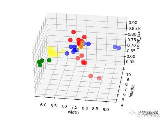
fig = plt.figure()
ax = fig.add_subplot(111, projection='3d')
ax.scatter(X_train['width'], X_train['height'],
X_train['color_score'], c=colors, marker='o', s=100)
ax.set_xlabel('width')
ax.set_ylabel('height')
ax.set_zlabel('color_score')
plt.show()
以下为程序运行之后展示的结果:

原文作者:Ruby的数据漫谈;如有侵权,请联系管理员删除。
上一篇:
企业级敏捷框架-SAFe
下一篇:
IT互联网公司的管理应该怎么做?

请登录后发表评论
登录
全部评论
