数据可视化是探索性数据分析(Exploratory Data Analysis, EDA)的重要组成部分,因为它有助于分析和可视化数据,以获得对其分布、变量之间关系和潜在异常值的启发性见解。
Python 有一组丰富的库,使我们能够快速有效地创建可视化。在使用Python进行探索性数据分析中有几种常用的可视化类型,主要包括:
条形图(Bar charts):用于显示不同类别之间的比较。
折线图(Line charts):用于显示一段时间内或不同类别之间的趋势。
饼状图(Pie charts):用于显示不同类别的比例或百分比。
直方图(Histograms):用于显示单个变量的分布。
热图(Heatmaps):用于显示不同变量之间的相关性。
散点图(Scatter plots):用来表示两个连续变量之间的关系。
箱形图(Box plots):用于显示变量的分布并标识异常值。
利用Python进行数据可视化的步骤
理解业务问题:第一步很重要,因为只有理解了业务问题我们最终才能够获得正确的可视化结果。 导入必要的库:导入必要的库,如Pandas, Seaborn, Matplotlib, Plotly。 加载数据集:加载要可视化的数据集。 数据清洗和预处理:通过删除缺失值、重复值和异常值来对数据进行清洗和预处理。另外,将分类数据转换为数值数据。 统计汇总:计算描述性统计数据,如平均值、中位数、众数、标准差和相关系数,从而了解变量之间的关系。 数据可视化和解释:创建可视化来理解数据中的分布、关系和模式。然后对可视化加以解释,从而获得关于数据的启发性见解和结论。
1. 理解业务问题
心血管疾病是全球人员死亡的主要原因。据世界卫生组织统计,每年有1790万人死于心脏病。其中85%的死亡是由心脏病发作和中风引起的。
在本文中,我们将探索来自Kaggle的心脏病发作数据集(获取方式见文末),并使用Python为探索性数据分析创建数据可视化。
该数据集包含患者的各种变量数据,如年龄、性别、血压、胆固醇水平以及是否患有心脏病。其目标是根据患者的医疗属性来预测他们是否有心脏病发作的风险。
2. 导入必要的库
import pandas as pd
import numpy as np

import matplotlib.pyplot as plt
import seaborn as sns
import plotly.express as px
import plotly.graph_objects as go
from plotly.subplots import make_subplots
3. 加载数据集
现在,让我们将数据集加载进来并开始探索吧!
heart = pd.read_csv('datasets/heart.csv')
现在我们已经加载了数据,让我们看一下DataFrame的前几行,以了解数据的大致内容:
heart.head()
我们可以看到,数据集包含14列,包括目标列(output),它表示患者是否有心脏病发作(1-高风险;0-低风险)。现在让我们开始创建可视化吧!
4. 数据清洗和预处理
数据清洗的目的是把数据准备好进行分析和可视化。
空值检查
heart.isnull().sum().sort_values(ascending=False).head(11)
正如我们在这里看到的,这个示例数据集中并不存在任何缺失值。
重复数据检查
从输出中可以看出,存在一行重复数据,将其删除即可:
🆗,现在数据已经清洗好啦!让我们继续接下来的步骤吧!
5. 统计汇总
通过统计汇总,我们可以看出数据集的大致情况,比如字段有效行数、均值、方差、最小最大值、分位数等等,只需要要一个方法一行代码即可实现:
heart.describe().T
我们在这里可以得到的主要推论是:对于大多数列,平均值与中位数相似(第50个百分位:50%)。
6. 数据可视化和解释
Ⅰ 基于性别的数据可视化
df = pd.crosstab(heart['output'], heart['sex'])
sns.set_style('white')

df.plot(kind='bar',
        figsize=(6, 6),
        color=['#c64343', '#e1d3c1'])
plt.title('Heart Attack Risk vs Sex', fontsize=16)
plt.xlabel('0 = Lower Risk                  1 = Higher Risk', fontsize=16)
plt.ylabel('Amount')
plt.legend(['Female', 'Male'], fontsize=14)
plt.xticks(rotation=0)
性别分布
# 将sex列的0和1分别转化为“Female”和“Male”并赋给heart2
heart2 = heart.copy()
heart2['sex'] = heart2['sex'].map({0: 'Female', 1: 'Male'})

fig = px.pie(heart2,
             names='sex',
             template='presentation',
             hole=0.6,
             color_discrete_sequence=['#e1d3c1', '#c64343'])
fig.update_layout(title_text='Gender Distribution',
                  title_x=0.5,
                  font=dict(size=18),
                  autosize=False,
                  width=500,
                  height=500,
                  showlegend=False)
fig.add_annotation(dict(x=0.5, y=0.5, align='center',
                        xref='paper', yref='paper',
                        showarrow=False, font_size=22,
                        text="<span style='font_size: 26px; color=#555; font_family: Arial'>Gender<br></span>"))
fig.update_traces(textposition='outside', textinfo='percent+label', rotation=20)
fig.show()
解释(Interpretation):男性有更高的心脏病发作风险。
Ⅱ 基于年龄的数据可视化
plt.figure(figsize=(14, 8))
sns.set_theme(font_scale=1.2)
sns.set_style('white')

sns.countplot(x=heart['age'], palette='Reds')
plt.title('Count of Patients Age', fontsize=20)
plt.xlabel('Age', fontsize=16)
plt.ylabel('Count', fontsize=16)
plt.show()
sns.set_theme(font_scale=1.3)
plt.figure(figsize=(8, 6))
sns.set_style('white')
sns.histplot(heart['age'], color='red', kde=True)
plt.title('Distribution of Patients Age', fontsize=20)
plt.xlabel('Age', fontsize=16)
plt.ylabel('Density', fontsize=16)
plt.show()
解释(Interpretation):大多数病人的年龄集中在50-60岁,其中,病人最多的年龄大致为58岁。
Ⅲ 基于胆固醇水平的数据可视化
sns.set_theme(font_scale=1.3)
plt.figure(figsize=(8, 6))
sns.set_style('white')

sns.histplot(heart[heart['output']==0]['chol'], color='blue', kde=True)
sns.histplot(heart[heart['output']==1]['chol'], color='red', kde=True)
plt.title('Heart Attack Risk vs Cholesterol', fontsize=20)
plt.xlabel('Cholesterol Level', fontsize=16)
plt.ylabel('Density', fontsize=16)
plt.legend(['Lower Risk', 'Higher Risk'], fontsize=16)
plt.show()
➡️ 年龄与胆固醇水平相关性分析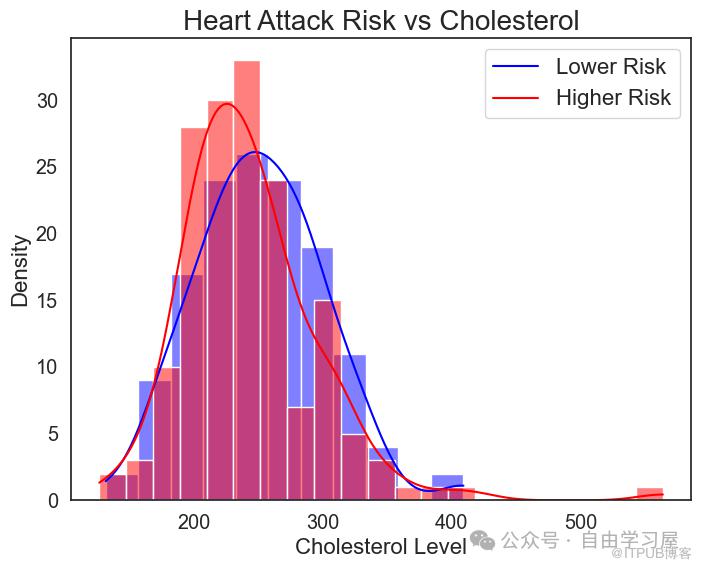
plt.figure(figsize=(8, 6))
sns.lineplot(x='age',
             y='chol',
             data=heart,
             color='red')
plt.title('Cholesterol with Age', fontsize=20)
plt.xlabel('Age', fontsize=16)
plt.ylabel('Cholesterol Level', fontsize=16)
plt.show()
解释(Interpretation):
大多数病人的胆固醇水平集中在200-300之间。 随着年龄的增长,人体内胆固醇水平增加的可能性更高。
Ⅳ 基于胸痛类型的数据可视化
heart3 = heart.copy()
heart3['cp'] = heart3['cp'].map({0: 'Typical angina', 1: 'Atypical angina',
                                 2: 'Non-anginal pain', 3: 'Asymptomic'})
df = pd.crosstab(heart3['cp'], heart3['output'])

sns.set_theme(font_scale=1.3)
sns.set_style('white')

df.plot(kind='bar',
        figsize=(11, 7),
        color=['#e1d3c1', '#c64343'])
plt.title('Heart Attack Risk vs. Chest Pain Type', fontsize=20)
plt.xlabel('Chest Pain Types', fontsize=16)
plt.ylabel('Amount', fontsize=16)
plt.legend(['Lower Risk', 'Higher Risk'], fontsize=14)
plt.xticks(rotation=0)
plt.show()
解释(Interpretation):
大多数病人的胸痛类型为典型心绞痛。 非心绞痛疼痛类型的病人具有更高的心脏病发作风险。
Ⅴ 基于相关性的数据可视化
plt.figure(figsize=(12, 10))
sns.set_theme(font_scale=0.9)

sns.heatmap(heart.corr(), annot=True, cmap='Reds')
plt.title('Correlation Between Variables', fontsize=15)
plt.show()
解释(Interpretation):
热力图显示以下变量之间存在强相关性:
胸痛类型和输出 最大心率和输出 斜率和输出
同时,也可以看出以下变量之间存在弱相关性:
旧峰值和输出 血管数和输出 运动诱发心绞痛和输出
结论
在这篇文章中,我们使用数据可视化检查了我们的数据集,创建了多个图,比如条形图、饼图、折线图、、直方图(带核密度曲线)、热力图。
探索性数据分析和数据可视化的主要目的是在做出任何假设之前帮我们更直观地理解数据,这有助于我们查看数据分布、汇总统计以及变量和异常值之间的关系。
说在最后的话
示例数据集获取方式,关注我,回复关键字“heart”即可领取,赶紧行动起来吧!
如果你觉得这篇文章对你有用,请“点赞➕在看➕分享➕关注”支持我,你的点赞和关注就是我持续创作分享的动力,让更多的朋友发现并加入我们,共同学习和进步!
Thank you for reading!
- END -
推荐阅读👇👇👇


原文作者:数据派探险家;如有侵权,请联系管理员删除。

最新文章
- 5个被过度高估的Python库(你绝对想不到)!
- 不掌握这10个Python概念,请不要自称高级开发人员(二)~~
- 不掌握这10个Python概念,请不要自称高级开发人员(一)~~
- 数据分析面试:你认为数据分析的价值如何体现?
- Python必知必会:使用 dedent() 方法优雅地展示多行字符串!
- Python必知必会:39个Python关键字详解,你的编程查阅小手册,收藏!
- Python必知必会:每个程序员都必须知道的22个Python单行代码!
- Python必知必会:15个令人相见恨晚的Python字符串格式化技巧!
- 24个令人眼前一亮的Python技巧—提升你的代码水平和质量(二)
- 24个令人眼前一亮的Python技巧—提升你的代码水平和质量(一)
