python可视化常用的包有pyecharts,plotly,matplotlib,seaborn等。本文展示一下这些包的基本用法(认为图不错的,代码可以直接复制拿去用)。
1.饼图
最基础的饼图
import matplotlib.pyplot as plt
import seaborn as sns
sns.set_palette("Blues",8)
# Pie chart, where the slices will be ordered and plotted counter-clockwise:
labels = 'Frogs', 'Hogs', 'Dogs', 'Logs'
sizes = [15, 30, 45, 10]
explode = (0, 0.1, 0, 0)  # only "explode" the 2nd slice (i.e. 'Hogs')
fig1, ax1 = plt.subplots(figsize = (10,7))
ax1.pie(sizes, explode=explode, labels=labels, autopct='%1.1f%%',
        shadow=True, startangle=90)
ax1.axis('equal')  # Equal aspect ratio ensures that pie is drawn as a circle.
plt.show()
饼图(多层饼图,其中一项展开)
import matplotlib.pyplot as plt
from matplotlib.patches import ConnectionPatch
import numpy as np
import seaborn as sns
sns.set_palette("Blues",8)
# make figure and assign axis objects
fig, (ax1, ax2) = plt.subplots(1, 2, figsize=(9, 5),dpi =100)
fig.subplots_adjust(wspace=0)#第一个饼的区间展开,展开的线的长度。
plt.rcParams['font.sans-serif']=['SimHei'] #用来正常显示中文标签
# pie chart parameters
ratios = [.27, .56, .17]
labels = ['分类1', '分类2', '分类3']
explode = [0.1, 0, 0]# 第一个饼设置间距
# rotate so that first wedge is split by the x-axis
angle = -180* ratios[0] #第一个饼展开
ax1.pie(ratios, autopct='%1.1f%%', startangle=angle,labels=labels, explode=explode)
# bar chart parameters
xpos = 0
bottom = 0
ratios = [.10, .20, .30, .40] #细分占比
width = 0.2
colors = ["#6C7B8B","#A2B5CD","#BCD2EE","#CAE1FF"]
for j in range(len(ratios)):
    height = ratios[j]
    ax2.bar(xpos, height, width, bottom=bottom, color=colors[j])
    ypos = bottom + ax2.patches[j].get_height() / 2
    bottom += height
    ax2.text(xpos, ypos, "%d%%" % (ax2.patches[j].get_height() * 100),ha='center')
ax2.set_title('占比情况')
ax2.legend(['分类A', '分类B', '分类C', '分类D'],loc='upper right',
          frameon=False,)#标签设置
ax2.axis('off')
ax2.set_xlim(- 2.5 * width, 2.5 * width)
# use ConnectionPatch to draw lines between the two plots
# get the wedge data
theta1, theta2 = ax1.patches[0].theta1, ax1.patches[0].theta2
center, r = ax1.patches[0].center, ax1.patches[0].r
bar_height = sum([item.get_height() for item in ax2.patches])
# draw top connecting line
x = r * np.cos(np.pi / 180 * theta2) + center[0]
y = r * np.sin(np.pi / 180 * theta2) + center[1]
con = ConnectionPatch(xyA=(-width / 2, bar_height), coordsA=ax2.transData,
                      xyB=(x, y), coordsB=ax1.transData)
con.set_color([0, 0, 0])
con.set_linewidth(1)
ax2.add_artist(con)
# draw bottom connecting line
x = r * np.cos(np.pi / 180 * theta1) + center[0]
y = r * np.sin(np.pi / 180 * theta1) + center[1]
con = ConnectionPatch(xyA=(-width / 2, 0), coordsA=ax2.transData,
                    xyB=(x, y), coordsB=ax1.transData)
con.set_color([0, 0, 0])
ax2.add_artist(con)
con.set_linewidth(1)
plt.show()
输出图
多层饼图(两层嵌套饼图)
import pyecharts.options as opts
from pyecharts.charts import Pie
inner_x_data = ["直达", "营销广告", "搜索引擎"]
inner_y_data = [335, 679, 1548]
inner_data_pair = [list(z) for z in zip(inner_x_data, inner_y_data)]
outer_x_data = ["直达", "营销广告", "搜索引擎", "邮件营销", "联盟广告", "视频广告", "百度", "谷歌", "必应", "其他"]
outer_y_data = [335, 310, 234, 135, 1048, 251, 147, 102]
outer_data_pair = [list(z) for z in zip(outer_x_data, outer_y_data)]
(Pie(init_opts=opts.InitOpts(width="1000px", height="800px"))
    .add(
        series_name="访问来源",
        data_pair=inner_data_pair,
        radius=[0, "30%"],
        label_opts=opts.LabelOpts(position="inner"),
    )
    .add(
        series_name="访问来源",
        radius=["40%", "55%"],
        data_pair=outer_data_pair,
        label_opts=opts.LabelOpts(
            position="outside",
            formatter="{a|{a}}{abg|}\n{hr|}\n {b|{b}: }{c}  {per|{d}%}  ",
            background_color="#eee",
            border_color="#aaa",
            border_width=1,
            border_radius=4,
            rich={
                "a": {"color": "#999", "lineHeight": 22, "align": "center"},
                "abg": {
                    "backgroundColor": "#e3e3e3",
                    "width": "100%",
                    "align": "right",
                    "height": 22,
                    "borderRadius": [4, 4, 0, 0],
                },
                "hr": {
                    "borderColor": "#aaa",
                    "width": "100%",
                    "borderWidth": 0.5,
                    "height": 0,
                },
                "b": {"fontSize": 16, "lineHeight": 33},
                "per": {
                    "color": "#eee",
                    "backgroundColor": "#334455",
                    "padding": [2, 4],
                    "borderRadius": 2,
                },
            },
        ),
    )
    .set_global_opts(legend_opts=opts.LegendOpts(pos_left="left", orient="vertical"))
    .set_series_opts(
        tooltip_opts=opts.TooltipOpts(
            trigger="item", formatter="{a} <br/>{b}: {c} ({d}%)"
        )
    )
    .render_notebook())
输出图
多个饼图
import plotly.graph_objects as go
from plotly.subplots import make_subplots
labels = ["US", "China", "European Union", "Russian Federation", "Brazil", "India",
          "Rest of World"]
# Create subplots: use 'domain' type for Pie subplot

fig = make_subplots(rows=1, cols=2, specs=[[{'type':'domain'}, {'type':'domain'}]])
fig.add_trace(go.Pie(labels=labels, values=[16, 15, 12, 6, 5, 4, 42], name="GHG Emissions"),
              1, 1)
fig.add_trace(go.Pie(labels=labels, values=[27, 11, 25, 8, 1, 3, 25], name="CO2 Emissions"),
              1, 2)
# Use `hole` to create a donut-like pie chart
fig.update_traces(hole=.4, hoverinfo="label+percent+name")
fig.update_layout(
    title_text="Global Emissions ",
    # Add annotations in the center of the donut pies.
    annotations=[dict(text='GHG', x=0.18, y=0.5, font_size=20, showarrow=False),
                 dict(text='CO2', x=0.82, y=0.5, font_size=20, showarrow=False)])
fig.show()
输出图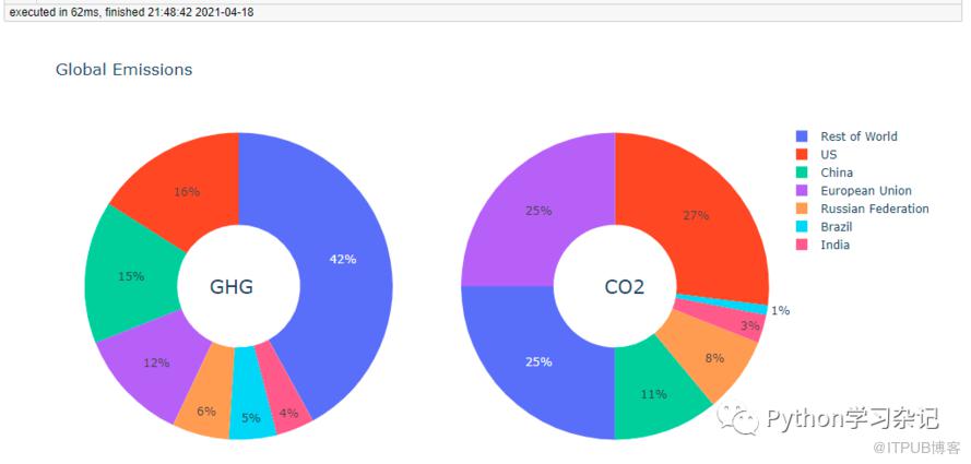
2.柱状图
基础柱状图
import matplotlib.pyplot as plt
plt.rcdefaults()#重置参数,初始化各个参数
fig, ax = plt.subplots(figsize = (8,5),)
yy = ('Tom', 'Dick', 'Harry', 'Slim', 'Jim')
xx = (1,2,5,6,7)
plt.rcParams['font.sans-serif'] = 'SimHei'#显示中文
ax.barh(yy, xx, align='center')
ax.set_yticks(yy)
ax.set_yticklabels(yy)
#ax.invert_yaxis()  # 若需要反转y坐标,加上本行代码
ax.set_xlabel('x轴')
ax.set_title('直方图样例')
plt.show()
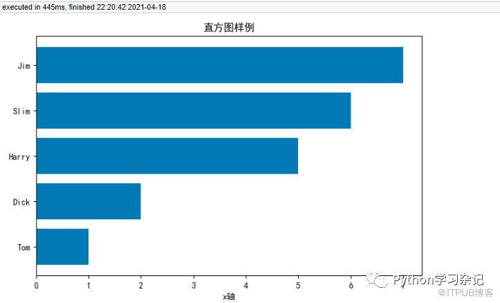 多个柱状图
多个柱状图
import matplotlib
import matplotlib.pyplot as plt
import numpy as np
plt.style.use('ggplot')#用了R软件常用包ggplot2背景
labels = ['G1', 'G2', 'G3', 'G4', 'G5']
men_means = [20, 34, 30, 35, 27]
women_means = [25, 32, 34, 20, 25]
x = np.arange(len(labels))  # the label locations
width = 0.35  # the width of the bars
fig, ax = plt.subplots()
rects1 = ax.bar(x - width/2, men_means, width, label='Men')
rects2 = ax.bar(x + width/2, women_means, width, label='Women')
# Add some text for labels, title and custom x-axis tick labels, etc.
ax.set_ylabel('Scores')
ax.set_title('Scores by group and gender')
ax.set_xticks(x)
ax.set_xticklabels(labels)
ax.legend()
fig.tight_layout()
plt.show()
3.3D图
3D散点图
import matplotlib.pyplot as plt
import numpy as np
# Fixing random state for reproducibility
np.random.seed(10)
def randrange(n, vmin, vmax):
    return (vmax - vmin)*np.random.rand(n) + vmin
fig = plt.figure(figsize=(10,8))
ax = fig.add_subplot(projection='3d')
n = 20
# For each set of style and range settings, plot n random points in the box
# defined by x in [23, 32], y in [0, 100], z in [zlow, zhigh].
for m, zlow, zhigh in [('o', -50, -25), ('^', -30, -5)]:
    xs = randrange(n, 23, 32)
    ys = randrange(n, 0, 100)
    zs = randrange(n, zlow, zhigh)
    ax.scatter(xs, ys, zs, marker=m)
ax.set_xlabel('X Label')
ax.set_ylabel('Y Label')
ax.set_zlabel('Z Label')
plt.show()
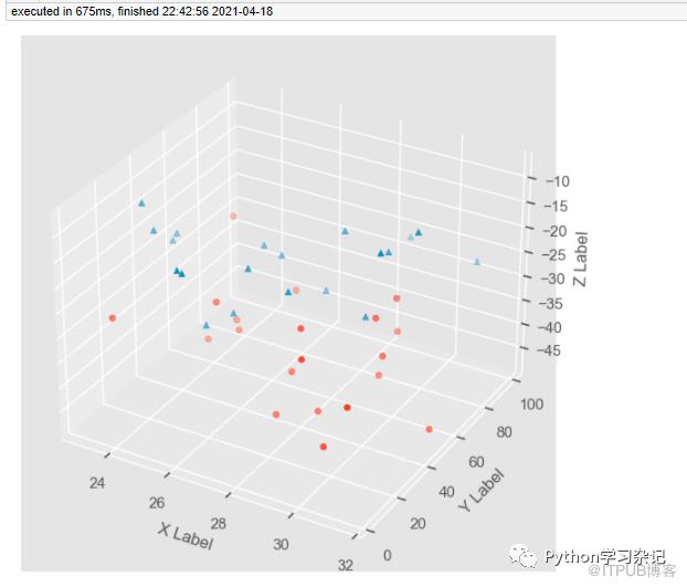 3D曲面图
3D曲面图
import matplotlib.pyplot as plt
from matplotlib.ticker import LinearLocator
import numpy as np
ax = plt.figure(figsize=(10,7)).add_subplot(projection='3d')
X = np.arange(-5, 5, 0.25)
xlen = len(X)
Y = np.arange(-5, 5, 0.25)
ylen = len(Y)
X, Y = np.meshgrid(X, Y)
R = np.sqrt(X**2 + Y**2)
Z = np.sin(R)
# Create an empty array of strings with the same shape as the meshgrid, and
# populate it with two colors in a checkerboard pattern.
colortuple = ('y', 'b')
colors = np.empty(X.shape, dtype=str)
for y in range(ylen):
    for x in range(xlen):
        colors[y, x] = colortuple[(x + y) % len(colortuple)]
# Plot the surface with face colors taken from the array we made.
surf = ax.plot_surface(X, Y, Z, facecolors=colors, linewidth=0)
# Customize the z axis.
ax.set_zlim(-1, 1)
ax.zaxis.set_major_locator(LinearLocator(6))
plt.show()
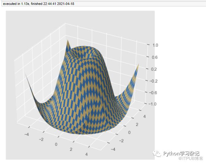 本次就写到这三类图像,后续有时间再更新。
原文作者:Python学习杂记;如有侵权,请联系管理员删除。
上一篇:
循环遍历的基本用法
下一篇:
jieba分词及词云图的制作

请登录后发表评论
登录
全部评论
