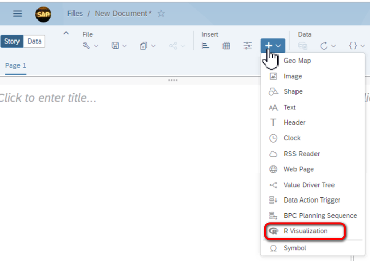
插入一个R visualization:
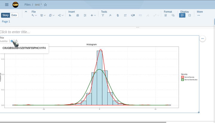
一定要确保图形出现这个model的小图标,代表这个R visualization的模型数据成功绑定之后才能进行下一步操作:
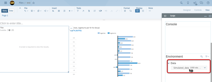
模型绑定成功后,在R script编辑器Environment标签页的Data下拉菜单里能看到模型数据。
使用这个SAP Analytics Cloud官方教程里提供的excel文件作为数据源:
https://www. sapanalytics.cloud/tuto rial-r-visualization/
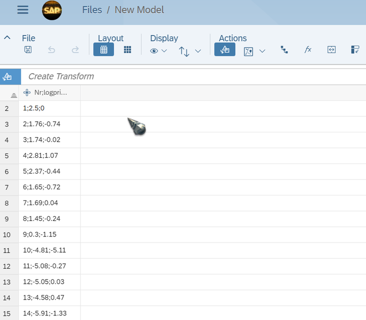
该excel内容如下:
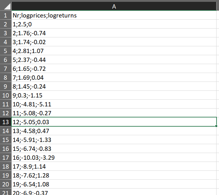
excel系统导入SAP Analytics Cloud后,需要使用simple transformation,将;分号分隔的值拆分成三列:
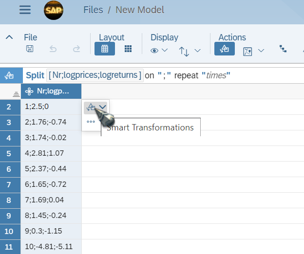
逐一拆分:
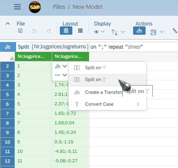
拆分完毕之后,生成Model. 将这个url里包含的R脚本复制粘贴到R编辑器里: https://www. sapanalytics.cloud/wp-c ontent/uploads/2019/09/R-Script-Plot.txt
# Discription:
# Creating a histogram of the log returns, adding the kernel density of the log returns
# and the normal density as reference distribution
#
# Requirements:
# ggplot requires a data frame
#
# Output:
# Histogram Plot
#
library(ggplot2)
Simulated_data <- data.frame(Simulated_data)
histgg <- ggplot(data = Simulated_data, aes(logreturns))
histgg + geom_histogram(aes(y = ..density..),fill = "lightblue",color = "black", alpha = 0.8, position = "identity") +
  geom_density(aes(color = "Kernel Density"), size = 1) +
  stat_function(aes(color = "Normal Distribution"), fun = dnorm, args = list(mean = mean(Simulated_data$logreturns), sd = sd(Simulated_data$logreturns)), size = 1) +
  ggtitle("Histogram") +
  theme(panel.grid = element_line(linetype = "dashed", color = "lightgrey"), panel.background = element_rect(fill = "white"),
        panel.border = element_rect(colour = "black", fill=NA),
        plot.title = element_text(hjust = 0.5)) +
  scale_colour_manual("Density", values = c("red", "darkgreen")) +
  xlab(" ")+
  ylab("Frequency")
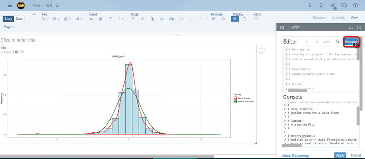
点击Execute按钮,就可以看到R脚本绘制出来的图形了:
要获取更多Jerry的原创文章,请关注公众号"汪子熙":

来自 “ ITPUB博客 ” ,链接:https://blog.itpub.net/24475491/viewspace-2685560/ ,如需转载,请注明出处,否则将追究法律责任。

请登录后发表评论
登录
全部评论
