技术解读:HarmonyOS 6.1 实战:toggleLike方法会创建一个新的FigureModel实例并翻转其liked属性
HarmonyOS ArKTS API 24深度
在当今移动互联网生态中,潮玩盲盒社区已经成为年轻消费群体高度活跃的垂直社交场景。从POP MART到52TOYS,从线上抽盒到二手交易,整个潮玩产业链正在经历从线下实体向线上数字化的快速迁移。HarmonyOS 6.1.1作为华为全场景智慧生活操作系统的最新迭代版本,其ArkTS声明式UI框架在HarmonyOS ArkTS API 24阶段已经发展得极为成熟,为开发者提供了从类型系统、状态管理到组件化构建的一整套现代化前端开发范式。本文将以一个完整的潮玩盲盒社区单文件页面应用为例,深入剖析基于HarmonyOS API 24的ArkTS开发实践,涵盖类型定义、可观察数据模型、纯函数工具层、硬编码数据治理、声明式组件构建、多Tab页面切换、模拟抽盒算法、交易市场行情图表、排行榜领奖台布局、弹框交互系统以及漂浮动画特效等十余个核心技术模块。
声明式UI编程范式的核心思想是"UI是状态的函数映射",即界面渲染完全由数据状态驱动,开发者只需关注状态的变化,框架自动完成UI的差异化更新。这一范式在HarmonyOS ArkTS API 24中通过 @State 、 @Prop 、 @Link 、 @Observed 、 @ObjectLink 等装饰器体系得到了全面落地。在本应用的盲盒抽盒流程中,当用户点击"立即抽盒"按钮后, isShaking 状态从 false 翻转为 true ,这一单一状态变化会同时驱动盲盒图标的旋转动画、提示文案的变更、按钮颜色的切换以及按钮文字的更新,充分展现了声明式UI"一处状态变更,多处UI响应"的强大表现力。相较于传统命令式UI开发中需要手动调用 findViewById 再逐一设置属性的方式,声明式范式大幅减少了模板代码量,同时从根本上消除了状态与视图不一致的隐患。
HarmonyOS 6.1.1在渲染性能层面引入了多项底层优化,包括但不限于更精细的组件树差异比对算法、GPU加速的属性动画管线以及针对 ForEach 列表渲染的增量更新策略。在本文分析的盲盒应用中,首页热门系列信息流使用 ForEach 渲染13条系列卡片,交易市场列表同样使用 ForEach 渲染13条交易条目,排行榜列表渲染13位收藏家排名。这些列表的每一项都通过精心设计的 keyGenerator 函数返回唯一键值,确保在数据源发生局部变更(如点赞数更新、价格变动)时,框架能够精准定位到需要重渲染的最小组件子树,而非粗暴地全量重建列表。这种基于键值的差异化更新机制是HarmonyOS ArkTS API 24列表性能优化的基石,也是本应用在低端设备上依然保持流畅滚动的关键所在。
状态管理是任何前端框架的核心命题,HarmonyOS ArkTS API 24提供了分层的状态管理架构来应对不同复杂度的场景。在本应用中, @State 装饰器用于管理组件内部的所有可变状态,包括当前选中的Tab索引、搜索关键词、Banner轮播索引、系列列表、藏品列表、交易列表、排行榜列表、抽盒记录列表、漂浮表情列表以及多个弹框的显示状态和数据。当这些 @State 变量被重新赋值时,ArkTS框架会自动触发依赖该状态的 @Builder 方法的重新执行,从而实现UI的自动刷新。值得注意的是,本应用中所有的状态变更都遵循了"不可变更新"模式——即不直接修改对象属性,而是创建新的模型实例来替换整个数组元素,这一模式确保了 @Observed 装饰的模型类能够被框架正确追踪和响应。
本应用采用单文件页面架构,即将所有类型定义、数据模型、工具函数、硬编码数据和UI组件集中在一个ArkTS源文件中。这种架构设计在原型开发阶段和小型应用中具有显著优势:所有代码集中可见,开发者可以在不切换文件的情况下完成功能迭代,同时避免了多文件之间的导入导出管理开销。应用实现了六个核心功能Tab:首页(Banner轮播、概率分布图、系列信息流)、图鉴(双列网格、稀有度筛选、编辑/删除/点赞操作)、抽盒(模拟抽盒动画、概率公示、实时抽盒记录)、交易(7日价格趋势迷你图、交易卡片列表、挂售弹框)、排行(领奖台三甲展示、完整排行榜列表)以及我的(个人信息卡、数据统计、功能入口、收藏展示柜)。此外,应用还实现了四种弹框交互(抽盒结果、挂售表单、编辑收藏、删除确认)和一层全局漂浮表情动画特效,构成了一个功能完整、交互丰富的潮玩社区体验。
一、类型系统设计:接口定义与数据契约
1.1 ColorPalette配色接口:全局视觉令牌的统一管理
interface
ColorPalette
{
bg
:
string
card
:
string
cardDeep
:
string
primary
:
string
accent
:
string
gold
:
string
textPrimary
:
string
textSecondary
:
string
textDim
:
string
green
:
string
red
:
string
blue
:
string
}
在HarmonyOS ArkTS API 24的类型系统中, interface 是定义数据契约的核心机制。与传统的TypeScript接口不同,ArkTS的接口在编译期会被严格检查,不支持任意属性访问,所有属性必须在接口定义中显式声明。本应用首先定义了 ColorPalette 接口,它声明了12个字符串类型的颜色属性,构成了整个应用的视觉设计令牌体系。
这种将配色方案抽象为接口的设计模式具有多重优势。首先,它实现了配色信息的类型安全——任何使用 ColorPalette 类型的变量都必须包含全部12个颜色属性,编译器会在编译阶段拦截缺失属性的错误。其次,它为配色方案的切换提供了扩展点——未来如果需要实现深色/浅色主题切换,只需创建多个实现 ColorPalette 接口的对象实例即可。在本应用中, bg 属性定义了页面背景色(深紫色 #1A0B2E ), card 定义了卡片背景色( #2A1B3D ), cardDeep 定义了更深层次的卡片色( #3D1E6D ), primary 定义了主色调(红色 #E94560 ), accent 定义了强调色(紫色 #7B2CBF ), gold 定义了金色( #FFD700 )用于稀有度和高价值标识。文本色被分为三个层次: textPrimary ( #F0F0F0 )用于主要文本, textSecondary ( #A0A0B8 )用于次要文本, textDim ( #6B6B80 )用于辅助说明文本。此外, green 、 red 、 blue 三个语义化颜色分别用于趋势上涨、趋势下跌和信息标签的场景。
1.2 SeriesItem系列项接口:潮玩系列的数据建模
interface
SeriesItem
{
id
:
number
name
:
string
brand
:
string
series
:
string
price
:
number
rarity
:
string
emoji
:
string
color
:
string
colorDeep
:
string
hot
:
number
stock
:
number
tags
:
string
[
]
}
SeriesItem 接口定义了潮玩盲盒系列的核心数据结构。每个系列包含唯一标识符 id (数字类型)、系列名称 name (如"MOLLY 星际漫游")、品牌名称 brand (如"POP MART"、“泡泡玛特”)、系列分类 series (如"星际系列"、“森林系列”)、单盒价格 price (数字类型,单位为元)、稀有度等级 rarity (字符串枚举值,包括"普通"、“稀有”、“隐藏”、“超级隐藏"四个等级)、代表Emoji表情符号 emoji 、主色 color 和深色 colorDeep (用于卡片背景的渐变层次)、热度值 hot (数字类型,用于排序和展示)、库存数量 stock 以及标签数组 tags (字符串数组,如"热门”、“限量”、"爆款"等)。
这里值得深入讨论的是 rarity 属性的类型选择。在本应用中, rarity 被定义为 string 类型而非联合字面量类型(如 '普通' | '稀有' | '隐藏' | '超级隐藏' )。这一选择是基于HarmonyOS ArkTS API 24的类型系统特性考量——虽然联合字面量类型能提供更严格的编译期检查,但在实际开发中,稀有度值可能来源于后端API返回、本地存储读取或用户输入等动态场景,使用 string 类型可以避免频繁的类型断言和运行时类型守卫的开销。同时,应用通过 getRarityColor 、 getRarityBg 等纯函数对稀有度字符串进行集中化的分支处理,确保了类型安全和可维护性的平衡。
1.3 FigureItem藏品项接口:收藏管理的核心实体
interface
FigureItem
{
id
:
number
name
:
string
series
:
string
rarity
:
string
emoji
:
string
acquired
:
string
note
:
string
liked
:
boolean
price
:
number
}
FigureItem 接口定义了用户收藏的盲盒手办藏品数据结构。与 SeriesItem 不同,藏品项关注的是用户已拥有的具体手办个体,而非系列层面信息。其中 acquired 属性记录了收藏日期(字符串格式如"2026-08-12"), note 属性存储用户自定义的收藏备注(如"第37发出货!欧皇附体"), liked 属性是一个布尔值,标记该藏品是否被用户特别喜爱(对应心形图标), price 属性记录该藏品的当前市场估值。
liked 属性使用 boolean 类型而非 number (0/1)是一个值得注意的设计决策。在HarmonyOS ArkTS API 24中,布尔类型的UI绑定(如 if (f.liked) 条件渲染心形图标)比数字类型的比较判断(如 if (f.liked === 1) )更加直观和语义化,同时也减少了类型转换的认知负担。当用户在图鉴页面点击心形图标时, toggleLike 方法会创建一个新的 FigureModel 实例并翻转其 liked 属性,这一不可变更新操作会触发ArkTS框架重新渲染对应的藏品卡片,更新心形图标的显示状态。
1.4 TradeItem与RankItem接口:交易与排行场景的数据建模
interface
TradeItem
{
id
:
number
figure
:
string
seller
:
string
avatar
:
string
price
:
number
condition
:
string
trend
:
string
likes
:
number
emoji
:
string
color
:
string
}
interface
RankItem
{
id
:
number
name
:
string
avatar
:
string
collectionCount
:
number
rareCount
:
number
score
:
number
badge
:
string
}
TradeItem 接口定义了交易市场中的挂售条目数据结构。其中 figure 属性存储藏品名称, seller 属性存储卖家昵称, avatar 属性使用Emoji作为卖家头像(如"🦸"代表"盲盒侠客"), condition 属性描述物品成色(枚举值包括"全新未拆"、“仅拆认证”、“微瑕”), trend 属性记录价格趋势(枚举值包括"up"、“down”、“stable”), likes 属性记录该挂售条目的收藏点赞数。 trend 属性使用英文短字符串而非中文,是因为它在代码逻辑中被频繁用于条件判断和函数参数传递,英文短字符串的字符数更少、比较运算更高效。
RankItem 接口定义了收藏家排行榜的条目数据结构。 collectionCount 属性记录总藏品数量, rareCount 属性记录稀有及以上品质的藏品数量, score 属性是综合积分(由藏品数量、稀有度、活跃度等多维度加权计算得出), badge 属性是等级徽章(枚举值包括"Legend"、“Master”、“Expert”、“Pro”、"Rising"五个等级)。这里 badge 使用英文而非中文,是因为它直接作为UI文本展示,英文徽章名称在国际化和视觉设计上更具辨识度,也更符合游戏化排行榜的审美惯例。
1.5 辅助类型接口:概率、价格趋势与动画状态
interface
ProbabilityItem
{
name
:
string
percent
:
number
emoji
:
string
}
interface
PricePoint
{
day
:
string
price
:
number
}
interface
UnboxRecord
{
id
:
number
name
:
string
rarity
:
string
emoji
:
string
time
:
string
color
:
string
}
PricePoint 接口定义了价格趋势数据点, day 属性是星期几的简称(如"一"、“二"等中文单字), price 属性是当天的成交均价。这一接口被用于交易市场的7日价格趋势迷你图,通过柱状图直观展示价格波动趋势。 UnboxRecord 接口定义了抽盒记录条目, time 属性使用相对时间描述(如"2分钟前”、“刚刚”), color 属性记录该记录的标识色,用于在列表中提供视觉区分。
interface
FloatingEmoji
{
emoji
:
string
x
:
number
y
:
number
size
:
number
phase
:
number
opacity
:
number
}
interface
HotTag
{
name
:
string
color
:
string
}
interface
TradeFormState
{
price
:
string
condition
:
string
shipping
:
string
autoDecline
:
boolean
}
interface
EditFormState
{
note
:
string
tag
:
string
order
:
number
}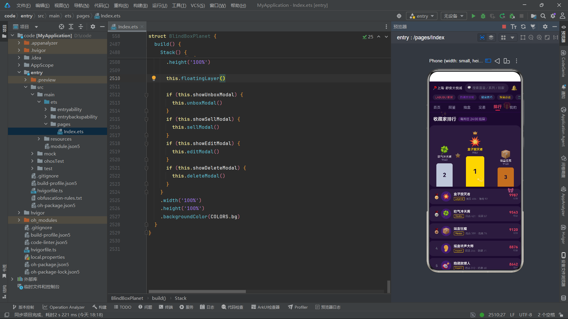
FloatingEmoji 接口定义了漂浮表情动画的状态数据, x 和 y 属性是以百分比表示的屏幕坐标位置, phase 属性是正弦波相位偏移量(用于让每个表情的运动不同步), size 属性是字体大小(即表情的视觉尺寸), opacity 属性是当前透明度值。这一接口是整个漂浮动画系统的基础数据结构,通过 setInterval 定时器周期性更新 opacity 和 y 值来实现浮动效果。
HotTag 接口定义了热门标签数据, TradeFormState 和 EditFormState 接口分别定义了挂售表单和编辑表单的状态数据。值得注意的是, TradeFormState 中的 price 属性使用 string 类型而非 number ,这是因为 TextInput 组件的 onChange 回调返回的是字符串类型,直接使用字符串可以避免在每次输入时进行数字解析和格式化,同时也能更好地处理空输入和非法字符的情况。
二、@Observed可观察数据模型类的设计与实现
2.1 @Observed装饰器的核心原理
@
Observed
class
SeriesModel
implements
SeriesItem
{
id
:
number
name
:
string
brand
:
string
series
:
string
price
:
number
rarity
:
string
emoji
:
string
color
:
string
colorDeep
:
string
hot
:
number
stock
:
number
tags
:
string
[
]
constructor
(
data
:
SeriesItem
)
{
this
.
id
=
data
.
id
this
.
name
=
data
.
name
this
.
brand
=
data
.
brand
this
.
series
=
data
.
series
this
.
price
=
data
.
price
this
.
rarity
=
data
.
rarity
this
.
emoji
=
data
.
emoji
this
.
color
=
data
.
color
this
.
colorDeep
=
data
.
colorDeep
this
.
hot
=
data
.
hot
this
.
stock
=
data
.
stock
this
.
tags
=
data
.
tags
}
}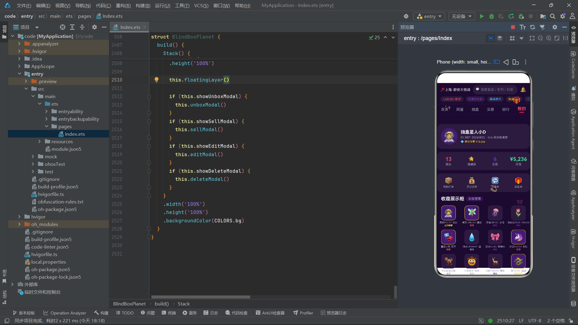
在HarmonyOS ArkTS API 24中, @Observed 装饰器用于将一个普通的TypeScript类标记为"可观察"的数据模型类。被 @Observed 装饰的类,其实例的属性变更可以被ArkTS状态管理系统追踪和响应。这一机制是ArkTS实现细粒度状态更新的关键基础设施——当 @Observed 类的实例属性发生变化时,框架会自动通知所有依赖该属性的UI组件进行重新渲染。
SeriesModel 类通过 implements SeriesItem 语法实现了 SeriesItem 接口,这意味着 SeriesModel 的实例在类型层面上完全兼容 SeriesItem 接口定义。这种"接口定义数据契约+类实现可观察行为"的设计模式实现了数据模型定义与框架行为绑定的关注点分离。接口 SeriesItem 纯粹描述数据结构,不依赖任何框架API,可以在任何上下文中复用;而 SeriesModel 类则通过 @Observed 装饰器赋予数据模型以状态观察能力,专门用于ArkTS组件的状态管理。
构造函数接收一个 SeriesItem 类型的参数 data ,并将其所有属性逐一赋值给实例属性。这种"从接口对象构造模型实例"的模式在整个应用中被统一采用,它解决了ArkTS的一个关键限制: @State 装饰的数组变量在更新时需要赋值全新的数组引用,而数组元素的类型必须是 @Observed 类才能实现属性级响应。因此,当硬编码数据使用普通接口类型定义时,需要通过构造函数将其转换为 @Observed 模型类实例后才能赋值给 @State 变量。
2.2 FigureModel与TradeModel:藏品与交易的可观察模型
@
Observed
class
FigureModel
implements
FigureItem
{
id
:
number
name
:
string
series
:
string
rarity
:
string
emoji
:
string
acquired
:
string
note
:
string
liked
:
boolean
price
:
number
constructor
(
data
:
FigureItem
)
{
this
.
id
=
data
.
id
this
.
name
=
data
.
name
this
.
series
=
data
.
series
this
.
rarity
=
data
.
rarity
this
.
emoji
=
data
.
emoji
this
.
acquired
=
data
.
acquired
this
.
note
=
data
.
note
this
.
liked
=
data
.
liked
this
.
price
=
data
.
price
}
}
@
Observed
class
TradeModel
implements
TradeItem
{
id
:
number
figure
:
string
seller
:
string
avatar
:
string
price
:
number
condition
:
string
trend
:
string
likes
:
number
emoji
:
string
color
:
string
constructor
(
data
:
TradeItem
)
{
this
.
id
=
data
.
id
this
.
figure
=
data
.
figure
this
.
seller
=
data
.
seller
this
.
avatar
=
data
.
avatar
this
.
price
=
data
.
price
this
.
condition
=
data
.
condition
this
.
trend
=
data
.
trend
this
.
likes
=
data
.
likes
this
.
emoji
=
data
.
emoji
this
.
color
=
data
.
color
}
}
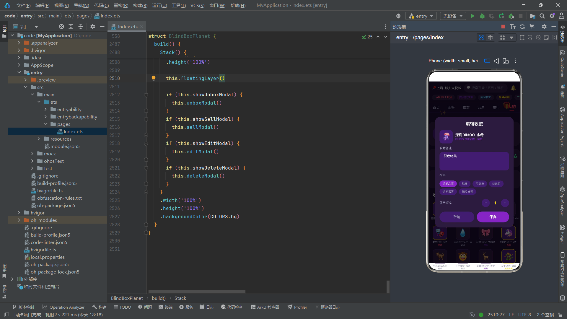
FigureModel 和 TradeModel 分别实现了 FigureItem 和 TradeItem 接口,并被 @Observed 装饰器标记为可观察类。 FigureModel 用于管理用户藏品列表的状态,当用户在图鉴页面点击心形图标时, toggleLike 方法会创建一个新的 FigureModel 实例(通过 new FigureModel(f) 从现有实例复制),翻转其 liked 属性,然后用新实例替换数组中的旧实例。这种"创建新实例替换旧实例"的不可变更新模式确保了 @Observed 框架能够正确检测到状态变化并触发UI更新。
TradeModel 用于管理交易市场的挂售条目状态。在交易卡片的渲染中,每个交易条目的价格趋势通过8根迷你柱状图展示,这些柱状图使用 TRADE_TREND_BARS 常量数组的数据驱动渲染。虽然柱状图数据本身是静态的,但交易卡片的 likes 属性可能会在用户交互时发生变化,使用 @Observed 模型类确保了这些动态属性变更能够被UI正确响应。
2.3 RankModel与UnboxRecordModel:排行与记录的可观察模型
@
Observed
class
RankModel
implements
RankItem
{
id
:
number
name
:
string
avatar
:
string
collectionCount
:
number
rareCount
:
number
score
:
number
badge
:
string
constructor
(
data
:
RankItem
)
{
this
.
id
=
data
.
id
this
.
name
=
data
.
name
this
.
avatar
=
data
.
avatar
this
.
collectionCount
=
data
.
collectionCount
this
.
rareCount
=
data
.
rareCount
this
.
score
=
data
.
score
this
.
badge
=
data
.
badge
}
}
@
Observed
class
UnboxRecordModel
implements
UnboxRecord
{
id
:
number
name
:
string
rarity
:
string
emoji
:
string
time
:
string
color
:
string
constructor
(
data
:
UnboxRecord
)
{
this
.
id
=
data
.
id
this
.
name
=
data
.
name
this
.
rarity
=
data
.
rarity
this
.
emoji
=
data
.
emoji
this
.
time
=
data
.
time
this
.
color
=
data
.
color
}
}
RankModel 封装了排行榜条目的数据模型。排行榜页面分为两个视觉区域:领奖台(展示前三名)和完整列表。领奖台部分直接通过数组索引访问 this.rankList[0] 、 this.rankList[1] 、 this.rankList[2] 来获取前三名数据,并使用三元运算符进行空值保护(如 this.rankList.length > 1 ? this.rankList[1].avatar : '📦' ),这种防御性编程确保了即使排行榜数据不足三条,UI也不会因为数组越界而崩溃。
UnboxRecordModel 封装了抽盒记录的数据模型。抽盒记录是动态生成的——每次用户执行抽盒操作后, doUnbox 方法会创建一个新的 UnboxRecordModel 实例并插入到记录列表的头部,同时通过 .slice(0, 8) 保留最近8条记录。这种"固定长度队列"的设计确保了抽盒记录列表不会无限增长,在保持用户最近操作可见性的同时控制了内存占用和渲染开销。
2.4 FloatingEmojiModel与表单模型类
@
Observed
class
FloatingEmojiModel
implements
FloatingEmoji
{
emoji
:
string
x
:
number
y
:
number
size
:
number
phase
:
number
opacity
:
number
constructor
(
data
:
FloatingEmoji
)
{
this
.
emoji
=
data
.
emoji
this
.
x
=
data
.
x
this
.
y
=
data
.
y
this
.
size
=
data
.
size
this
.
phase
=
data
.
phase
this
.
opacity
=
data
.
opacity
}
}
@
Observed
class
TradeFormModel
implements
TradeFormState
{
price
:
string
condition
:
string
shipping
:
string
autoDecline
:
boolean
constructor
(
data
:
TradeFormState
)
{
this
.
price
=
data
.
price
this
.
condition
=
data
.
condition
this
.
shipping
=
data
.
shipping
this
.
autoDecline
=
data
.
autoDecline
}
}
@
Observed
class
EditFormModel
implements
EditFormState
{
note
:
string
tag
:
string
order
:
number
constructor
(
data
:
EditFormState
)
{
this
.
note
=
data
.
note
this
.
tag
=
data
.
tag
this
.
order
=
data
.
order
}
}
FloatingEmojiModel 是漂浮表情动画系统的核心数据模型。每个漂浮表情实例包含了位置坐标( x 、 y )、视觉尺寸( size )、动画相位( phase )和当前透明度( opacity )。在 aboutToAppear 生命周期钩子中,应用通过 setInterval 每120毫秒触发一次状态更新,计算每个表情的新透明度和Y轴偏移量,然后创建新的 FloatingEmojiModel 实例替换旧实例,驱动漂浮层UI的重新渲染。
TradeFormModel 和 EditFormModel 分别封装了挂售表单和编辑表单的状态数据。这两个模型类的设计体现了"表单状态集中管理"的设计原则——所有表单字段的值都存储在单一模型实例中,当任何字段发生变化时,通过创建新的模型实例来触发整个表单UI的更新。例如, setSellCondition 方法不是直接修改 this.sellForm.condition 属性,而是创建一个全新的 TradeFormModel 实例,将原有字段值与新的 condition 值合并后赋值给 this.sellForm 。这种不可变更新模式虽然看起来有些冗长,但它确保了状态变更的可追溯性和UI响应的确定性。
三、配色系统与全局纯函数工具层
3.1 COLORS配色常量:应用视觉基调的定义
const
COLORS
:
ColorPalette
=
{
bg
:
'#1A0B2E'
,
card
:
'#2A1B3D'
,
cardDeep
:
'#3D1E6D'
,
primary
:
'#E94560'
,
accent
:
'#7B2CBF'
,
gold
:
'#FFD700'
,
textPrimary
:
'#F0F0F0'
,
textSecondary
:
'#A0A0B8'
,
textDim
:
'#6B6B80'
,
green
:
'#3DD68C'
,
red
:
'#FF5A6E'
,
blue
:
'#4FC3F7'
}
COLORS 是应用的全局配色常量,类型为 ColorPalette 接口。它定义了应用的整体视觉基调——以深紫色( #1A0B2E )为背景的暗色主题,搭配红色( #E94560 )主色调和紫色( #7B2CBF )强调色,营造出潮玩盲盒社区特有的神秘感和潮流感。金色( #FFD700 )被用于稀有度标识和高价值元素,在暗色背景上形成强烈的视觉焦点。
暗色主题的选择不仅仅是审美偏好,更是基于用户体验的考量。潮玩盲盒社区的用户群体以年轻消费者为主,他们倾向于在夜间或暗光环境下浏览和互动。暗色主题可以显著降低屏幕亮度,减少视觉疲劳,同时让彩色Emoji和金色高亮元素在视觉上更加突出。HarmonyOS 6.1.1在系统层面支持暗色模式的自适应切换,虽然本应用使用了固定的暗色配色方案,但其配色策略与系统暗色模式的设计理念保持一致。
3.2 稀有度颜色映射函数:getRarityColor与getRarityBg
function
getRarityColor
(
r
:
string
)
:
string
{
if
(
r
===
'超级隐藏'
)
{
return
COLORS
.
gold
}
if
(
r
===
'隐藏'
)
{
return
COLORS
.
primary
}
if
(
r
===
'稀有'
)
{
return
COLORS
.
accent
}
return
COLORS
.
textSecondary
}
function
getRarityBg
(
r
:
string
)
:
string
{
if
(
r
===
'超级隐藏'
)
{
return
'rgba(255,215,0,0.15)'
}
if
(
r
===
'隐藏'
)
{
return
'rgba(233,69,96,0.15)'
}
if
(
r
===
'稀有'
)
{
return
'rgba(123,44,191,0.25)'
}
return
'rgba(160,160,184,0.12)'
}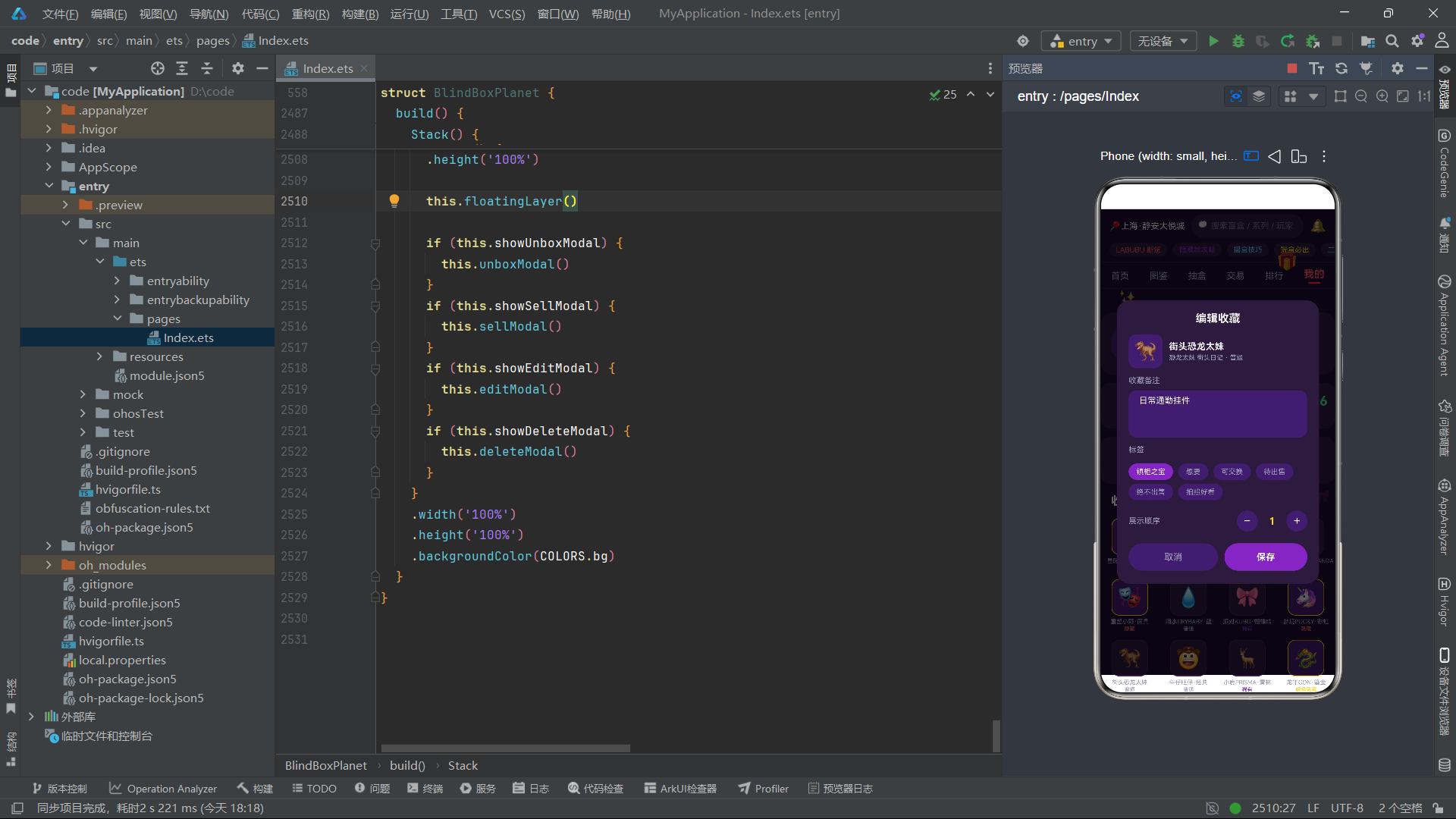
getRarityColor 函数接收稀有度字符串参数,返回对应的文字颜色。"超级隐藏"返回金色( COLORS.gold ),"隐藏"返回红色( COLORS.primary ),"稀有"返回紫色( COLORS.accent ),"普通"返回灰色( COLORS.textSecondary )。这一颜色映射策略建立了稀有度与视觉表现的直观关联——越稀有的品质,颜色越醒目。
getRarityBg 函数返回稀有度对应的背景色,使用 rgba 格式定义半透明背景。值得注意的是,不同稀有度的透明度不同:"超级隐藏"的背景透明度为0.15(最低),"隐藏"为0.15,"稀有"为0.25(最高),"普通"为0.12。这种差异化的透明度设计确保了高稀有度标签在视觉上既不过于突兀又能引起注意,低稀有度标签则保持低调。
这两个函数被封装为全局纯函数而非类方法,体现了函数式编程的设计理念。纯函数的特点是相同的输入永远产生相同的输出,不依赖也不修改任何外部状态,这使得它们具有高度的可测试性和可复用性。在应用的多个Builder方法中(如 rarityBadge 、 unboxModal 、 galleryTab 等),这两个函数被反复调用,确保了稀有度视觉表现的一致性。
3.3 趋势图标与颜色函数:getTrendIcon与getTrendColor
function
getTrendIcon
(
t
:
string
)
:
string
{
if
(
t
===
'up'
)
{
return
'▲'
}
if
(
t
===
'down'
)
{
return
'▼'
}
return
'—'
}
function
getTrendColor
(
t
:
string
)
:
string
{
if
(
t
===
'up'
)
{
return
COLORS
.
green
}
if
(
t
===
'down'
)
{
return
COLORS
.
red
}
return
COLORS
.
textSecondary
}
getTrendIcon 和 getTrendColor 函数分别返回价格趋势的图标符号和颜色。趋势"up"对应上升箭头"▲"和绿色,趋势"down"对应下降箭头"▼"和红色,趋势"stable"对应横线"—"和灰色。这两个函数在交易市场的卡片渲染中被使用,为每条交易条目提供直观的趋势视觉标识。
使用Unicode符号(▲、▼、—)而非图标图片是一个轻量化的设计选择。Unicode符号不需要额外的图片资源加载,渲染开销极低,且天然支持字体大小和颜色的动态设置。在HarmonyOS ArkTS API 24中,Text组件可以直接渲染Unicode符号,配合 fontColor 和 fontSize 属性实现灵活的样式控制。
3.4 格式化函数群:formatPrice、formatHot与getBarWidth
function
formatPrice
(
p
:
number
)
:
string
{
return
'¥'
+
p
.
toFixed
(
2
)
}
function
formatHot
(
h
:
number
)
:
string
{
if
(
h
>=
10000
)
{
return
(
h
/
10000
)
.
toFixed
(
1
)
+
'w'
}
return
h
.
toString
(
)
}
function
getBarWidth
(
p
:
number
)
:
string
{
return
Math
.
max
(
p
*
2
,
6
)
+
'%'
}
formatPrice 函数将数字价格格式化为带人民币符号和两位小数的字符串,如 formatPrice(69) 返回"¥69.00"。使用 toFixed(2) 确保所有价格显示统一的小数位数,这在交易场景中尤为重要——统一的价格格式有助于用户快速比较不同商品的价格差异。
formatHot 函数实现了热度值的"万"单位转换。当热度值大于等于10000时,除以10000并保留一位小数,后缀添加’w’(万的拼音首字母),如 formatHot(86400) 返回"8.6w";否则直接返回数字字符串。这种格式化方式是中国互联网产品的惯例,用户对"w"单位的认知成本极低。
getBarWidth 函数将概率百分比转换为进度条宽度百分比。它将输入概率值乘以2(因为最大概率39.5%需要映射到约79%的宽度),同时通过 Math.max 确保最小宽度为6%,避免极低概率的进度条在视觉上完全不可见。这种"下限保护"的设计确保了所有概率条都有可见的视觉表示,即使概率仅为1.5%。
3.5 领奖台尺寸与颜色函数:getPodiumHeight与getPodiumColor
function
getPodiumHeight
(
rank
:
number
)
:
number
{
if
(
rank
===
1
)
{
return
120
}
if
(
rank
===
2
)
{
return
92
}
return
76
}
function
getPodiumColor
(
rank
:
number
)
:
string
{
if
(
rank
===
1
)
{
return
COLORS
.
gold
}
if
(
rank
===
2
)
{
return
'#C0C8D8'
}
return
'#B87333'
}
getPodiumHeight 函数根据排名返回领奖台的高度值:第一名120vp、第二名92vp、第三名76vp。这种递减的高度设计在视觉上模拟了现实中的领奖台结构——冠军站在最高的台子上,亚军和季军依次降低。高度差(120-92=28vp,92-76=16vp)的非线性递减确保了第一名在视觉上的绝对优势地位。
getPodiumColor 函数返回领奖台的颜色:第一名金色( COLORS.gold ,即 #FFD700 )、第二名银色( #C0C8D8 )、第三名铜色( #B87333 )。这三种颜色对应了奥运奖牌的经典配色——金、银、铜,在用户认知中具有天然的等级含义,无需额外解释即可理解排名含义。
3.6 趋势柱状图高度函数:getTrendBarHeight
function
getTrendBarHeight
(
v
:
number
,
maxV
:
number
)
:
number
{
if
(
maxV
<=
0
)
{
return
4
}
return
Math
.
max
(
4
,
Math
.
round
(
v
/
maxV
*
26
)
)
}
getTrendBarHeight 函数根据数值和最大值计算柱状图的渲染高度。函数首先处理了 maxV <= 0 的边界情况(返回最小高度4vp),避免了除零错误。在正常情况下,它将输入值 v 相对于最大值 maxV 的比例映射到0-26vp的高度范围,并通过 Math.max(4, ...) 确保最小高度为4vp。这个函数被用于两个场景:交易市场的7日价格趋势迷你图( maxV 为1500)和每条交易卡片内的8根趋势柱状图( maxV 为16)。
3.7 漂浮动画计算函数:floatOpacity与floatOffset
function
floatOpacity
(
phase
:
number
,
tick
:
number
)
:
number
{
const
v
:
number
=
Math
.
sin
(
tick
*
0.6
+
phase
)
*
0.5
+
0.5
return
0.15
+
v
*
0.55
}
function
floatOffset
(
phase
:
number
,
tick
:
number
)
:
number
{
return
Math
.
sin
(
tick
*
0.8
+
phase
)
*
8
}
floatOpacity 函数计算漂浮表情在当前时刻的透明度。它使用正弦函数 Math.sin(tick * 0.6 + phase) 生成一个在[-1, 1]范围内振荡的值,通过 * 0.5 + 0.5 将其映射到[0, 1]范围,然后再映射到[0.15, 0.70]范围( 0.15 + v * 0.55 )。这种基于正弦波的透明度动画产生了平滑的"呼吸"效果——表情会缓慢变亮再变暗,循环往复。
floatOffset 函数计算漂浮表情在Y轴方向的偏移量。它使用不同频率( 0.8 vs 0.6 )和相位的正弦波,生成在[-8, 8]范围内的偏移值。不同表情的 phase 值不同(从0.3到5.0),确保了各表情的运动互不同步,产生了自然分散的漂浮效果。
这两个函数的设计体现了动画系统设计中的两个关键原则。首先是"参数化"原则——通过 phase 参数让同一函数可以驱动多个独立的动画实例,每个实例的运动轨迹互不相同。其次是"正弦波"原则——正弦函数是最自然的周期性运动模型,它在峰值和谷值处的变化率最小(导数为零),在中间位置变化率最大,这种"缓入缓出"的运动曲线比线性动画更加自然和舒适。
3.8 随机稀有度与超级稀有判断函数:randomRarity与isSuperRare
function
randomRarity
(
seed
:
number
)
:
string
{
const
r
:
number
=
(
seed
*
2654435761
)
%
100
if
(
r
<
3
)
{
return
'超级隐藏'
}
if
(
r
<
12
)
{
return
'隐藏'
}
if
(
r
<
40
)
{
return
'稀有'
}
return
'普通'
}
function
isSuperRare
(
r
:
string
)
:
boolean
{
return
r
===
'超级隐藏'
||
r
===
'隐藏'
}
randomRarity 函数实现了一个基于种子的伪随机稀有度生成算法。它使用了Knuth推荐的乘法散列常数 2654435761 (即2^32 / 黄金比例),将输入种子乘以该常数后取模100,得到一个0-99的伪随机数。然后根据概率区间返回对应的稀有度:0-2为"超级隐藏"(3%概率),3-11为"隐藏"(9%概率),12-39为"稀有"(28%概率),40-99为"普通"(60%概率)。
使用基于种子的伪随机算法而非 Math.random() 是一个深思熟虑的设计决策。在本应用中,抽盒的种子由 Date.now() % 10000 + this.unboxCount * 7 计算得出,结合了当前时间戳和抽盒次数,确保了每次抽盒的种子值不同。同时,基于种子的设计使得抽盒结果在理论上是可以复现的——相同的种子必定产生相同的稀有度结果,这一特性在调试和测试场景中非常有价值。
isSuperRare 函数是一个简单的判断函数,返回稀有度是否为"超级隐藏"或"隐藏"。这个函数在应用中被多处使用——抽盒结果弹框根据是否超级稀有显示不同的标题文案和祝福语,收藏展示柜根据是否超级稀有显示不同的边框颜色,概率分布图根据是否超级稀有使用不同的进度条颜色。
四、硬编码数据层的设计与组织
4.1 系列列表数据:SERIES_LIST
const
SERIES_LIST
:
SeriesItem
[
]
=
[
{
id
:
1
,
name
:
'MOLLY 星际漫游'
,
brand
:
'POP MART'
,
series
:
'星际系列'
,
price
:
69
,
rarity
:
'隐藏'
,
emoji
:
'👩🚀'
,
color
:
'#7B2CBF'
,
colorDeep
:
'#3D1E6D'
,
hot
:
86400
,
stock
:
523
,
tags
:
[
'热门'
,
'限量'
]
}
,
{
id
:
2
,
name
:
'LABUBU 精灵森林'
,
brand
:
'POP MART'
,
series
:
'森林系列'
,
price
:
99
,
rarity
:
'超级隐藏'
,
emoji
:
'🧚'
,
color
:
'#2D6A4F'
,
colorDeep
:
'#1B4332'
,
hot
:
152000
,
stock
:
208
,
tags
:
[
'爆款'
,
'预售'
]
}
,
{
id
:
3
,
name
:
'DIMOO 深海秘境'
,
brand
:
'POP MART'
,
series
:
'海洋系列'
,
price
:
69
,
rarity
:
'隐藏'
,
emoji
:
'🐠'
,
color
:
'#1976D2'
,
colorDeep
:
'#0D47A1'
,
hot
:
43100
,
stock
:
1042
,
tags
:
[
'新品'
]
}
,
{
id
:
4
,
name
:
'SKULLPANDA 暗夜花'
,
brand
:
'POP MART'
,
series
:
'暗夜系列'
,
price
:
79
,
rarity
:
'稀有'
,
emoji
:
'🌷'
,
color
:
'#E94560'
,
colorDeep
:
'#7A1F35'
,
hot
:
98000
,
stock
:
356
,
tags
:
[
'热门'
,
'联名'
]
}
,
{
id
:
5
,
name
:
'Hirono 小野重塑'
,
brand
:
'泡泡玛特'
,
series
:
'重塑系列'
,
price
:
89
,
rarity
:
'稀有'
,
emoji
:
'🎭'
,
color
:
'#5F0F40'
,
colorDeep
:
'#2A0A20'
,
hot
:
76500
,
stock
:
471
,
tags
:
[
'艺术'
]
}
,
{
id
:
6
,
name
:
'CRYBABY 泪之海'
,
brand
:
'POP MART'
,
series
:
'泪水系列'
,
price
:
69
,
rarity
:
'普通'
,
emoji
:
'💧'
,
color
:
'#4FC3F7'
,
colorDeep
:
'#1565C0'
,
hot
:
32000
,
stock
:
1893
,
tags
:
[
'治愈'
]
}
,
{
id
:
7
,
name
:
'KUBO 三丽鸥派对'
,
brand
:
'泡泡玛特'
,
series
:
'派对系列'
,
price
:
59
,
rarity
:
'稀有'
,
emoji
:
'🎀'
,
color
:
'#FF6B9D'
,
colorDeep
:
'#C2185B'
,
hot
:
61200
,
stock
:
834
,
tags
:
[
'联名'
,
'可爱'
]
}
,
{
id
:
8
,
name
:
'PUCKY 独角兽梦境'
,
brand
:
'POP MART'
,
series
:
'梦境系列'
,
price
:
59
,
rarity
:
'隐藏'
,
emoji
:
'🦄'
,
color
:
'#9C27B0'
,
colorDeep
:
'#4A148C'
,
hot
:
54900
,
stock
:
659
,
tags
:
[
'梦幻'
]
}
,
{
id
:
9
,
name
:
'恐龙太妹 街头日记'
,
brand
:
'52TOYS'
,
series
:
'街头系列'
,
price
:
79
,
rarity
:
'稀有'
,
emoji
:
'🦖'
,
color
:
'#00897B'
,
colorDeep
:
'#004D40'
,
hot
:
28400
,
stock
:
1268
,
tags
:
[
'国潮'
]
}
,
{
id
:
10
,
name
:
'旺仔牛仔很忙'
,
brand
:
'旺旺'
,
series
:
'牛仔系列'
,
price
:
49
,
rarity
:
'普通'
,
emoji
:
'🤠'
,
color
:
'#F57C00'
,
colorDeep
:
'#E65100'
,
hot
:
19700
,
stock
:
2345
,
tags
:
[
'情怀'
,
'低价'
]
}
,
{
id
:
11
,
name
:
'Prisma 小鹿物语'
,
brand
:
'若来Rolife'
,
series
:
'物语系列'
,
price
:
69
,
rarity
:
'隐藏'
,
emoji
:
'🦌'
,
color
:
'#8D6E63'
,
colorDeep
:
'#3E2723'
,
hot
:
36800
,
stock
:
952
,
tags
:
[
'治愈'
,
'新品'
]
}
,
{
id
:
12
,
name
:
'GON 咕咚龙年'
,
brand
:
'TOP TOY'
,
series
:
'生肖系列'
,
price
:
89
,
rarity
:
'超级隐藏'
,
emoji
:
'🐉'
,
color
:
'#D32F2F'
,
colorDeep
:
'#7B0F0F'
,
hot
:
113400
,
stock
:
187
,
tags
:
[
'爆款'
,
'生肖'
]
}
,
{
id
:
13
,
name
:
'小甜豆 糖果屋'
,
brand
:
'泡泡玛特'
,
series
:
'糖果系列'
,
price
:
59
,
rarity
:
'稀有'
,
emoji
:
'🍬'
,
color
:
'#EC407A'
,
colorDeep
:
'#880E4F'
,
hot
:
45200
,
stock
:
733
,
tags
:
[
'甜系'
]
}
]SERIES_LIST 是首页热门系列信息流的数据源,包含了13个潮玩系列条目。每个条目都精心设计了独特的品牌、系列名、价格、稀有度、Emoji和配色方案。数据涵盖了POP MART、泡泡玛特、52TOYS、若来Rolife、TOP TOY、旺旺等真实潮玩品牌,以及MOLLY、LABUBU、DIMOO、SKULLPANDA、Hirono小野、CRYBABY、PUCKY等知名IP系列,使应用在数据层面就具备了真实潮玩社区的质感。
每个系列条目的 color 和 colorDeep 属性定义了该系列的主题色和深色调。例如,"LABUBU 精灵森林"使用森林绿( #2D6A4F )和深森林绿( #1B4332 ),"DIMOO 深海秘境"使用海洋蓝( #1976D2 )和深海蓝( #0D47A1 ),"暗夜花SKULLPANDA"使用暗红色( #E94560 )和深暗红( #7A1F35 )。这些配色与系列的视觉主题高度吻合,在卡片渲染时提供了即时的视觉辨识度。
hot 热度值的分布从19700(旺仔牛仔很忙)到152000(LABUBU 精灵森林),跨度近8倍。 stock 库存值从187(GON 咕咚龙年,超级隐藏限量款)到2345(旺仔牛仔很忙,普通款),反映了稀有度与库存量之间的反相关关系——越稀有的系列库存越少,这一设计符合盲盒市场的真实规律。
4.2 藏品列表与交易列表数据
const
FIGURE_LIST
:
FigureItem
[
]
=
[
{
id
:
1
,
name
:
'星际MOLLY·启航'
,
series
:
'MOLLY 星际漫游'
,
rarity
:
'超级隐藏'
,
emoji
:
'👩🚀'
,
acquired
:
'2026-08-12'
,
note
:
'第37发出货!欧皇附体'
,
liked
:
true
,
price
:
1299
}
,
{
id
:
2
,
name
:
'精灵LABUBU·蘑菇'
,
series
:
'LABUBU 精灵森林'
,
rarity
:
'隐藏'
,
emoji
:
'🧚'
,
acquired
:
'2026-08-05'
,
note
:
'端盒抽中,摆床头了'
,
liked
:
true
,
price
:
899
}
,
{
id
:
3
,
name
:
'深海DIMOO·水母'
,
series
:
'DIMOO 深海秘境'
,
rarity
:
'稀有'
,
emoji
:
'🪼'
,
acquired
:
'2026-07-28'
,
note
:
'配色绝美'
,
liked
:
false
,
price
:
199
}
,
{
id
:
4
,
name
:
'暗夜花SKULLPANDA'
,
series
:
'SKULLPANDA 暗夜花'
,
rarity
:
'稀有'
,
emoji
:
'🌷'
,
acquired
:
'2026-07-21'
,
note
:
'和闺蜜换的'
,
liked
:
true
,
price
:
249
}
,
{
id
:
5
,
name
:
'重塑小野·面具'
,
series
:
'Hirono 小野重塑'
,
rarity
:
'隐藏'
,
emoji
:
'🎭'
,
acquired
:
'2026-07-19'
,
note
:
'拍照神器'
,
liked
:
true
,
price
:
799
}
,
{
id
:
6
,
name
:
'泪水CRYBABY·蓝'
,
series
:
'CRYBABY 泪之海'
,
rarity
:
'普通'
,
emoji
:
'💧'
,
acquired
:
'2026-07-10'
,
note
:
'第一发就出,运气好'
,
liked
:
false
,
price
:
69
}
,
{
id
:
7
,
name
:
'派对KUBO·蝴蝶结'
,
series
:
'KUBO 三丽鸥派对'
,
rarity
:
'稀有'
,
emoji
:
'🎀'
,
acquired
:
'2026-07-02'
,
note
:
'柜子C位预留'
,
liked
:
true
,
price
:
179
}
,
{
id
:
8
,
name
:
'梦境PUCKY·彩虹'
,
series
:
'PUCKY 独角兽梦境'
,
rarity
:
'隐藏'
,
emoji
:
'🦄'
,
acquired
:
'2026-06-30'
,
note
:
'摇盒摇出来的'
,
liked
:
false
,
price
:
689
}
,
{
id
:
9
,
name
:
'街头恐龙太妹'
,
series
:
'恐龙太妹 街头日记'
,
rarity
:
'普通'
,
emoji
:
'🦖'
,
acquired
:
'2026-06-22'
,
note
:
'日常通勤挂件'
,
liked
:
false
,
price
:
79
}
,
{
id
:
10
,
name
:
'牛仔旺仔·经典'
,
series
:
'旺仔牛仔很忙'
,
rarity
:
'普通'
,
emoji
:
'🤠'
,
acquired
:
'2026-06-15'
,
note
:
'童年回忆杀'
,
liked
:
true
,
price
:
49
}
,
{
id
:
11
,
name
:
'小鹿PRISMA·雾林'
,
series
:
'Prisma 小鹿物语'
,
rarity
:
'稀有'
,
emoji
:
'🦌'
,
acquired
:
'2026-06-08'
,
note
:
'礼物盒还没拆完'
,
liked
:
false
,
price
:
159
}
,
{
id
:
12
,
name
:
'龙年GON·鎏金'
,
series
:
'GON 咕咚龙年'
,
rarity
:
'超级隐藏'
,
emoji
:
'🐉'
,
acquired
:
'2026-06-01'
,
note
:
'镇柜之宝,不卖!'
,
liked
:
true
,
price
:
2399
}
,
{
id
:
13
,
name
:
'糖果小甜豆·棒棒糖'
,
series
:
'小甜豆 糖果屋'
,
rarity
:
'稀有'
,
emoji
:
'🍬'
,
acquired
:
'2026-05-26'
,
note
:
'超可爱的桌面摆件'
,
liked
:
true
,
price
:
189
}
]FIGURE_LIST 定义了用户已收藏的13件藏品数据。每件藏品的 note 属性都设计了富有个性化的文案,如"第37发出货!欧皇附体"、“端盒抽中,摆床头了”、"镇柜之宝,不卖!"等,这些文案模拟了真实用户在潮玩社区中的表达风格,增强了应用的代入感。 price 属性记录了藏品的市场估值,从49元(旺仔牛仔·经典)到2399元(龙年GON·鎏金),跨度近50倍,反映了不同稀有度和IP热度的价值差异。
acquired 属性记录了收藏日期,从2026-05-26到2026-08-12,跨度近三个月,模拟了用户持续收藏的时间线。 liked 属性在13件藏品中有7件为true(已点赞),6件为false(未点赞),这一分布使得图鉴页面的心形图标在视觉上有较好的混合展示效果。
const
TRADE_LIST
:
TradeItem
[
]
=
[
{
id
:
1
,
figure
:
'星际MOLLY·启航'
,
seller
:
'盲盒侠客'
,
avatar
:
'🦸'
,
price
:
1288
,
condition
:
'全新未拆'
,
trend
:
'up'
,
likes
:
342
,
emoji
:
'👩🚀'
,
color
:
'#7B2CBF'
}
,
{
id
:
2
,
figure
:
'精灵LABUBU·蘑菇'
,
seller
:
'森林拾荒者'
,
avatar
:
'🍄'
,
price
:
866
,
condition
:
'仅拆认证'
,
trend
:
'up'
,
likes
:
218
,
emoji
:
'🧚'
,
color
:
'#2D6A4F'
}
,
{
id
:
3
,
figure
:
'深海DIMOO·水母'
,
seller
:
'潜水员阿伟'
,
avatar
:
'🤿'
,
price
:
185
,
condition
:
'仅拆认证'
,
trend
:
'down'
,
likes
:
76
,
emoji
:
'🪼'
,
color
:
'#1976D2'
}
,
{
id
:
4
,
figure
:
'暗夜花SKULLPANDA'
,
seller
:
'夜蔷薇'
,
avatar
:
'🌹'
,
price
:
259
,
condition
:
'微瑕'
,
trend
:
'stable'
,
likes
:
91
,
emoji
:
'🌷'
,
color
:
'#E94560'
}
,
{
id
:
5
,
figure
:
'重塑小野·面具'
,
seller
:
'面具收藏家'
,
avatar
:
'🎭'
,
price
:
780
,
condition
:
'全新未拆'
,
trend
:
'up'
,
likes
:
187
,
emoji
:
'🎭'
,
color
:
'#5F0F40'
}
,
{
id
:
6
,
figure
:
'泪水CRYBABY·蓝'
,
seller
:
'蓝色多瑙河'
,
avatar
:
'🌊'
,
price
:
65
,
condition
:
'仅拆认证'
,
trend
:
'down'
,
likes
:
23
,
emoji
:
'💧'
,
color
:
'#4FC3F7'
}
,
{
id
:
7
,
figure
:
'派对KUBO·蝴蝶结'
,
seller
:
'蝴蝶结少女'
,
avatar
:
'🎀'
,
price
:
175
,
condition
:
'仅拆认证'
,
trend
:
'stable'
,
likes
:
64
,
emoji
:
'🎀'
,
color
:
'#FF6B9D'
}
,
{
id
:
8
,
figure
:
'梦境PUCKY·彩虹'
,
seller
:
'追虹人'
,
avatar
:
'🌈'
,
price
:
699
,
condition
:
'全新未拆'
,
trend
:
'up'
,
likes
:
156
,
emoji
:
'🦄'
,
color
:
'#9C27B0'
}
,
{
id
:
9
,
figure
:
'街头恐龙太妹'
,
seller
:
'太妹本妹'
,
avatar
:
'🦖'
,
price
:
72
,
condition
:
'微瑕'
,
trend
:
'down'
,
likes
:
38
,
emoji
:
'🦖'
,
color
:
'#00897B'
}
,
{
id
:
10
,
figure
:
'牛仔旺仔·经典'
,
seller
:
'旺仔俱乐部'
,
avatar
:
'🤠'
,
price
:
45
,
condition
:
'仅拆认证'
,
trend
:
'stable'
,
likes
:
19
,
emoji
:
'🤠'
,
color
:
'#F57C00'
}
,
{
id
:
11
,
figure
:
'龙年GON·鎏金'
,
seller
:
'金龙鱼福星'
,
avatar
:
'🐉'
,
price
:
2388
,
condition
:
'全新未拆'
,
trend
:
'up'
,
likes
:
512
,
emoji
:
'🐉'
,
color
:
'#D32F2F'
}
,
{
id
:
12
,
figure
:
'小鹿PRISMA·雾林'
,
seller
:
'雾林漫步'
,
avatar
:
'🦌'
,
price
:
149
,
condition
:
'仅拆认证'
,
trend
:
'stable'
,
likes
:
57
,
emoji
:
'🦌'
,
color
:
'#8D6E63'
}
,
{
id
:
13
,
figure
:
'糖果小甜豆·棒棒糖'
,
seller
:
'甜豆经销商'
,
avatar
:
'🍬'
,
price
:
182
,
condition
:
'全新未拆'
,
trend
:
'up'
,
likes
:
88
,
emoji
:
'🍬'
,
color
:
'#EC407A'
}
]TRADE_LIST 定义了交易市场的13条挂售数据。每条交易的 seller 属性都设计了富有创意的卖家昵称,如"盲盒侠客"、“森林拾荒者”、“面具收藏家”、“追虹人"等,配合Emoji头像营造了生动的社区氛围。 trend 属性分布为:7条"up”(看涨)、3条"down"(看跌)、3条"stable"(平稳),整体偏涨势的市场趋势符合潮玩市场近年来持续升温的真实走向。 condition 属性涵盖了"全新未拆"、“仅拆认证”、"微瑕"三种成色,反映了二手交易市场的真实状态。
4.3 排行榜与概率数据
const
RANK_LIST
:
RankItem
[
]
=
[
{
id
:
1
,
name
:
'盒子毁灭者'
,
avatar
:
'💥'
,
collectionCount
:
486
,
rareCount
:
92
,
score
:
9987
,
badge
:
'Legend'
}
,
{
id
:
2
,
name
:
'欧气冲天酱'
,
avatar
:
'🍀'
,
collectionCount
:
421
,
rareCount
:
87
,
score
:
9543
,
badge
:
'Master'
}
,
{
id
:
3
,
name
:
'端盒狂魔'
,
avatar
:
'📦'
,
collectionCount
:
389
,
rareCount
:
76
,
score
:
9120
,
badge
:
'Master'
}
,
{
id
:
4
,
name
:
'摇盒听声大师'
,
avatar
:
'👂'
,
collectionCount
:
355
,
rareCount
:
71
,
score
:
8876
,
badge
:
'Expert'
}
,
{
id
:
5
,
name
:
'隐藏款猎人'
,
avatar
:
'🎯'
,
collectionCount
:
312
,
rareCount
:
68
,
score
:
8642
,
badge
:
'Expert'
}
,
{
id
:
6
,
name
:
'抽非酋但不服'
,
avatar
:
'😤'
,
collectionCount
:
298
,
rareCount
:
55
,
score
:
8320
,
badge
:
'Expert'
}
,
{
id
:
7
,
name
:
'柜子永远不够'
,
avatar
:
'🗄️'
,
collectionCount
:
276
,
rareCount
:
52
,
score
:
8011
,
badge
:
'Pro'
}
,
{
id
:
8
,
name
:
'交换达人小柔'
,
avatar
:
'🤝'
,
collectionCount
:
254
,
rareCount
:
48
,
score
:
7790
,
badge
:
'Pro'
}
,
{
id
:
9
,
name
:
'深夜蹲点王'
,
avatar
:
'🌙'
,
collectionCount
:
231
,
rareCount
:
45
,
score
:
7544
,
badge
:
'Pro'
}
,
{
id
:
10
,
name
:
'白菜价收货郎'
,
avatar
:
'🥬'
,
collectionCount
:
218
,
rareCount
:
39
,
score
:
7288
,
badge
:
'Pro'
}
,
{
id
:
11
,
name
:
'拆盒直播员'
,
avatar
:
'📺'
,
collectionCount
:
196
,
rareCount
:
36
,
score
:
7012
,
badge
:
'Rising'
}
,
{
id
:
12
,
name
:
'萌新三连抽'
,
avatar
:
'🌱'
,
collectionCount
:
87
,
rareCount
:
9
,
score
:
5120
,
badge
:
'Rising'
}
,
{
id
:
13
,
name
:
'只抽不集症'
,
avatar
:
'🌀'
,
collectionCount
:
76
,
rareCount
:
7
,
score
:
4899
,
badge
:
'Rising'
}
]
RANK_LIST 定义了13位收藏家的排行数据, badge 属性按照"Legend > Master > Expert > Pro > Rising"的等级体系分布。排行榜第一名"盒子毁灭者"拥有486件藏品和92件稀有藏品,积分9987分;最后一名"只抽不集症"仅有76件藏品和7件稀有藏品,积分4899分。积分与藏品数量、稀有度正相关,但并非简单的线性关系——例如第三名"端盒狂魔"的藏品数(389)少于第二名"欧气冲天酱"(421),但稀有藏品数(76)也较少,积分差距(9120 vs 9543)合理反映了这一差异。
const
PROBABILITY_DATA
:
ProbabilityItem
[
]
=
[
{
name
:
'星际MOLLY·启航'
,
percent
:
1.5
,
emoji
:
'👩🚀'
}
,
{
name
:
'星际MOLLY·星尘'
,
percent
:
3.0
,
emoji
:
'✨'
}
,
{
name
:
'星际MOLLY·银河'
,
percent
:
8.5
,
emoji
:
'🌌'
}
,
{
name
:
'星际MOLLY·流星'
,
percent
:
12.0
,
emoji
:
'☄️'
}
,
{
name
:
'星际MOLLY·卫星'
,
percent
:
15.5
,
emoji
:
'🛰️'
}
,
{
name
:
'星际MOLLY·火箭'
,
percent
:
20.0
,
emoji
:
'🚀'
}
,
{
name
:
'星际MOLLY·月光'
,
percent
:
39.5
,
emoji
:
'🌙'
}
]PROBABILITY_DATA 定义了"MOLLY 星际漫游"系列的7个款式及其出货概率。概率从1.5%(启航,超级隐藏款)到39.5%(月光,普通款),总和为100%。这一数据结构是首页概率分布图的数据源,通过水平进度条直观展示各款式的出货概率,让用户在抽盒前充分了解概率信息。
4.4 价格趋势与辅助常量数据
const
PRICE_TREND
:
PricePoint
[
]
=
[
{
day
:
'一'
,
price
:
1180
}
,
{
day
:
'二'
,
price
:
1240
}
,
{
day
:
'三'
,
price
:
1190
}
,
{
day
:
'四'
,
price
:
1320
}
,
{
day
:
'五'
,
price
:
1280
}
,
{
day
:
'六'
,
price
:
1410
}
,
{
day
:
'日'
,
price
:
1350
}
]
const
TRADE_TREND_BARS
:
number
[
]
=
[
5
,
8
,
6
,
10
,
7
,
12
,
9
,
14
]
PRICE_TREND 定义了"星际MOLLY·启航"近7日的成交均价数据,价格从周一的1180元波动到周日的1350元,总体呈上涨趋势。这组数据驱动了交易市场页面的7日价格趋势迷你柱状图。 TRADE_TREND_BARS 定义了8根迷你柱状图的高度数据,被用于每条交易卡片内的趋势小图渲染。
const
UNBOX_RECORDS_INIT
:
UnboxRecord
[
]
=
[
{
id
:
1
,
name
:
'星际MOLLY·流星'
,
rarity
:
'稀有'
,
emoji
:
'☄️'
,
time
:
'2分钟前'
,
color
:
'#7B2CBF'
}
,
{
id
:
2
,
name
:
'星际MOLLY·月光'
,
rarity
:
'普通'
,
emoji
:
'🌙'
,
time
:
'8分钟前'
,
color
:
'#4A148C'
}
,
{
id
:
3
,
name
:
'星际MOLLY·火箭'
,
rarity
:
'普通'
,
emoji
:
'🚀'
,
time
:
'15分钟前'
,
color
:
'#1565C0'
}
,
{
id
:
4
,
name
:
'星际MOLLY·银河'
,
rarity
:
'稀有'
,
emoji
:
'🌌'
,
time
:
'26分钟前'
,
color
:
'#3D1E6D'
}
,
{
id
:
5
,
name
:
'星际MOLLY·星尘'
,
rarity
:
'隐藏'
,
emoji
:
'✨'
,
time
:
'41分钟前'
,
color
:
'#E94560'
}
]
const
FLOATING_EMOJIS_INIT
:
FloatingEmoji
[
]
=
[
{
emoji
:
'✨'
,
x
:
8
,
y
:
12
,
size
:
22
,
phase
:
0.3
,
opacity
:
0.5
}
,
{
emoji
:
'🎁'
,
x
:
78
,
y
:
8
,
size
:
26
,
phase
:
1.1
,
opacity
:
0.4
}
,
{
emoji
:
'⭐'
,
x
:
30
,
y
:
40
,
size
:
18
,
phase
:
2.2
,
opacity
:
0.6
}
,
{
emoji
:
'💫'
,
x
:
55
,
y
:
55
,
size
:
24
,
phase
:
3.0
,
opacity
:
0.35
}
,
{
emoji
:
'🎀'
,
x
:
88
,
y
:
62
,
size
:
20
,
phase
:
4.1
,
opacity
:
0.5
}
,
{
emoji
:
'✨'
,
x
:
45
,
y
:
80
,
size
:
16
,
phase
:
5.0
,
opacity
:
0.45
}
,
{
emoji
:
'⭐'
,
x
:
15
,
y
:
88
,
size
:
22
,
phase
:
0.7
,
opacity
:
0.3
}
,
{
emoji
:
'🎁'
,
x
:
65
,
y
:
90
,
size
:
18
,
phase
:
2.6
,
opacity
:
0.55
}
]
UNBOX_RECORDS_INIT 定义了抽盒记录的初始数据(5条),这些记录在应用启动时即显示在抽盒页面的"最近抽盒"区域,为用户提供了"其他玩家正在抽盒"的社区氛围感。 FLOATING_EMOJIS_INIT 定义了8个漂浮表情的初始状态,每个表情的 phase 值不同(从0.3到5.0),确保了各表情的动画互不同步。
const
HOT_TAGS
:
HotTag
[
]
=
[
{
name
:
'LABUBU 断货'
,
color
:
'#E94560'
}
,
{
name
:
'隐藏款攻略'
,
color
:
'#7B2CBF'
}
,
{
name
:
'摇盒技巧'
,
color
:
'#4FC3F7'
}
,
{
name
:
'端盒必出'
,
color
:
'#FFD700'
}
,
{
name
:
'二手捡漏'
,
color
:
'#3DD68C'
}
,
{
name
:
'新品首发'
,
color
:
'#FF6B9D'
}
,
{
name
:
'联名限定'
,
color
:
'#EC407A'
}
,
{
name
:
'生肖系列'
,
color
:
'#D32F2F'
}
]
const
BANNER_COLORS
:
string
[
]
=
[
'#7B2CBF'
,
'#E94560'
,
'#1976D2'
,
'#2D6A4F'
]
const
BANNER_TITLES
:
string
[
]
=
[
'LABUBU 新品首发'
,
'隐藏款概率 UP'
,
'龙年限量返场'
,
'会员日 5 折'
]
const
BANNER_SUBS
:
string
[
]
=
[
'预约抽盒送好礼'
,
'限时双倍爆率'
,
'鎏金款等你抽'
,
'全场包邮包售后'
]
const
CONTENT_TABS
:
string
[
]
=
[
'首页'
,
'图鉴'
,
'抽盒'
,
'交易'
,
'排行'
,
'我的'
]
const
CONDITION_OPTIONS
:
string
[
]
=
[
'全新未拆'
,
'仅拆认证'
,
'微瑕'
]
const
SHIPPING_OPTIONS
:
string
[
]
=
[
'包邮'
,
'到付'
,
'自提'
,
'顺丰保价'
]
const
TAG_OPTIONS
:
string
[
]
=
[
'镇柜之宝'
,
'想要'
,
'可交换'
,
'待出售'
,
'绝不出售'
,
'拍照好看'
]
HOT_TAGS 定义了8个热门标签,每个标签都有独特的颜色,用于顶部搜索栏下方的水平滚动标签条。 BANNER_COLORS 、 BANNER_TITLES 和 BANNER_SUBS 三个数组共同定义了首页Banner轮播的4张卡片数据。 CONTENT_TABS 定义了6个内容Tab的名称。 CONDITION_OPTIONS 、 SHIPPING_OPTIONS 和 TAG_OPTIONS 分别定义了挂售表单的成色选项、发货方式选项和编辑表单的标签选项。
五、@Entry主组件的状态管理与生命周期
5.1 @Entry与@Component装饰器
@
Entry
@
Component
struct BlindBoxPlanet
{
@Entry 装饰器标记 BlindBoxPlanet 结构体为应用的入口页面组件。在HarmonyOS ArkTS API 24中,一个页面文件中只能有一个 @Entry 装饰的组件,它代表整个页面的根组件,框架会自动将其挂载到页面的根容器上。 @Component 装饰器标记该结构体为一个自定义组件,使其具备了声明式UI构建能力。
struct 关键字定义了一个结构体而非类。在ArkTS中,自定义组件使用 struct 而非 class 来定义,这是因为组件实例的创建和管理由框架负责,开发者不需要(也不应该)手动实例化组件。 struct 语义上更接近于"值类型"和"数据载体",与组件作为"UI描述载体"的角色相契合。
5.2 @State状态变量群:UI驱动的数据源
@
State
currentTab
:
number
=
0
@
State
bottomTab
:
number
=
0
@
State
searchKeyword
:
string
=
''
@
State
bannerIndex
:
number
=
0
@
State
seriesList
:
SeriesModel
[
]
=
SERIES_LIST
.
map
(
(
s
:
SeriesItem
)
=>
new
SeriesModel
(
s
)
)
@
State
figureList
:
FigureModel
[
]
=
FIGURE_LIST
.
map
(
(
f
:
FigureItem
)
=>
new
FigureModel
(
f
)
)
@
State
tradeList
:
TradeModel
[
]
=
TRADE_LIST
.
map
(
(
t
:
TradeItem
)
=>
new
TradeModel
(
t
)
)
@
State
rankList
:
RankModel
[
]
=
RANK_LIST
.
map
(
(
r
:
RankItem
)
=>
new
RankModel
(
r
)
)
@
State
unboxRecords
:
UnboxRecordModel
[
]
=
UNBOX_RECORDS_INIT
.
map
(
(
u
:
UnboxRecord
)
=>
new
UnboxRecordModel
(
u
)
)
@
State
floatingEmojis
:
FloatingEmojiModel
[
]
=
FLOATING_EMOJIS_INIT
.
map
(
(
f
:
FloatingEmoji
)
=>
new
FloatingEmojiModel
(
f
)
)
@State 装饰器是ArkTS状态管理的核心,它标记的变量是组件内部的响应式状态。当 @State 变量的值发生变化时(通过赋值操作),框架会自动触发依赖该变量的UIBuilder方法的重新执行,从而实现UI的自动更新。
currentTab 和 bottomTab 分别管理内容Tab和底部Tab的选中状态。 searchKeyword 管理搜索框的输入文本。 bannerIndex 管理Banner轮播的当前索引。这四个简单类型的状态变量控制着应用的核心导航和搜索交互。
列表型状态变量的初始化值得关注。以 seriesList 为例,它通过 SERIES_LIST.map((s: SeriesItem) => new SeriesModel(s)) 将硬编码的 SeriesItem 数组转换为 SeriesModel 可观察模型数组。这一转换是必要的——只有 @Observed 装饰的类实例才能在属性变更时触发UI更新,而普通的接口对象不具备这一能力。通过 .map() 方法遍历每个数据项并调用模型类的构造函数,应用在初始化阶段就完成了从"纯数据"到"可观察数据"的转换。
5.3 抽盒与弹框状态变量
@
State
tickCount
:
number
=
0
@
State
shakeText
:
string
=
'点击盲盒开始抽盒'
@
State
isShaking
:
boolean
=
false
@
State
unboxCount
:
number
=
0
@
State
showUnboxModal
:
boolean
=
false
@
State
showSellModal
:
boolean
=
false
@
State
showEditModal
:
boolean
=
false
@
State
showDeleteModal
:
boolean
=
false
@
State
unboxResult
:
FigureModel
=
new
FigureModel
(
FIGURE_LIST
[
0
]
)
@
State
sellTarget
:
TradeModel
=
new
TradeModel
(
TRADE_LIST
[
0
]
)
@
State
sellForm
:
TradeFormModel
=
new
TradeFormModel
(
{
price
:
''
,
condition
:
'全新未拆'
,
shipping
:
'包邮'
,
autoDecline
:
false
}
)
@
State
editTarget
:
FigureModel
=
new
FigureModel
(
FIGURE_LIST
[
0
]
)
@
State
editForm
:
EditFormModel
=
new
EditFormModel
(
{
note
:
''
,
tag
:
'镇柜之宝'
,
order
:
1
}
)
@
State
deleteTarget
:
FigureModel
=
new
FigureModel
(
FIGURE_LIST
[
0
]
)
private
emojiTimer
:
number
=
-
1
private
recordIdSeed
:
number
=
100
tickCount 是漂浮动画系统的心跳计数器,初始值为0,每120毫秒递增1。 shakeText 管理抽盒区域的提示文案, isShaking 标记抽盒动画是否正在进行, unboxCount 记录用户已抽盒的次数。这三个状态变量共同驱动了抽盒页面的交互动画。
弹框状态管理采用了"每个弹框独立控制"的设计模式。四个布尔型状态变量( showUnboxModal 、 showSellModal 、 showEditModal 、 showDeleteModal )分别控制四种弹框的显示和隐藏。这种设计虽然需要四个独立变量,但它提供了最大的灵活性——可以同时控制多个弹框的显示状态(虽然在实际交互中通常只显示一个弹框)。
弹框数据状态变量在声明时就完成了初始化。例如, unboxResult 被初始化为 FIGURE_LIST[0] 对应的 FigureModel 实例, sellForm 被初始化为一个带有默认值的 TradeFormModel 实例。这些初始值会在用户触发相应弹框时被替换为实际数据。 private emojiTimer: number = -1 和 private recordIdSeed: number = 100 是两个私有变量,分别用于管理定时器ID和抽盒记录的自增ID种子,它们不参与UI渲染,因此不需要 @State 装饰。
5.4 aboutToAppear生命周期:漂浮动画的启动
aboutToAppear
(
)
:
void
{
this
.
emojiTimer
=
setInterval
(
(
)
=>
{
this
.
tickCount
+=
1
const
updated
:
FloatingEmojiModel
[
]
=
this
.
floatingEmojis
.
map
(
(
f
:
FloatingEmojiModel
)
=>
{
const
m
:
FloatingEmojiModel
=
new
FloatingEmojiModel
(
f
)
m
.
opacity
=
floatOpacity
(
f
.
phase
,
this
.
tickCount
)
m
.
y
=
f
.
y
+
floatOffset
(
f
.
phase
,
this
.
tickCount
)
*
0.3
return
m
}
)
this
.
floatingEmojis
=
updated
}
,
120
)
}
aboutToAppear 是ArkTS组件的生命周期钩子,在组件实例创建后、UI渲染前被调用。本应用在此钩子中启动了漂浮表情动画的定时器,实现了"页面一加载就开始动画"的效果。
定时器回调函数的逻辑分为三步。首先, this.tickCount += 1 递增全局心跳计数器。然后,通过 .map() 遍历当前的所有漂浮表情,为每个表情创建一个新的 FloatingEmojiModel 实例(从现有实例复制),并使用 floatOpacity 和 floatOffset 函数计算新的透明度和Y轴偏移量。最后,将更新后的数组赋值给 this.floatingEmojis ,触发漂浮层UI的重新渲染。
这种"每120毫秒全量重建数组"的动画驱动方式在性能上是可以接受的,因为漂浮表情只有8个实例,数组重建的开销极低。但对于更大规模的动画场景(如数百个粒子),建议使用HarmonyOS 6.1.1提供的 animateTo 显式动画API或 @Animatable 装饰器来实现更高效的动画驱动。
5.5 aboutToDisappear生命周期:资源清理
aboutToDisappear
(
)
:
void
{
if
(
this
.
emojiTimer
>=
0
)
{
clearInterval
(
this
.
emojiTimer
)
this
.
emojiTimer
=
-
1
}
}
aboutToDisappear 是组件销毁前的生命周期钩子。本应用在此钩子中清理了漂浮动画的定时器,防止组件销毁后定时器继续执行导致的内存泄漏和无效状态更新。 clearInterval(this.emojiTimer) 清除定时器,然后将 emojiTimer 重置为-1(初始值),这一重置操作虽然不影响功能,但保持了状态的一致性和可读性。
这个清理操作是ArkTS开发中的最佳实践之一。在HarmonyOS ArkTS API 24中,如果组件在定时器回调执行前被销毁,而定时器未被清除,回调函数仍然会尝试访问已销毁组件的 this 引用,可能导致运行时错误或不可预期的行为。通过在 aboutToDisappear 中清除定时器,应用确保了组件生命周期的完整性和资源管理的安全性。
六、业务方法层:状态变更的集中管理
6.1 Tab切换逻辑:switchTab与switchBottomTab
switchTab
(
index
:
number
)
:
void
{
this
.
currentTab
=
index
}
switchBottomTab
(
index
:
number
)
:
void
{
this
.
bottomTab
=
index
if
(
index
===
0
)
{
this
.
currentTab
=
0
}
else
if
(
index
===
1
)
{
this
.
currentTab
=
1
}
else
if
(
index
===
4
)
{
this
.
currentTab
=
5
}
}
switchTab 方法实现了内容Tab的切换逻辑,直接将 currentTab 状态变量赋值为传入的索引值。由于 currentTab 是 @State 装饰的变量,赋值操作会自动触发 build 方法中 if-else 条件分支的重新求值,从而渲染对应Tab的页面内容。
switchBottomTab 方法实现了底部Tab栏与内容Tab的联动逻辑。底部Tab栏有5个按钮(首页、分类、加号、消息、我的),而内容Tab有6个页面(首页、图鉴、抽盒、交易、排行、我的)。 switchBottomTab 方法中的 if-else 分支建立了两者的映射关系:底部"首页"(index 0)映射到内容"首页"(currentTab 0),底部"分类"(index 1)映射到内容"图鉴"(currentTab 1),底部"我的"(index 4)映射到内容"我的"(currentTab 5)。底部"消息"(index 3)和中间的加号按钮没有映射到内容Tab——加号按钮直接在 onClick 中设置 this.currentTab = 2 跳转到抽盒页面。
6.2 点赞功能:toggleLike的不可变更新模式
toggleLike
(
figureId
:
number
)
:
void
{
this
.
figureList
=
this
.
figureList
.
map
(
(
f
:
FigureModel
)
=>
{
const
m
:
FigureModel
=
new
FigureModel
(
f
)
if
(
m
.
id
===
figureId
)
{
m
.
liked
=
!
m
.
liked
}
return
m
}
)
}
toggleLike 方法实现了藏品点赞功能的切换。它接收目标藏品的 id 作为参数,通过 .map() 遍历整个藏品列表,为每个藏品创建一个新的 FigureModel 实例。当遍历到 id 匹配的藏品时,翻转其 liked 属性( m.liked = !m.liked );其他藏品保持原样。最终将新数组赋值给 this.figureList ,触发UI更新。
这种"全量映射重建"的更新模式虽然看起来不够高效(即使只更新一个元素也要遍历整个列表),但在ArkTS中是推荐的做法。原因在于 @State 装饰的数组变量需要被赋予新的引用才能触发框架的差异检测——直接修改数组元素的属性(如 this.figureList[0].liked = true )不会触发UI更新。通过 .map() 创建新数组确保了引用的变化,同时 @Observed 模型类的属性变更会被框架追踪,实现精确的UI差异更新。
6.3 抽盒核心算法:doUnbox的完整流程
doUnbox
(
)
:
void
{
if
(
this
.
isShaking
)
{
return
}
this
.
isShaking
=
true
this
.
shakeText
=
'摇一摇 · 摇一摇 · 摇一摇'
setTimeout
(
(
)
=>
{
const
seed
:
number
=
Date
.
now
(
)
%
10000
+
this
.
unboxCount
*
7
const
rarity
:
string
=
randomRarity
(
seed
)
const
pool
:
FigureItem
[
]
=
FIGURE_LIST
.
filter
(
(
f
:
FigureItem
)
=>
f
.
rarity
===
rarity
)
const
pick
:
FigureItem
=
pool
.
length
>
0
?
pool
[
seed
%
pool
.
length
]
:
FIGURE_LIST
[
2
]
this
.
unboxResult
=
new
FigureModel
(
pick
)
this
.
unboxCount
+=
1
const
record
:
UnboxRecordModel
=
new
UnboxRecordModel
(
{
id
:
this
.
recordIdSeed
,
name
:
pick
.
name
,
rarity
:
pick
.
rarity
,
emoji
:
pick
.
emoji
,
time
:
'刚刚'
,
color
:
COLORS
.
accent
}
)
this
.
recordIdSeed
+=
1
this
.
unboxRecords
=
[
record
]
.
concat
(
this
.
unboxRecords
)
.
slice
(
0
,
8
)
this
.
isShaking
=
false
this
.
shakeText
=
'点击盲盒开始抽盒'
this
.
showUnboxModal
=
true
}
,
900
)
}
doUnbox 方法是整个应用最核心的业务方法,实现了模拟抽盒的完整流程。方法首先通过 if (this.isShaking) return 进行防抖处理——如果抽盒动画正在进行,直接返回不执行任何操作。这一设计防止了用户在抽盒动画期间快速多次点击导致的重复抽盒和状态混乱。
防抖检查通过后, this.isShaking = true 标记抽盒开始, this.shakeText 更新为"摇一摇 · 摇一摇 · 摇一摇"。这两个状态变更会立即驱动UI更新——盲盒图标开始旋转( rotate({ angle: 15 }) )和放大( scale({ x: 1.1, y: 1.1 }) ),提示文案变更为摇一摇提示,按钮文字变为"抽取中…",按钮颜色从红色( COLORS.primary )变为紫色( COLORS.accent )。
setTimeout(() => { ... }, 900) 在900毫秒后执行抽盒结果计算。900毫秒的延迟是为了让摇盒动画有足够的展示时间,营造"摇盒-揭晓"的仪式感。在回调函数中,抽盒算法分为以下步骤:
种子生成 : const seed = Date.now() % 10000 + this.unboxCount * 7 ——结合当前时间戳(取模10000得到0-9999的范围)和抽盒次数(乘以7增加区分度)生成伪随机种子。
稀有度计算 : const rarity = randomRarity(seed) ——调用 randomRarity 函数,根据种子计算本次抽盒的稀有度等级。
奖品池筛选 : const pool = FIGURE_LIST.filter((f: FigureItem) => f.rarity === rarity) ——从全部藏品中筛选出与计算出的稀有度匹配的藏品子集。
最终结果选择 : const pick = pool.length > 0 ? pool[seed % pool.length] : FIGURE_LIST[2] ——使用种子对奖品池取模选择具体藏品。如果奖品池为空(理论上不会发生,但作为防御性编程),回退到 FIGURE_LIST[2] (深海DIMOO·水母)。
状态更新 :将抽盒结果赋值给 this.unboxResult ,递增 this.unboxCount ,创建新的抽盒记录并插入到记录列表头部(保留最近8条),重置 isShaking 和 shakeText 状态,最后设置 this.showUnboxModal = true 显示抽盒结果弹框。
6.4 收藏抽盒结果:collectUnboxResult
collectUnboxResult
(
)
:
void
{
const
result
:
FigureModel
=
new
FigureModel
(
this
.
unboxResult
)
result
.
acquired
=
'2026-08-23'
result
.
note
=
'今日抽盒获得'
this
.
figureList
=
[
result
]
.
concat
(
this
.
figureList
)
this
.
showUnboxModal
=
false
}
collectUnboxResult 方法将抽盒结果添加到用户的藏品列表中。它首先从 this.unboxResult 创建一个新的 FigureModel 实例(避免直接修改原始状态),然后设置 acquired 属性为当前日期(“2026-08-23”), note 属性为"今日抽盒获得"。最后通过 [result].concat(this.figureList) 将新藏品插入到列表头部,并将结果赋值给 this.figureList 触发UI更新,同时关闭抽盒结果弹框。
将新藏品插入到列表头部而非尾部是一个有意识的UX设计决策。在图鉴页面,藏品列表以双列网格形式展示,新收藏的藏品出现在列表顶部可以让用户立即看到收藏结果,提供即时的正向反馈。同时,新藏品的 id 属性来自 FIGURE_LIST 中的原始数据,而非自增生成,这意味着如果用户多次抽到同一款式,藏品列表中会出现多个相同 id 的条目——这在实际应用中可能需要去重处理,但在本模拟应用中是可接受的设计。
6.5 挂售表单方法群
openSellModal
(
trade
:
TradeModel
)
:
void
{
this
.
sellTarget
=
new
TradeModel
(
trade
)
this
.
sellForm
=
new
TradeFormModel
(
{
price
:
trade
.
price
.
toFixed
(
0
)
,
condition
:
'全新未拆'
,
shipping
:
'包邮'
,
autoDecline
:
false
}
)
this
.
showSellModal
=
true
}
confirmSell
(
)
:
void
{
this
.
showSellModal
=
false
}
setSellCondition
(
c
:
string
)
:
void
{
this
.
sellForm
=
new
TradeFormModel
(
{
price
:
this
.
sellForm
.
price
,
condition
:
c
,
shipping
:
this
.
sellForm
.
shipping
,
autoDecline
:
this
.
sellForm
.
autoDecline
}
)
}
setSellShipping
(
s
:
string
)
:
void
{
this
.
sellForm
=
new
TradeFormModel
(
{
price
:
this
.
sellForm
.
price
,
condition
:
this
.
sellForm
.
condition
,
shipping
:
s
,
autoDecline
:
this
.
sellForm
.
autoDecline
}
)
}
toggleAutoDecline
(
)
:
void
{
this
.
sellForm
=
new
TradeFormModel
(
{
price
:
this
.
sellForm
.
price
,
condition
:
this
.
sellForm
.
condition
,
shipping
:
this
.
sellForm
.
shipping
,
autoDecline
:
!
this
.
sellForm
.
autoDecline
}
)
}
挂售表单方法群实现了挂售弹框的完整交互逻辑。 openSellModal 方法接收目标交易条目作为参数,创建 sellTarget (挂售目标)和 sellForm (挂售表单状态)的初始状态,然后显示弹框。表单的 price 字段初始化为交易条目的当前价格( trade.price.toFixed(0) 取整数部分), condition 默认为"全新未拆", shipping 默认为"包邮", autoDecline 默认为 false 。
setSellCondition 、 setSellShipping 和 toggleAutoDecline 三个方法分别处理表单中成色选择、发货方式选择和自动拒绝开关的交互。它们都采用了相同的模式:创建一个新的 TradeFormModel 实例,保留原有字段值的同时更新目标字段,然后赋值给 this.sellForm 。这种"全量重建"的模式确保了每次表单交互都能触发UI更新,但也带来了一定的代码冗余——每个方法都需要列出所有四个字段。
这种冗余在HarmonyOS ArkTS API 24中是必要的。由于 @State 装饰的 @Observed 模型实例需要被赋予新引用才能触发UI更新,直接修改属性(如 this.sellForm.condition = c )不会触发框架的差异检测。虽然代码看起来冗长,但它确保了状态变更的可预测性和UI响应的确定性。
6.6 编辑收藏方法群
openEditModal
(
figure
:
FigureModel
)
:
void
{
this
.
editTarget
=
new
FigureModel
(
figure
)
this
.
editForm
=
new
EditFormModel
(
{
note
:
figure
.
note
,
tag
:
'镇柜之宝'
,
order
:
1
}
)
this
.
showEditModal
=
true
}
confirmEdit
(
)
:
void
{
this
.
figureList
=
this
.
figureList
.
map
(
(
f
:
FigureModel
)
=>
{
const
m
:
FigureModel
=
new
FigureModel
(
f
)
if
(
m
.
id
===
this
.
editTarget
.
id
)
{
m
.
note
=
this
.
editForm
.
note
}
return
m
}
)
this
.
showEditModal
=
false
}
setEditTag
(
t
:
string
)
:
void
{
this
.
editForm
=
new
EditFormModel
(
{
note
:
this
.
editForm
.
note
,
tag
:
t
,
order
:
this
.
editForm
.
order
}
)
}
stepOrder
(
delta
:
number
)
:
void
{
const
next
:
number
=
Math
.
min
(
9
,
Math
.
max
(
1
,
this
.
editForm
.
order
+
delta
)
)
this
.
editForm
=
new
EditFormModel
(
{
note
:
this
.
editForm
.
note
,
tag
:
this
.
editForm
.
tag
,
order
:
next
}
)
}
编辑收藏方法群实现了编辑弹框的完整交互逻辑。 openEditModal 方法接收目标藏品作为参数,创建 editTarget (编辑目标)和 editForm (编辑表单状态)的初始状态。表单的 note 字段初始化为藏品的现有备注, tag 默认为"镇柜之宝", order 默认为1。
confirmEdit 方法在用户点击"保存"按钮时执行。它通过 .map() 遍历藏品列表,为每个藏品创建新的 FigureModel 实例,当遍历到目标藏品时,将其 note 属性更新为表单中编辑后的值。这种"全量映射更新"模式确保了 @State 变量获得新的引用,触发UI更新。
stepOrder 方法实现了展示顺序的步进器交互。它接收一个 delta 参数(-1或1),通过 Math.min(9, Math.max(1, this.editForm.order + delta)) 将计算结果限制在1-9的范围内,然后创建新的 EditFormModel 实例更新表单状态。 Math.min 和 Math.max 的组合使用是一种常见的范围限制技巧——先通过 Math.max 设置下限,再通过 Math.min 设置上限,确保结果始终在指定范围内。
6.7 删除收藏方法群
openDeleteModal
(
figure
:
FigureModel
)
:
void
{
this
.
deleteTarget
=
new
FigureModel
(
figure
)
this
.
showDeleteModal
=
true
}
confirmDelete
(
)
:
void
{
this
.
figureList
=
this
.
figureList
.
filter
(
(
f
:
FigureModel
)
=>
f
.
id
!==
this
.
deleteTarget
.
id
)
this
.
showDeleteModal
=
false
}
删除收藏方法群实现了删除确认弹框的交互逻辑。 openDeleteModal 方法接收目标藏品作为参数,创建 deleteTarget 并显示删除确认弹框。 confirmDelete 方法通过 .filter() 过滤掉目标藏品,生成新数组赋值给 this.figureList ,然后关闭弹框。
使用 .filter() 而非 .splice() 来删除元素是不可变更新模式的体现。 .splice() 会直接修改原数组,而 .filter() 会返回一个新数组——前者无法触发 @State 的UI更新,后者则能正确触发。这一区别在ArkTS开发中至关重要,是状态管理的基础知识。
七、通用Builder方法:可复用的UI构建块
7.1 modalOverlay与sectionTitle
@
Builder
modalOverlay
(
onClose
:
(
)
=>
void
)
{
Column
(
)
.
width
(
'100%'
)
.
height
(
'100%'
)
.
backgroundColor
(
'rgba(0,0,0,0.6)'
)
.
onClick
(
onClose
)
}
@
Builder
sectionTitle
(
title
:
string
,
extra
:
string
)
{
Row
(
)
{
Text
(
title
)
.
fontSize
(
18
)
.
fontWeight
(
FontWeight
.
Bold
)
.
fontColor
(
COLORS
.
textPrimary
)
Text
(
extra
)
.
fontSize
(
12
)
.
fontColor
(
COLORS
.
textSecondary
)
.
margin
(
{
left
:
8
}
)
.
padding
(
{
left
:
8
,
right
:
8
,
top
:
2
,
bottom
:
2
}
)
.
backgroundColor
(
'rgba(123,44,191,0.25)'
)
.
borderRadius
(
8
)
}
.
width
(
'100%'
)
.
padding
(
{
left
:
16
,
right
:
16
,
top
:
16
,
bottom
:
10
}
)
}
modalOverlay 是一个通用的模态遮罩层Builder方法。它接收一个 onClose 回调函数作为参数,渲染一个全屏的半透明黑色遮罩层,点击时调用 onClose 回调关闭弹框。这个Builder方法虽然在本应用的弹框实现中没有被直接调用(每个弹框都内联了遮罩层),但它展示了ArkTS Builder方法参数化的能力——通过传入不同的回调函数,同一个Builder可以服务于不同的关闭逻辑。
sectionTitle 是区域标题的通用Builder方法,在应用的多个Tab页面中被复用。它接收 title (主标题)和 extra (附加标签)两个字符串参数,渲染一个水平排列的Row容器,包含粗体18号字的主标题和带紫色半透明背景的小号附加标签。这个Builder方法的复用体现了组件化设计的核心优势——通过参数化将UI的结构和样式固定,仅暴露数据变化的接口,实现了"一次定义,多处复用"。
7.2 rarityBadge:稀有度徽章组件
@
Builder
rarityBadge
(
rarity
:
string
)
{
Text
(
rarity
)
.
fontSize
(
10
)
.
fontColor
(
getRarityColor
(
rarity
)
)
.
padding
(
{
left
:
6
,
right
:
6
,
top
:
2
,
bottom
:
2
}
)
.
backgroundColor
(
getRarityBg
(
rarity
)
)
.
borderRadius
(
4
)
}
rarityBadge 是稀有度徽章的通用Builder方法。它接收稀有度字符串参数,通过 getRarityColor 和 getRarityBg 纯函数获取对应的颜色和背景色,渲染一个小巧的圆角徽章。这个Builder方法在应用中被大量复用——系列卡片、藏品卡片、抽盒记录列表、抽盒结果弹框等位置都使用了稀有度徽章来标识物品的稀有度等级。
通过将颜色映射逻辑抽取到纯函数中, rarityBadge Builder方法本身保持了极简的结构——一个Text组件加上样式修饰。如果未来需要调整稀有度的颜色方案(例如新增"传说"等级),只需修改 getRarityColor 和 getRarityBg 函数,所有使用 rarityBadge 的位置都会自动更新。这种"逻辑与视图分离"的设计模式大幅降低了维护成本。
八、京东风格顶部Header与内容Tab导航
8.1 headerBar:定位、搜索与通知的复合头部
@
Builder
headerBar
(
)
{
Column
(
)
{
Row
(
)
{
Column
(
)
{
Row
(
)
{
Text
(
'📍'
)
.
fontSize
(
14
)
Text
(
'上海·静安大悦城'
)
.
fontSize
(
13
)
.
fontColor
(
COLORS
.
textPrimary
)
.
maxLines
(
1
)
}
.
alignItems
(
VerticalAlign
.
Center
)
}
.
alignItems
(
HorizontalAlign
.
Start
)
Column
(
)
{
Row
(
)
{
Text
(
'🔍'
)
.
fontSize
(
16
)
TextInput
(
{
placeholder
:
'搜索盲盒 / 系列 / 玩家'
,
text
:
this
.
searchKeyword
}
)
.
placeholderColor
(
COLORS
.
textDim
)
.
placeholderFont
(
{
size
:
13
}
)
.
fontColor
(
COLORS
.
textPrimary
)
.
fontSize
(
13
)
.
backgroundColor
(
'transparent'
)
.
padding
(
0
)
.
onChange
(
(
v
:
string
)
=>
{
this
.
searchKeyword
=
v
}
)
}
.
alignItems
(
VerticalAlign
.
Center
)
.
padding
(
{
left
:
10
,
right
:
10
}
)
.
height
(
36
)
.
backgroundColor
(
COLORS
.
card
)
.
borderRadius
(
18
)
}
.
layoutWeight
(
1
)
.
margin
(
{
left
:
10
,
right
:
10
}
)
Text
(
'🔔'
)
.
fontSize
(
20
)
.
onClick
(
(
)
=>
{
this
.
currentTab
=
4
}
)
}
.
alignItems
(
VerticalAlign
.
Center
)
.
width
(
'100%'
)
.
padding
(
{
left
:
14
,
right
:
14
,
top
:
8
,
bottom
:
8
}
)
headerBar Builder方法实现了京东风格的顶部导航头部,包含三个主要元素:地理位置定位、搜索框和通知按钮。地理位置区域使用📍Emoji和"上海·静安大悦城"文本组合,模拟了京东App中"配送至XXX"的地理位置展示功能。 maxLines(1) 确保文本不会换行,保持头部布局的稳定性。
搜索框区域是头部的核心组件。它使用 TextInput 组件接收用户输入, placeholder 属性设置提示文案"搜索盲盒 / 系列 / 玩家", placeholderColor 和 placeholderFont 分别设置提示文本的颜色和字体大小。 backgroundColor('transparent') 将TextInput的背景设为透明,使其融入外层Row容器的 COLORS.card 背景色中。 onChange 回调将输入值同步到 this.searchKeyword 状态变量,实现了搜索关键词的响应式管理。搜索框外层Row容器使用了18的 borderRadius 值,形成了胶囊形状的搜索框外观,这是京东App搜索框的经典视觉风格。
通知按钮使用🔔Emoji,点击后通过 this.currentTab = 4 跳转到排行榜页面。在实际应用中,通知按钮通常会跳转到消息中心页面,但在本模拟应用中,排行榜页面被作为通知按钮的跳转目标。
8.2 热门标签滚动条
Scroll
(
)
{
Row
(
)
{
ForEach
(
HOT_TAGS
,
(
tag
:
HotTag
)
=>
{
Text
(
tag
.
name
)
.
fontSize
(
11
)
.
fontColor
(
tag
.
color
)
.
padding
(
{
left
:
10
,
right
:
10
,
top
:
4
,
bottom
:
4
}
)
.
backgroundColor
(
COLORS
.
card
)
.
borderRadius
(
12
)
.
margin
(
{
right
:
8
}
)
}
,
(
tag
:
HotTag
)
=>
tag
.
name
)
}
.
padding
(
{
left
:
14
,
right
:
14
}
)
}
.
scrollable
(
ScrollDirection
.
Horizontal
)
.
scrollBar
(
BarState
.
Off
)
.
width
(
'100%'
)
.
margin
(
{
bottom
:
8
}
)
}
.
width
(
'100%'
)
.
backgroundColor
(
COLORS
.
bg
)
}
热门标签滚动条是头部区域的下半部分,使用 Scroll 组件包裹一个水平排列的 Row 容器,通过 ForEach 渲染8个热门标签。每个标签使用独立的颜色(来自 HOT_TAGS 数据的 color 属性),背景色为 COLORS.card ,圆角12形成胶囊形状。 scrollable(ScrollDirection.Horizontal) 设置滚动方向为水平, scrollBar(BarState.Off) 隐藏滚动条,使标签条在视觉上更加简洁。
8.3 contentTabs:内容Tab导航栏
@
Builder
contentTabs
(
)
{
Row
(
)
{
ForEach
(
CONTENT_TABS
,
(
name
:
string
,
index
:
number
)
=>
{
Column
(
)
{
Text
(
name
)
.
fontSize
(
index
===
this
.
currentTab
?
16
:
14
)
.
fontWeight
(
index
===
this
.
currentTab
?
FontWeight
.
Bold
:
FontWeight
.
Normal
)
.
fontColor
(
index
===
this
.
currentTab
?
COLORS
.
primary
:
COLORS
.
textSecondary
)
if
(
index
===
this
.
currentTab
)
{
Text
(
''
)
.
width
(
18
)
.
height
(
3
)
.
borderRadius
(
2
)
.
backgroundColor
(
COLORS
.
primary
)
.
margin
(
{
top
:
3
}
)
}
}
.
padding
(
{
top
:
8
,
bottom
:
6
,
left
:
6
,
right
:
6
}
)
.
onClick
(
(
)
=>
{
this
.
switchTab
(
index
)
}
)
}
,
(
name
:
string
)
=>
name
)
}
.
width
(
'100%'
)
.
justifyContent
(
FlexAlign
.
SpaceAround
)
.
backgroundColor
(
COLORS
.
bg
)
.
border
(
{
width
:
1
,
color
:
'rgba(123,44,191,0.3)'
}
)
}
contentTabs Builder方法实现了内容Tab导航栏,包含6个Tab。选中状态的视觉反馈通过三个维度实现:字体大小(选中16号,未选中14号)、字重(选中粗体,未选中常规)和颜色(选中红色,未选中灰色)。此外,选中Tab下方还会渲染一个18x3的红色圆角指示条,通过 if (index === this.currentTab) 条件渲染实现。 justifyContent(FlexAlign.SpaceAround) 将6个Tab均匀分布在水平方向上。
九、首页Tab:Banner轮播、概率分布与系列信息流
9.1 Banner轮播实现
@
Builder
homeTab
(
)
{
Column
(
)
{
Scroll
(
)
{
Column
(
)
{
Scroll
(
)
{
Row
(
)
{
ForEach
(
BANNER_TITLES
,
(
title
:
string
,
index
:
number
)
=>
{
Column
(
)
{
Text
(
title
)
.
fontSize
(
20
)
.
fontWeight
(
FontWeight
.
Bold
)
.
fontColor
(
'#FFFFFF'
)
Text
(
BANNER_SUBS
[
index
]
)
.
fontSize
(
12
)
.
fontColor
(
'rgba(255,255,255,0.8)'
)
.
margin
(
{
top
:
6
}
)
Text
(
'立即查看 ›'
)
.
fontSize
(
12
)
.
fontColor
(
COLORS
.
bg
)
.
padding
(
{
left
:
12
,
right
:
12
,
top
:
4
,
bottom
:
4
}
)
.
backgroundColor
(
'#FFFFFF'
)
.
borderRadius
(
12
)
.
margin
(
{
top
:
12
}
)
}
.
width
(
320
)
.
height
(
120
)
.
justifyContent
(
FlexAlign
.
Center
)
.
alignItems
(
HorizontalAlign
.
Center
)
.
borderRadius
(
16
)
.
backgroundColor
(
BANNER_COLORS
[
index
]
)
.
margin
(
{
right
:
12
}
)
.
onClick
(
(
)
=>
{
this
.
bannerIndex
=
index
}
)
}
,
(
title
:
string
)
=>
title
)
}
.
padding
(
{
left
:
16
,
right
:
16
}
)
}
.
scrollable
(
ScrollDirection
.
Horizontal
)
.
scrollBar
(
BarState
.
Off
)
.
width
(
'100%'
)
.
margin
(
{
top
:
12
}
)
Banner轮播使用水平 Scroll 组件实现,通过 ForEach 渲染4张Banner卡片。每张卡片的宽度固定为320vp、高度120vp,使用 BANNER_COLORS[index] 作为背景色。卡片内容包含三行文本:粗体20号白色标题、12号半透明白色副标题、以及一个白色背景的"立即查看 ›"按钮。点击Banner卡片时, this.bannerIndex = index 更新当前选中的Banner索引。这种使用 Scroll 实现轮播的方式是一种轻量级方案,用户可以通过水平滑动手动浏览Banner。
9.2 概率分布图实现
Column
(
)
{
this
.
sectionTitle
(
'本季概率分布'
,
'MOLLY 星际漫游'
)
ForEach
(
PROBABILITY_DATA
,
(
p
:
ProbabilityItem
)
=>
{
Row
(
)
{
Text
(
p
.
emoji
)
.
fontSize
(
14
)
.
width
(
24
)
Text
(
p
.
name
)
.
fontSize
(
12
)
.
fontColor
(
COLORS
.
textSecondary
)
.
width
(
120
)
.
maxLines
(
1
)
Row
(
)
{
Text
(
''
)
.
height
(
10
)
.
borderRadius
(
5
)
.
backgroundColor
(
isSuperRare
(
'隐藏'
)
&&
p
.
percent
<
5
?
COLORS
.
gold
:
COLORS
.
accent
)
.
width
(
getBarWidth
(
p
.
percent
)
)
}
.
layoutWeight
(
1
)
.
height
(
10
)
.
backgroundColor
(
'rgba(255,255,255,0.06)'
)
.
borderRadius
(
5
)
Text
(
p
.
percent
.
toFixed
(
1
)
+
'%'
)
.
fontSize
(
11
)
.
fontColor
(
p
.
percent
<
5
?
COLORS
.
gold
:
COLORS
.
textPrimary
)
.
width
(
44
)
.
textAlign
(
TextAlign
.
End
)
}
.
alignItems
(
VerticalAlign
.
Center
)
.
width
(
'100%'
)
.
padding
(
{
left
:
16
,
right
:
16
,
top
:
5
,
bottom
:
5
}
)
}
,
(
p
:
ProbabilityItem
)
=>
p
.
name
)
}
.
width
(
'100%'
)
.
backgroundColor
(
COLORS
.
card
)
.
borderRadius
(
16
)
.
margin
(
{
left
:
16
,
right
:
16
,
top
:
16
}
)
概率分布图通过水平进度条直观展示"MOLLY 星际漫游"系列7个款式的出货概率。每行包含四个元素:Emoji图标(24vp宽)、款式名称(120vp宽)、进度条( layoutWeight(1) 填充剩余空间)和百分比文本(44vp宽,右对齐)。进度条使用嵌套Row结构:外层设置淡白色背景,内层Text设置宽度为 getBarWidth(p.percent) 的返回值。当概率低于5%时使用金色,其他使用紫色。
9.3 系列信息流卡片
this
.
sectionTitle
(
'热门系列'
,
'每日更新'
)
ForEach
(
this
.
seriesList
,
(
s
:
SeriesModel
)
=>
{
Column
(
)
{
Row
(
)
{
Column
(
)
{
Text
(
s
.
emoji
)
.
fontSize
(
42
)
}
.
width
(
88
)
.
height
(
88
)
.
justifyContent
(
FlexAlign
.
Center
)
.
alignItems
(
HorizontalAlign
.
Center
)
.
borderRadius
(
16
)
.
backgroundColor
(
s
.
colorDeep
)
Column
(
)
{
Text
(
s
.
name
)
.
fontSize
(
16
)
.
fontWeight
(
FontWeight
.
Bold
)
.
fontColor
(
COLORS
.
textPrimary
)
.
maxLines
(
1
)
Text
(
s
.
brand
+
' · '
+
s
.
series
)
.
fontSize
(
11
)
.
fontColor
(
COLORS
.
textSecondary
)
.
margin
(
{
top
:
4
}
)
Row
(
)
{
this
.
rarityBadge
(
s
.
rarity
)
ForEach
(
s
.
tags
,
(
t
:
string
)
=>
{
Text
(
t
)
.
fontSize
(
9
)
.
fontColor
(
COLORS
.
gold
)
.
padding
(
{
left
:
5
,
right
:
5
,
top
:
2
,
bottom
:
2
}
)
.
border
(
{
width
:
1
,
color
:
COLORS
.
gold
}
)
.
borderRadius
(
4
)
.
margin
(
{
left
:
5
}
)
}
,
(
t
:
string
)
=>
s
.
id
.
toString
(
)
+
t
)
}
.
margin
(
{
top
:
6
}
)
Row
(
)
{
Text
(
'🔥 '
+
formatHot
(
s
.
hot
)
)
.
fontSize
(
11
)
.
fontColor
(
COLORS
.
primary
)
Text
(
'库存 '
+
s
.
stock
)
.
fontSize
(
11
)
.
fontColor
(
COLORS
.
textDim
)
.
margin
(
{
left
:
10
}
)
}
.
margin
(
{
top
:
6
}
)
}
.
layoutWeight
(
1
)
.
alignItems
(
HorizontalAlign
.
Start
)
.
margin
(
{
left
:
12
}
)
Column
(
)
{
Text
(
formatPrice
(
s
.
price
)
)
.
fontSize
(
16
)
.
fontWeight
(
FontWeight
.
Bold
)
.
fontColor
(
COLORS
.
primary
)
Text
(
'去抽盒'
)
.
fontSize
(
12
)
.
fontColor
(
'#FFFFFF'
)
.
padding
(
{
left
:
12
,
right
:
12
,
top
:
5
,
bottom
:
5
}
)
.
backgroundColor
(
COLORS
.
primary
)
.
borderRadius
(
14
)
.
margin
(
{
top
:
8
}
)
.
onClick
(
(
)
=>
{
this
.
currentTab
=
2
}
)
}
.
alignItems
(
HorizontalAlign
.
End
)
}
.
alignItems
(
VerticalAlign
.
Center
)
.
width
(
'100%'
)
}
.
width
(
'100%'
)
.
padding
(
12
)
.
backgroundColor
(
COLORS
.
card
)
.
borderRadius
(
16
)
.
margin
(
{
left
:
16
,
right
:
16
,
top
:
10
}
)
}
,
(
s
:
SeriesModel
)
=>
s
.
id
.
toString
(
)
+
s
.
hot
.
toString
(
)
)
系列信息流通过 ForEach 渲染13个系列卡片。每个卡片采用水平三栏布局:左侧88x88vp的Emoji图标区域(使用系列深色 colorDeep 作为背景),中间的系列信息区域(使用 layoutWeight(1) 填充剩余空间),右侧的价格和操作区域。 ForEach 的 keyGenerator 使用 s.id.toString() + s.hot.toString() 作为键值,将系列ID和热度值组合,确保热度值变化时对应卡片能被正确更新。
十、图鉴Tab:双列网格与藏品管理
10.1 稀有度筛选与双列网格
@
Builder
galleryTab
(
)
{
Scroll
(
)
{
Column
(
)
{
this
.
sectionTitle
(
'我的图鉴'
,
'13/104 已收录'
)
Row
(
)
{
ForEach
(
[
'全部'
,
'普通'
,
'稀有'
,
'隐藏'
,
'超级隐藏'
]
,
(
r
:
string
)
=>
{
Text
(
r
)
.
fontSize
(
11
)
.
fontColor
(
r
===
'全部'
?
COLORS
.
textPrimary
:
COLORS
.
textSecondary
)
.
padding
(
{
left
:
12
,
right
:
12
,
top
:
5
,
bottom
:
5
}
)
.
backgroundColor
(
r
===
'全部'
?
COLORS
.
cardDeep
:
COLORS
.
card
)
.
borderRadius
(
14
)
.
margin
(
{
right
:
8
}
)
}
,
(
r
:
string
)
=>
r
)
}
.
width
(
'100%'
)
.
padding
(
{
left
:
16
,
right
:
16
,
top
:
4
,
bottom
:
8
}
)
ForEach
(
[
0
,
1
]
,
(
col
:
number
)
=>
{
Row
(
)
{
ForEach
(
this
.
figureList
.
filter
(
(
f
:
FigureModel
)
=>
f
.
id
%
2
===
col
)
,
(
f
:
FigureModel
)
=>
{
Column
(
)
{
Column
(
)
{
Text
(
f
.
emoji
)
.
fontSize
(
44
)
if
(
f
.
liked
)
{
Text
(
'❤️'
)
.
fontSize
(
14
)
.
position
(
{
x
:
8
,
y
:
8
}
)
}
}
.
width
(
'100%'
)
.
height
(
96
)
.
justifyContent
(
FlexAlign
.
Center
)
.
alignItems
(
HorizontalAlign
.
Center
)
.
borderRadius
(
{
topLeft
:
14
,
topRight
:
14
}
)
.
backgroundColor
(
COLORS
.
cardDeep
)
Column
(
)
{
Text
(
f
.
name
)
.
fontSize
(
13
)
.
fontWeight
(
FontWeight
.
Bold
)
.
fontColor
(
COLORS
.
textPrimary
)
.
maxLines
(
1
)
Text
(
f
.
series
)
.
fontSize
(
10
)
.
fontColor
(
COLORS
.
textDim
)
.
maxLines
(
1
)
.
margin
(
{
top
:
2
}
)
Row
(
)
{
this
.
rarityBadge
(
f
.
rarity
)
Text
(
formatPrice
(
f
.
price
)
)
.
fontSize
(
10
)
.
fontColor
(
COLORS
.
gold
)
.
margin
(
{
left
:
6
}
)
}
.
margin
(
{
top
:
6
}
)
Row
(
)
{
Text
(
'📝'
)
.
fontSize
(
14
)
.
onClick
(
(
)
=>
{
this
.
openEditModal
(
f
)
}
)
Text
(
'🗑️'
)
.
fontSize
(
14
)
.
margin
(
{
left
:
12
}
)
.
onClick
(
(
)
=>
{
this
.
openDeleteModal
(
f
)
}
)
Text
(
f
.
liked
?
'❤️'
:
'🤍'
)
.
fontSize
(
14
)
.
margin
(
{
left
:
12
}
)
.
onClick
(
(
)
=>
{
this
.
toggleLike
(
f
.
id
)
}
)
}
.
margin
(
{
top
:
8
}
)
}
.
alignItems
(
HorizontalAlign
.
Start
)
.
padding
(
10
)
.
width
(
'100%'
)
}
.
layoutWeight
(
1
)
.
backgroundColor
(
COLORS
.
card
)
.
borderRadius
(
14
)
.
margin
(
{
left
:
col
===
0
?
16
:
6
,
right
:
col
===
0
?
6
:
16
,
top
:
8
}
)
}
,
(
f
:
FigureModel
)
=>
f
.
id
.
toString
(
)
+
(
f
.
liked
?
'1'
:
'0'
)
)
}
.
alignItems
(
VerticalAlign
.
Top
)
.
width
(
'100%'
)
}
,
(
col
:
number
)
=>
col
.
toString
(
)
)
双列网格布局是图鉴页面的核心视觉结构。实现方式使用了"双ForEach"模式——外层 ForEach 遍历 [0, 1] 两个列索引,内层 ForEach 通过 this.figureList.filter((f: FigureModel) => f.id % 2 === col) 筛选出属于当前列的藏品。 id 为奇数的藏品进入第一列, id 为偶数的进入第二列。每个藏品卡片分为上下两部分:上方是96vp高的Emoji图标区域,如果藏品被点赞则通过 position({ x: 8, y: 8 }) 绝对定位显示心形图标;下方是藏品信息区域,包含名称、系列、稀有度徽章和价格,以及编辑、删除、点赞三个操作按钮。
keyGenerator 使用 f.id.toString() + (f.liked ? '1' : '0') ,将藏品ID和点赞状态组合作为键值。这一设计确保了当用户点击点赞按钮时,对应卡片的键值会发生变化,触发框架对该卡片的重新渲染,更新心形图标的显示状态。外边距的列差异化处理 margin({ left: col === 0 ? 16 : 6, right: col === 0 ? 6 : 16, top: 8 }) 确保了两列之间的间距与列到屏幕边缘的间距形成合理的视觉比例。
十一、抽盒Tab:模拟抽盒的完整交互体验
11.1 抽盒大卡片与动画驱动
@
Builder
unboxTab
(
)
{
Scroll
(
)
{
Column
(
)
{
this
.
sectionTitle
(
'模拟抽盒'
,
'MOLLY 星际漫游 · ¥69/盒'
)
Column
(
)
{
Text
(
'🎁'
)
.
fontSize
(
72
)
.
rotate
(
{
angle
:
this
.
isShaking
?
15
:
0
}
)
.
scale
(
{
x
:
this
.
isShaking
?
1.1
:
1
,
y
:
this
.
isShaking
?
1.1
:
1
}
)
.
margin
(
{
top
:
30
}
)
Text
(
this
.
shakeText
)
.
fontSize
(
16
)
.
fontWeight
(
FontWeight
.
Bold
)
.
fontColor
(
this
.
isShaking
?
COLORS
.
gold
:
COLORS
.
textPrimary
)
.
margin
(
{
top
:
20
}
)
Text
(
'已抽 '
+
this
.
unboxCount
+
' 次 · 出货率 1/62'
)
.
fontSize
(
11
)
.
fontColor
(
COLORS
.
textSecondary
)
.
margin
(
{
top
:
8
}
)
Text
(
this
.
isShaking
?
'抽取中…'
:
'立即抽盒'
)
.
fontSize
(
15
)
.
fontWeight
(
FontWeight
.
Bold
)
.
fontColor
(
'#FFFFFF'
)
.
padding
(
{
left
:
40
,
right
:
40
,
top
:
10
,
bottom
:
10
}
)
.
backgroundColor
(
this
.
isShaking
?
COLORS
.
accent
:
COLORS
.
primary
)
.
borderRadius
(
22
)
.
margin
(
{
top
:
24
,
bottom
:
30
}
)
.
onClick
(
(
)
=>
{
this
.
doUnbox
(
)
}
)
}
.
width
(
'100%'
)
.
alignItems
(
HorizontalAlign
.
Center
)
.
backgroundColor
(
COLORS
.
cardDeep
)
.
borderRadius
(
20
)
.
margin
(
{
left
:
16
,
right
:
16
,
top
:
8
}
)
抽盒大卡片区域提供了模拟抽盒的完整交互体验。🎁Emoji通过 rotate 和 scale 属性实现了摇盒动画效果——当 isShaking 为true时旋转15度并放大到1.1倍,为false时恢复原位和原尺寸。提示文案 shakeText 在抽盒过程中变为"摇一摇 · 摇一摇 · 摇一摇",颜色变为金色。"立即抽盒"按钮通过条件渲染实现了状态切换的文字和颜色变化:抽盒中显示"抽取中…"和紫色背景,空闲时显示"立即抽盒"和红色背景。
11.2 概率公示与抽盒记录
Row
(
)
{
Text
(
'⚡ 概率公示'
)
.
fontSize
(
11
)
.
fontColor
(
COLORS
.
gold
)
Text
(
'隐藏 1/144 · 超级隐藏 1/576,理性消费快乐抽盒'
)
.
fontSize
(
11
)
.
fontColor
(
COLORS
.
textSecondary
)
.
margin
(
{
left
:
8
}
)
}
.
alignItems
(
VerticalAlign
.
Center
)
.
width
(
'100%'
)
.
padding
(
{
left
:
16
,
right
:
16
,
top
:
12
}
)
.
constraintSize
(
{
minHeight
:
32
}
)
this
.
sectionTitle
(
'最近抽盒'
,
'全站实时'
)
Column
(
)
{
ForEach
(
this
.
unboxRecords
,
(
r
:
UnboxRecordModel
)
=>
{
Row
(
)
{
Text
(
r
.
emoji
)
.
fontSize
(
24
)
.
width
(
40
)
.
height
(
40
)
.
textAlign
(
TextAlign
.
Center
)
.
backgroundColor
(
COLORS
.
cardDeep
)
.
borderRadius
(
12
)
Column
(
)
{
Text
(
r
.
name
)
.
fontSize
(
13
)
.
fontWeight
(
FontWeight
.
Bold
)
.
fontColor
(
COLORS
.
textPrimary
)
Text
(
r
.
time
)
.
fontSize
(
10
)
.
fontColor
(
COLORS
.
textDim
)
.
margin
(
{
top
:
2
}
)
}
.
alignItems
(
HorizontalAlign
.
Start
)
.
layoutWeight
(
1
)
.
margin
(
{
left
:
10
}
)
this
.
rarityBadge
(
r
.
rarity
)
}
.
alignItems
(
VerticalAlign
.
Center
)
.
width
(
'100%'
)
.
padding
(
{
left
:
14
,
right
:
14
,
top
:
10
,
bottom
:
10
}
)
.
border
(
{
width
:
1
,
color
:
'rgba(123,44,191,0.25)'
}
)
.
borderRadius
(
12
)
.
margin
(
{
left
:
16
,
right
:
16
,
top
:
6
}
)
}
,
(
r
:
UnboxRecordModel
)
=>
r
.
id
.
toString
(
)
+
r
.
time
)
}
.
width
(
'100%'
)
.
padding
(
{
bottom
:
30
}
)
概率公示条以金色"⚡ 概率公示"标签和灰色详细概率文本组合,向用户公示隐藏款和超级隐藏款的出货概率,并以"理性消费快乐抽盒"的文案倡导理性消费。抽盒记录列表通过 ForEach 渲染 this.unboxRecords 状态变量,每条记录包含Emoji图标、藏品名称和时间、以及稀有度徽章。新记录在 doUnbox 方法中被插入到列表头部,最多保留8条。
十二、交易Tab:行情图表与交易卡片
12.1 七日价格趋势迷你图
@
Builder
tradeTab
(
)
{
Scroll
(
)
{
Column
(
)
{
this
.
sectionTitle
(
'交易市场'
,
'今日成交 ¥286,540'
)
Column
(
)
{
Text
(
'星际MOLLY·启航 · 近7日行情'
)
.
fontSize
(
13
)
.
fontWeight
(
FontWeight
.
Bold
)
.
fontColor
(
COLORS
.
textPrimary
)
.
padding
(
{
top
:
14
,
left
:
14
}
)
.
alignSelf
(
ItemAlign
.
Start
)
Row
(
)
{
ForEach
(
PRICE_TREND
,
(
p
:
PricePoint
)
=>
{
Column
(
)
{
Text
(
p
.
price
.
toString
(
)
)
.
fontSize
(
9
)
.
fontColor
(
COLORS
.
textSecondary
)
Text
(
''
)
.
width
(
10
)
.
height
(
getTrendBarHeight
(
p
.
price
,
1500
)
)
.
borderRadius
(
4
)
.
backgroundColor
(
p
.
price
>=
1300
?
COLORS
.
gold
:
COLORS
.
accent
)
.
margin
(
{
top
:
4
}
)
Text
(
p
.
day
)
.
fontSize
(
9
)
.
fontColor
(
COLORS
.
textDim
)
.
margin
(
{
top
:
4
}
)
}
.
alignItems
(
HorizontalAlign
.
Center
)
.
margin
(
{
left
:
6
,
right
:
6
}
)
}
,
(
p
:
PricePoint
)
=>
p
.
day
+
p
.
price
.
toString
(
)
)
}
.
justifyContent
(
FlexAlign
.
Center
)
.
width
(
'100%'
)
.
padding
(
{
top
:
12
,
bottom
:
16
}
)
Row
(
)
{
Text
(
'当前 ¥1350'
)
.
fontSize
(
11
)
.
fontColor
(
COLORS
.
gold
)
Text
(
'▲ 14.4% 本周'
)
.
fontSize
(
11
)
.
fontColor
(
COLORS
.
green
)
.
margin
(
{
left
:
10
}
)
}
.
padding
(
{
bottom
:
14
}
)
}
.
width
(
'100%'
)
.
backgroundColor
(
COLORS
.
card
)
.
borderRadius
(
16
)
.
margin
(
{
left
:
16
,
right
:
16
,
top
:
4
}
)
七日价格趋势迷你图展示了"星际MOLLY·启航"近7天的成交均价变化。通过 ForEach 渲染7个 PricePoint 数据项,每个数据项渲染为包含价格数值、柱状图和星期标签的Column。柱状图的颜色根据价格阈值动态变化:当价格大于等于1300元时使用金色,否则使用紫色。 getTrendBarHeight(p.price, 1500) 将价格值映射到4-30vp的高度范围。图表底部展示当前价格(金色)和本周涨幅(绿色)。
12.2 交易卡片列表
ForEach
(
this
.
tradeList
,
(
t
:
TradeModel
)
=>
{
Column
(
)
{
Row
(
)
{
Text
(
t
.
emoji
)
.
fontSize
(
32
)
.
width
(
56
)
.
height
(
56
)
.
textAlign
(
TextAlign
.
Center
)
.
borderRadius
(
12
)
.
backgroundColor
(
t
.
color
+
'33'
)
Column
(
)
{
Text
(
t
.
figure
)
.
fontSize
(
14
)
.
fontWeight
(
FontWeight
.
Bold
)
.
fontColor
(
COLORS
.
textPrimary
)
.
maxLines
(
1
)
Row
(
)
{
Text
(
t
.
avatar
+
' '
+
t
.
seller
)
.
fontSize
(
11
)
.
fontColor
(
COLORS
.
textSecondary
)
Text
(
t
.
condition
)
.
fontSize
(
9
)
.
fontColor
(
COLORS
.
blue
)
.
padding
(
{
left
:
5
,
right
:
5
,
top
:
1
,
bottom
:
1
}
)
.
backgroundColor
(
'rgba(79,195,247,0.15)'
)
.
borderRadius
(
4
)
.
margin
(
{
left
:
8
}
)
}
.
alignItems
(
VerticalAlign
.
Center
)
.
margin
(
{
top
:
4
}
)
Row
(
)
{
ForEach
(
TRADE_TREND_BARS
,
(
v
:
number
,
i
:
number
)
=>
{
Text
(
''
)
.
width
(
5
)
.
height
(
getTrendBarHeight
(
v
,
16
)
)
.
borderRadius
(
2
)
.
backgroundColor
(
t
.
trend
===
'up'
?
COLORS
.
green
:
(
t
.
trend
===
'down'
?
COLORS
.
red
:
COLORS
.
textDim
)
)
.
margin
(
{
right
:
3
}
)
.
alignSelf
(
ItemAlign
.
End
)
}
,
(
v
:
number
,
i
:
number
)
=>
t
.
id
.
toString
(
)
+
'_'
+
i
.
toString
(
)
)
}
.
height
(
28
)
.
alignItems
(
VerticalAlign
.
Bottom
)
.
margin
(
{
top
:
6
}
)
}
.
alignItems
(
HorizontalAlign
.
Start
)
.
layoutWeight
(
1
)
.
margin
(
{
left
:
12
}
)
Column
(
)
{
Text
(
formatPrice
(
t
.
price
)
)
.
fontSize
(
16
)
.
fontWeight
(
FontWeight
.
Bold
)
.
fontColor
(
COLORS
.
primary
)
Row
(
)
{
Text
(
getTrendIcon
(
t
.
trend
)
)
.
fontSize
(
10
)
.
fontColor
(
getTrendColor
(
t
.
trend
)
)
Text
(
t
.
trend
===
'up'
?
'看涨'
:
(
t
.
trend
===
'down'
?
'看跌'
:
'平稳'
)
)
.
fontSize
(
10
)
.
fontColor
(
getTrendColor
(
t
.
trend
)
)
.
margin
(
{
left
:
3
}
)
}
.
margin
(
{
top
:
4
}
)
Text
(
'♥ '
+
t
.
likes
.
toString
(
)
)
.
fontSize
(
10
)
.
fontColor
(
COLORS
.
textDim
)
.
margin
(
{
top
:
4
}
)
Text
(
'我要出'
)
.
fontSize
(
11
)
.
fontColor
(
COLORS
.
gold
)
.
padding
(
{
left
:
10
,
right
:
10
,
top
:
4
,
bottom
:
4
}
)
.
border
(
{
width
:
1
,
color
:
COLORS
.
gold
}
)
.
borderRadius
(
12
)
.
margin
(
{
top
:
8
}
)
.
onClick
(
(
)
=>
{
this
.
openSellModal
(
t
)
}
)
}
.
alignItems
(
HorizontalAlign
.
End
)
}
.
alignItems
(
VerticalAlign
.
Center
)
.
width
(
'100%'
)
}
.
width
(
'100%'
)
.
padding
(
12
)
.
backgroundColor
(
COLORS
.
card
)
.
borderRadius
(
16
)
.
margin
(
{
left
:
16
,
right
:
16
,
top
:
10
}
)
}
,
(
t
:
TradeModel
)
=>
t
.
id
.
toString
(
)
+
t
.
likes
.
toString
(
)
)
交易卡片列表通过 ForEach 渲染13条交易条目。每张卡片采用水平三栏布局:左侧Emoji图标区域(使用 t.color + '33' 形成25%透明度背景色),中间交易信息区域(包含藏品名称、卖家信息和成色标签、以及8根迷你趋势柱状图),右侧价格和操作区域。趋势柱状图通过内层 ForEach 渲染 TRADE_TREND_BARS 数组,颜色根据交易条目的 trend 属性动态选择。"我要出"按钮点击后调用 this.openSellModal(t) 打开挂售弹框。
十三、排行Tab:领奖台与排行榜列表
13.1 领奖台三甲展示
@
Builder
rankTab
(
)
{
Scroll
(
)
{
Column
(
)
{
this
.
sectionTitle
(
'收藏家排行'
,
'每周日 24:00 结算'
)
Row
(
)
{
Column
(
)
{
Text
(
this
.
rankList
.
length
>
1
?
this
.
rankList
[
1
]
.
avatar
:
'📦'
)
.
fontSize
(
32
)
Text
(
this
.
rankList
.
length
>
1
?
this
.
rankList
[
1
]
.
name
:
''
)
.
fontSize
(
11
)
.
fontColor
(
COLORS
.
textPrimary
)
.
maxLines
(
1
)
Text
(
this
.
rankList
.
length
>
1
?
this
.
rankList
[
1
]
.
score
.
toString
(
)
:
''
)
.
fontSize
(
10
)
.
fontColor
(
COLORS
.
textSecondary
)
Column
(
)
{
Text
(
'2'
)
.
fontSize
(
22
)
.
fontWeight
(
FontWeight
.
Bold
)
.
fontColor
(
COLORS
.
bg
)
}
.
width
(
64
)
.
height
(
getPodiumHeight
(
2
)
)
.
justifyContent
(
FlexAlign
.
Center
)
.
borderRadius
(
{
topLeft
:
8
,
topRight
:
8
}
)
.
backgroundColor
(
getPodiumColor
(
2
)
)
.
margin
(
{
top
:
8
}
)
}
.
alignItems
(
HorizontalAlign
.
Center
)
.
layoutWeight
(
1
)
Column
(
)
{
Text
(
'👑'
)
.
fontSize
(
16
)
.
margin
(
{
bottom
:
2
}
)
Text
(
this
.
rankList
.
length
>
0
?
this
.
rankList
[
0
]
.
avatar
:
'🏆'
)
.
fontSize
(
40
)
Text
(
this
.
rankList
.
length
>
0
?
this
.
rankList
[
0
]
.
name
:
''
)
.
fontSize
(
12
)
.
fontWeight
(
FontWeight
.
Bold
)
.
fontColor
(
COLORS
.
gold
)
.
maxLines
(
1
)
Text
(
this
.
rankList
.
length
>
0
?
this
.
rankList
[
0
]
.
score
.
toString
(
)
:
''
)
.
fontSize
(
10
)
.
fontColor
(
COLORS
.
textSecondary
)
Column
(
)
{
Text
(
'1'
)
.
fontSize
(
26
)
.
fontWeight
(
FontWeight
.
Bold
)
.
fontColor
(
COLORS
.
bg
)
}
.
width
(
72
)
.
height
(
getPodiumHeight
(
1
)
)
.
justifyContent
(
FlexAlign
.
Center
)
.
borderRadius
(
{
topLeft
:
8
,
topRight
:
8
}
)
.
backgroundColor
(
getPodiumColor
(
1
)
)
.
margin
(
{
top
:
8
}
)
}
.
alignItems
(
HorizontalAlign
.
Center
)
.
layoutWeight
(
1
)
Column
(
)
{
Text
(
this
.
rankList
.
length
>
2
?
this
.
rankList
[
2
]
.
avatar
:
'📦'
)
.
fontSize
(
32
)
Text
(
this
.
rankList
.
length
>
2
?
this
.
rankList
[
2
]
.
name
:
''
)
.
fontSize
(
11
)
.
fontColor
(
COLORS
.
textPrimary
)
.
maxLines
(
1
)
Text
(
this
.
rankList
.
length
>
2
?
this
.
rankList
[
2
]
.
score
.
toString
(
)
:
''
)
.
fontSize
(
10
)
.
fontColor
(
COLORS
.
textSecondary
)
Column
(
)
{
Text
(
'3'
)
.
fontSize
(
20
)
.
fontWeight
(
FontWeight
.
Bold
)
.
fontColor
(
COLORS
.
bg
)
}
.
width
(
64
)
.
height
(
getPodiumHeight
(
3
)
)
.
justifyContent
(
FlexAlign
.
Center
)
.
borderRadius
(
{
topLeft
:
8
,
topRight
:
8
}
)
.
backgroundColor
(
getPodiumColor
(
3
)
)
.
margin
(
{
top
:
8
}
)
}
.
alignItems
(
HorizontalAlign
.
Center
)
.
layoutWeight
(
1
)
}
.
alignItems
(
VerticalAlign
.
Bottom
)
.
width
(
'100%'
)
.
padding
(
{
top
:
20
,
bottom
:
0
}
)
.
backgroundColor
(
COLORS
.
card
)
.
borderRadius
(
20
)
.
margin
(
{
left
:
16
,
right
:
16
,
top
:
4
}
)
领奖台通过三列布局展示前三名收藏家,排列顺序为"第二名-第一名-第三名"(从左到右)。每个领奖台列从上到下包含:Emoji头像、用户名、积分、以及带排名数字的台座。台座的高度和颜色通过 getPodiumHeight 和 getPodiumColor 函数获取。 alignItems(VerticalAlign.Bottom) 使三列在垂直方向上底部对齐,形成正确的领奖台视觉效果。每个列的数据访问都使用了三元运算符进行空值保护,防止排行榜数据不足时出现数组越界错误。
13.2 排行榜列表
ForEach
(
this
.
rankList
,
(
r
:
RankModel
,
index
:
number
)
=>
{
Row
(
)
{
Text
(
index
<
3
?
[
'🥇'
,
'🥈'
,
'🥉'
]
[
index
]
:
(
index
+
1
)
.
toString
(
)
)
.
fontSize
(
index
<
3
?
20
:
14
)
.
fontWeight
(
FontWeight
.
Bold
)
.
fontColor
(
index
<
3
?
COLORS
.
gold
:
COLORS
.
textDim
)
.
width
(
34
)
.
textAlign
(
TextAlign
.
Center
)
Text
(
r
.
avatar
)
.
fontSize
(
24
)
.
width
(
40
)
.
height
(
40
)
.
textAlign
(
TextAlign
.
Center
)
.
backgroundColor
(
COLORS
.
cardDeep
)
.
borderRadius
(
20
)
Column
(
)
{
Text
(
r
.
name
)
.
fontSize
(
13
)
.
fontWeight
(
FontWeight
.
Bold
)
.
fontColor
(
COLORS
.
textPrimary
)
.
maxLines
(
1
)
Row
(
)
{
Text
(
r
.
badge
)
.
fontSize
(
9
)
.
fontColor
(
COLORS
.
gold
)
.
padding
(
{
left
:
5
,
right
:
5
,
top
:
1
,
bottom
:
1
}
)
.
border
(
{
width
:
1
,
color
:
COLORS
.
gold
}
)
.
borderRadius
(
4
)
Text
(
'藏品 '
+
r
.
collectionCount
+
' · 隐藏 '
+
r
.
rareCount
)
.
fontSize
(
10
)
.
fontColor
(
COLORS
.
textDim
)
.
margin
(
{
left
:
6
}
)
}
.
alignItems
(
VerticalAlign
.
Center
)
.
margin
(
{
top
:
3
}
)
}
.
alignItems
(
HorizontalAlign
.
Start
)
.
layoutWeight
(
1
)
.
margin
(
{
left
:
10
}
)
Column
(
)
{
Text
(
r
.
score
.
toString
(
)
)
.
fontSize
(
14
)
.
fontWeight
(
FontWeight
.
Bold
)
.
fontColor
(
COLORS
.
primary
)
Text
(
'积分'
)
.
fontSize
(
9
)
.
fontColor
(
COLORS
.
textDim
)
}
.
alignItems
(
HorizontalAlign
.
End
)
}
.
alignItems
(
VerticalAlign
.
Center
)
.
width
(
'100%'
)
.
padding
(
{
left
:
12
,
right
:
12
,
top
:
10
,
bottom
:
10
}
)
.
backgroundColor
(
COLORS
.
card
)
.
borderRadius
(
14
)
.
margin
(
{
left
:
16
,
right
:
16
,
top
:
8
}
)
}
,
(
r
:
RankModel
)
=>
r
.
id
.
toString
(
)
+
r
.
score
.
toString
(
)
)
排行榜列表通过 ForEach 渲染完整的13位收藏家排名。排名标识使用条件表达式:前三名使用奖牌Emoji(🥇🥈🥉),第四名及以后使用数字。前三名的字体大小为20号、颜色为金色,其他排名为14号、颜色为暗色。中间用户信息区域包含用户名、等级徽章和藏品统计。右侧积分区域显示积分数值和"积分"标签。
十四、我的Tab:个人信息与收藏展示
14.1 个人信息卡与数据统计
@
Builder
mineTab
(
)
{
Scroll
(
)
{
Column
(
)
{
Row
(
)
{
Text
(
'🧑🚀'
)
.
fontSize
(
40
)
.
width
(
64
)
.
height
(
64
)
.
textAlign
(
TextAlign
.
Center
)
.
backgroundColor
(
COLORS
.
cardDeep
)
.
borderRadius
(
32
)
Column
(
)
{
Text
(
'抽盒星人小D'
)
.
fontSize
(
17
)
.
fontWeight
(
FontWeight
.
Bold
)
.
fontColor
(
COLORS
.
textPrimary
)
Text
(
'ID: BBP-20260823 · LV.6 星际收藏家'
)
.
fontSize
(
11
)
.
fontColor
(
COLORS
.
textSecondary
)
.
margin
(
{
top
:
4
}
)
Row
(
)
{
Text
(
'💎 累计消费 ¥18,666'
)
.
fontSize
(
10
)
.
fontColor
(
COLORS
.
gold
)
}
.
margin
(
{
top
:
4
}
)
}
.
alignItems
(
HorizontalAlign
.
Start
)
.
layoutWeight
(
1
)
.
margin
(
{
left
:
12
}
)
}
.
alignItems
(
VerticalAlign
.
Center
)
.
width
(
'100%'
)
.
padding
(
16
)
.
backgroundColor
(
COLORS
.
card
)
.
borderRadius
(
20
)
.
margin
(
{
left
:
16
,
right
:
16
,
top
:
12
}
)
Row
(
)
{
Column
(
)
{
Text
(
'13'
)
.
fontSize
(
20
)
.
fontWeight
(
FontWeight
.
Bold
)
.
fontColor
(
COLORS
.
primary
)
Text
(
'藏品'
)
.
fontSize
(
11
)
.
fontColor
(
COLORS
.
textSecondary
)
.
margin
(
{
top
:
2
}
)
}
.
layoutWeight
(
1
)
Column
(
)
{
Text
(
'4'
)
.
fontSize
(
20
)
.
fontWeight
(
FontWeight
.
Bold
)
.
fontColor
(
COLORS
.
gold
)
Text
(
'隐藏款'
)
.
fontSize
(
11
)
.
fontColor
(
COLORS
.
textSecondary
)
.
margin
(
{
top
:
2
}
)
}
.
layoutWeight
(
1
)
Column
(
)
{
Text
(
'6'
)
.
fontSize
(
20
)
.
fontWeight
(
FontWeight
.
Bold
)
.
fontColor
(
COLORS
.
accent
)
Text
(
'在售'
)
.
fontSize
(
11
)
.
fontColor
(
COLORS
.
textSecondary
)
.
margin
(
{
top
:
2
}
)
}
.
layoutWeight
(
1
)
Column
(
)
{
Text
(
'¥5,236'
)
.
fontSize
(
20
)
.
fontWeight
(
FontWeight
.
Bold
)
.
fontColor
(
COLORS
.
green
)
Text
(
'估值'
)
.
fontSize
(
11
)
.
fontColor
(
COLORS
.
textSecondary
)
.
margin
(
{
top
:
2
}
)
}
.
layoutWeight
(
1
)
}
.
alignItems
(
VerticalAlign
.
Center
)
.
width
(
'100%'
)
.
padding
(
{
top
:
16
,
bottom
:
16
}
)
.
backgroundColor
(
COLORS
.
card
)
.
borderRadius
(
16
)
.
margin
(
{
left
:
16
,
right
:
16
,
top
:
12
}
)个人信息卡展示了用户头像、昵称、ID、等级和累计消费信息。数据统计卡使用四等分布局展示藏品统计:13件藏品(红色)、4件隐藏款(金色)、6件在售(紫色)、¥5,236估值(绿色)。每个统计项使用 layoutWeight(1) 实现等宽分布,四个统计项使用不同的颜色与各自的数据语义对应。
14.2 功能入口与收藏展示柜
Row
(
)
{
ForEach
(
[
[
'📦'
,
'我的订单'
]
,
[
'💰'
,
'卖出记录'
]
,
[
'🔁'
,
'交换中'
]
,
[
'🎁'
,
'愿望单'
]
]
,
(
entry
:
string
[
]
)
=>
{
Column
(
)
{
Text
(
entry
[
0
]
)
.
fontSize
(
24
)
Text
(
entry
[
1
]
)
.
fontSize
(
10
)
.
fontColor
(
COLORS
.
textSecondary
)
.
margin
(
{
top
:
4
}
)
}
.
alignItems
(
HorizontalAlign
.
Center
)
.
layoutWeight
(
1
)
}
,
(
entry
:
string
[
]
)
=>
entry
[
1
]
)
}
.
width
(
'100%'
)
.
padding
(
{
top
:
14
,
bottom
:
14
}
)
.
backgroundColor
(
COLORS
.
card
)
.
borderRadius
(
16
)
.
margin
(
{
left
:
16
,
right
:
16
,
top
:
12
}
)
this
.
sectionTitle
(
'收藏展示柜'
,
'长按管理'
)
ForEach
(
[
0
,
1
,
2
]
,
(
row
:
number
)
=>
{
Row
(
)
{
ForEach
(
this
.
figureList
.
filter
(
(
f
:
FigureModel
)
=>
Math
.
floor
(
(
f
.
id
-
1
)
/
4
)
===
row
)
,
(
f
:
FigureModel
)
=>
{
Column
(
)
{
Text
(
f
.
emoji
)
.
fontSize
(
30
)
.
width
(
56
)
.
height
(
56
)
.
textAlign
(
TextAlign
.
Center
)
.
borderRadius
(
12
)
.
backgroundColor
(
isSuperRare
(
f
.
rarity
)
?
COLORS
.
cardDeep
:
COLORS
.
card
)
.
border
(
{
width
:
1
,
color
:
isSuperRare
(
f
.
rarity
)
?
COLORS
.
gold
:
'rgba(123,44,191,0.3)'
}
)
Text
(
f
.
name
)
.
fontSize
(
9
)
.
fontColor
(
COLORS
.
textSecondary
)
.
maxLines
(
1
)
.
margin
(
{
top
:
4
}
)
Text
(
f
.
rarity
)
.
fontSize
(
8
)
.
fontColor
(
getRarityColor
(
f
.
rarity
)
)
.
margin
(
{
top
:
1
}
)
}
.
alignItems
(
HorizontalAlign
.
Center
)
.
layoutWeight
(
1
)
.
onClick
(
(
)
=>
{
this
.
openEditModal
(
f
)
}
)
}
,
(
f
:
FigureModel
)
=>
'm'
+
f
.
id
.
toString
(
)
)
}
.
width
(
'100%'
)
.
padding
(
{
top
:
6
,
bottom
:
6
}
)
}
,
(
row
:
number
)
=>
'row'
+
row
.
toString
(
)
)
功能入口区域使用四等分布局展示四个功能图标。收藏展示柜使用三行四列的网格布局,通过"双ForEach"模式实现——外层遍历 [0, 1, 2] 三个行索引,内层通过 Math.floor((f.id - 1) / 4) === row 筛选出属于当前行的藏品。每个藏品格子的视觉样式根据稀有度动态变化:超级稀有的藏品使用更深的背景色和金色边框,普通和稀有藏品使用普通卡片色和半透明紫色边框。点击藏品格子调用 this.openEditModal(f) 打开编辑弹框。
十五、底部Tab栏与弹框系统
15.1 bottomBar:五按钮导航
@
Builder
bottomBar
(
)
{
Row
(
)
{
Column
(
)
{
Text
(
'🏠'
)
.
fontSize
(
22
)
Text
(
'首页'
)
.
fontSize
(
10
)
.
fontColor
(
this
.
bottomTab
===
0
?
COLORS
.
primary
:
COLORS
.
textDim
)
.
margin
(
{
top
:
2
}
)
}
.
alignItems
(
HorizontalAlign
.
Center
)
.
layoutWeight
(
1
)
.
onClick
(
(
)
=>
{
this
.
switchBottomTab
(
0
)
}
)
Column
(
)
{
Text
(
'🗂️'
)
.
fontSize
(
22
)
Text
(
'分类'
)
.
fontSize
(
10
)
.
fontColor
(
this
.
bottomTab
===
1
?
COLORS
.
primary
:
COLORS
.
textDim
)
.
margin
(
{
top
:
2
}
)
}
.
alignItems
(
HorizontalAlign
.
Center
)
.
layoutWeight
(
1
)
.
onClick
(
(
)
=>
{
this
.
switchBottomTab
(
1
)
}
)
Column
(
)
{
Text
(
'➕'
)
.
fontSize
(
24
)
.
fontColor
(
'#FFFFFF'
)
.
width
(
46
)
.
height
(
46
)
.
textAlign
(
TextAlign
.
Center
)
.
backgroundColor
(
COLORS
.
primary
)
.
borderRadius
(
23
)
}
.
alignItems
(
HorizontalAlign
.
Center
)
.
layoutWeight
(
1
)
.
onClick
(
(
)
=>
{
this
.
currentTab
=
2
}
)
Column
(
)
{
Text
(
'💬'
)
.
fontSize
(
22
)
Text
(
'消息'
)
.
fontSize
(
10
)
.
fontColor
(
this
.
bottomTab
===
3
?
COLORS
.
primary
:
COLORS
.
textDim
)
.
margin
(
{
top
:
2
}
)
}
.
alignItems
(
HorizontalAlign
.
Center
)
.
layoutWeight
(
1
)
.
onClick
(
(
)
=>
{
this
.
switchBottomTab
(
3
)
}
)
Column
(
)
{
Text
(
'🧑🚀'
)
.
fontSize
(
22
)
Text
(
'我的'
)
.
fontSize
(
10
)
.
fontColor
(
this
.
bottomTab
===
4
?
COLORS
.
primary
:
COLORS
.
textDim
)
.
margin
(
{
top
:
2
}
)
}
.
alignItems
(
HorizontalAlign
.
Center
)
.
layoutWeight
(
1
)
.
onClick
(
(
)
=>
{
this
.
switchBottomTab
(
4
)
}
)
}
.
alignItems
(
VerticalAlign
.
Center
)
.
width
(
'100%'
)
.
height
(
58
)
.
padding
(
{
bottom
:
6
}
)
.
backgroundColor
(
COLORS
.
card
)
.
border
(
{
width
:
1
,
color
:
'rgba(123,44,191,0.3)'
}
)
}底部Tab栏使用五等分布局,包含五个按钮。中间的加号按钮是底部Tab栏的视觉焦点——46x46vp的圆形红色背景,白色➕图标,在视觉上形成了"凸起"的按钮效果。点击加号按钮直接跳转到抽盒页面,这一设计将"抽盒"作为应用的核心功能入口,放置在底部Tab栏最显眼的位置。
15.2 抽盒结果弹框
@
Builder
unboxModal
(
)
{
Column
(
)
{
Column
(
)
{
Text
(
isSuperRare
(
this
.
unboxResult
.
rarity
)
?
'🎉 恭喜出货!'
:
'抽盒结果'
)
.
fontSize
(
18
)
.
fontWeight
(
FontWeight
.
Bold
)
.
fontColor
(
isSuperRare
(
this
.
unboxResult
.
rarity
)
?
COLORS
.
gold
:
COLORS
.
textPrimary
)
.
margin
(
{
top
:
20
}
)
Column
(
)
{
Text
(
this
.
unboxResult
.
emoji
)
.
fontSize
(
64
)
Text
(
this
.
unboxResult
.
rarity
)
.
fontSize
(
14
)
.
fontWeight
(
FontWeight
.
Bold
)
.
fontColor
(
getRarityColor
(
this
.
unboxResult
.
rarity
)
)
.
padding
(
{
left
:
16
,
right
:
16
,
top
:
4
,
bottom
:
4
}
)
.
backgroundColor
(
getRarityBg
(
this
.
unboxResult
.
rarity
)
)
.
borderRadius
(
12
)
.
margin
(
{
top
:
10
}
)
}
.
width
(
140
)
.
height
(
140
)
.
justifyContent
(
FlexAlign
.
Center
)
.
alignItems
(
HorizontalAlign
.
Center
)
.
borderRadius
(
70
)
.
backgroundColor
(
COLORS
.
cardDeep
)
.
border
(
{
width
:
2
,
color
:
getRarityColor
(
this
.
unboxResult
.
rarity
)
}
)
.
margin
(
{
top
:
16
}
)
Text
(
this
.
unboxResult
.
name
)
.
fontSize
(
16
)
.
fontWeight
(
FontWeight
.
Bold
)
.
fontColor
(
COLORS
.
textPrimary
)
.
margin
(
{
top
:
14
}
)
Text
(
this
.
unboxResult
.
series
)
.
fontSize
(
11
)
.
fontColor
(
COLORS
.
textSecondary
)
.
margin
(
{
top
:
4
}
)
Text
(
isSuperRare
(
this
.
unboxResult
.
rarity
)
?
'击败了全站 99.2% 的玩家!'
:
'概率 '
+
(
this
.
unboxResult
.
rarity
===
'稀有'
?
'8/62'
:
'39/62'
)
+
',感谢惠顾'
)
.
fontSize
(
11
)
.
fontColor
(
COLORS
.
gold
)
.
margin
(
{
top
:
8
}
)
Row
(
)
{
Column
(
)
{
Text
(
'再抽一次'
)
.
fontSize
(
14
)
.
fontWeight
(
FontWeight
.
Bold
)
.
fontColor
(
COLORS
.
textPrimary
)
}
.
padding
(
{
left
:
24
,
right
:
24
,
top
:
10
,
bottom
:
10
}
)
.
borderRadius
(
20
)
.
border
(
{
width
:
1
,
color
:
COLORS
.
textSecondary
}
)
.
onClick
(
(
)
=>
{
this
.
showUnboxModal
=
false
this
.
doUnbox
(
)
}
)
Column
(
)
{
Text
(
'收入囊中'
)
.
fontSize
(
14
)
.
fontWeight
(
FontWeight
.
Bold
)
.
fontColor
(
'#FFFFFF'
)
}
.
padding
(
{
left
:
24
,
right
:
24
,
top
:
10
,
bottom
:
10
}
)
.
borderRadius
(
20
)
.
backgroundColor
(
COLORS
.
primary
)
.
margin
(
{
left
:
14
}
)
.
onClick
(
(
)
=>
{
this
.
collectUnboxResult
(
)
}
)
}
.
alignItems
(
VerticalAlign
.
Center
)
.
margin
(
{
top
:
20
,
bottom
:
24
}
)
}
.
width
(
'82%'
)
.
alignItems
(
HorizontalAlign
.
Center
)
.
backgroundColor
(
COLORS
.
card
)
.
borderRadius
(
24
)
}
.
width
(
'100%'
)
.
height
(
'100%'
)
.
justifyContent
(
FlexAlign
.
Center
)
.
alignItems
(
HorizontalAlign
.
Center
)
.
backgroundColor
(
'rgba(0,0,0,0.7)'
)
.
onClick
(
(
)
=>
{
this
.
showUnboxModal
=
false
}
)
}
抽盒结果弹框采用居中卡片样式,背景为70%不透明度的黑色遮罩层。弹框内容根据稀有度动态变化:超级稀有时标题显示"🎉 恭喜出货!“和金色文字,底部文案显示"击败了全站 99.2% 的玩家!”;非超级稀有时标题显示"抽盒结果",底部文案显示对应的概率信息。中央的圆形展示区(140x140vp, borderRadius(70) )使用稀有度颜色作为边框,内含64号Emoji和稀有度标签。底部两个按钮"再抽一次"(描边样式)和"收入囊中"(红色填充样式)分别调用 doUnbox 和 collectUnboxResult 方法。
15.3 挂售弹框与编辑弹框
@
Builder
sellModal
(
)
{
Column
(
)
{
Column
(
)
{
Column
(
)
.
width
(
40
)
.
height
(
4
)
.
borderRadius
(
2
)
.
backgroundColor
(
COLORS
.
textDim
)
.
margin
(
{
top
:
10
}
)
Row
(
)
{
Text
(
'挂售 · '
+
this
.
sellTarget
.
figure
)
.
fontSize
(
16
)
.
fontWeight
(
FontWeight
.
Bold
)
.
fontColor
(
COLORS
.
textPrimary
)
}
.
padding
(
{
top
:
14
,
bottom
:
10
}
)
.
width
(
'100%'
)
Column
(
)
{
Text
(
'出售价格'
)
.
fontSize
(
12
)
.
fontColor
(
COLORS
.
textSecondary
)
.
alignSelf
(
ItemAlign
.
Start
)
Row
(
)
{
Text
(
'¥'
)
.
fontSize
(
20
)
.
fontWeight
(
FontWeight
.
Bold
)
.
fontColor
(
COLORS
.
primary
)
TextInput
(
{
placeholder
:
'输入出售价格'
,
text
:
this
.
sellForm
.
price
}
)
.
placeholderColor
(
COLORS
.
textDim
)
.
placeholderFont
(
{
size
:
13
}
)
.
fontColor
(
COLORS
.
textPrimary
)
.
fontSize
(
16
)
.
type
(
InputType
.
Number
)
.
backgroundColor
(
'transparent'
)
.
padding
(
0
)
.
margin
(
{
left
:
6
}
)
.
onChange
(
(
v
:
string
)
=>
{
this
.
sellForm
.
price
=
v
}
)
}
.
alignItems
(
VerticalAlign
.
Center
)
.
padding
(
{
left
:
12
,
right
:
12
}
)
.
height
(
46
)
.
backgroundColor
(
COLORS
.
cardDeep
)
.
borderRadius
(
12
)
.
margin
(
{
top
:
8
}
)
Text
(
'建议价:'
+
formatPrice
(
this
.
sellTarget
.
price
)
+
'(参考近7日行情)'
)
.
fontSize
(
10
)
.
fontColor
(
COLORS
.
textDim
)
.
margin
(
{
top
:
6
}
)
.
alignSelf
(
ItemAlign
.
Start
)
}
.
width
(
'100%'
)
.
padding
(
{
left
:
16
,
right
:
16
,
top
:
6
}
)
挂售弹框采用底部弹层样式,通过 justifyContent(FlexAlign.End) 将内容卡片贴在屏幕底部。弹框顶部有一个40x4vp的拖拽指示条(圆角灰色条),下方是"挂售 · [藏品名]"标题。价格输入区域包含¥符号和 TextInput ( type(InputType.Number) 限制为数字输入),底部显示建议价参考信息。成色选择和发货方式使用chip样式按钮,选中状态使用不同的背景色和文字色区分。
编辑弹框采用居中对话框样式,包含藏品信息预览、收藏备注( TextArea 多行输入)、标签选择( Flex 自动换行布局)和展示顺序步进器。删除确认弹框采用小卡片样式,显示⚠️警告图标、藏品信息和"移出后仅删除收藏记录,不影响交易历史"的提示文案。
15.4 漂浮表情特效层
@
Builder
floatingLayer
(
)
{
Column
(
)
{
ForEach
(
this
.
floatingEmojis
,
(
f
:
FloatingEmojiModel
)
=>
{
Text
(
f
.
emoji
)
.
fontSize
(
f
.
size
)
.
opacity
(
f
.
opacity
)
.
position
(
{
x
:
(
f
.
x
+
floatOffset
(
f
.
phase
,
this
.
tickCount
)
*
0.5
)
+
'%'
,
y
:
f
.
y
+
'%'
}
)
}
,
(
f
:
FloatingEmojiModel
)
=>
f
.
emoji
+
this
.
tickCount
.
toString
(
)
)
}
.
width
(
'100%'
)
.
height
(
'100%'
)
.
hitTestBehavior
(
HitTestMode
.
None
)
}
漂浮表情特效层是覆盖在整个页面上方的装饰性动画层。通过 ForEach 渲染8个漂浮Emoji,每个Emoji的透明度和X轴位置通过 floatOpacity 和 floatOffset 函数实时计算。 hitTestBehavior(HitTestMode.None) 设置该层不拦截触摸事件,确保漂浮层不会影响用户与下方内容的交互。 keyGenerator 使用 f.emoji + this.tickCount.toString() 作为键值,每次心跳都会生成新的键值,确保所有表情在每帧都被重新渲染。
15.5 build方法:页面主构建入口
build
(
)
{
Stack
(
)
{
Column
(
)
{
this
.
headerBar
(
)
this
.
contentTabs
(
)
if
(
this
.
currentTab
===
0
)
{
this
.
homeTab
(
)
}
else
if
(
this
.
currentTab
===
1
)
{
this
.
galleryTab
(
)
}
else
if
(
this
.
currentTab
===
2
)
{
this
.
unboxTab
(
)
}
else
if
(
this
.
currentTab
===
3
)
{
this
.
tradeTab
(
)
}
else
if
(
this
.
currentTab
===
4
)
{
this
.
rankTab
(
)
}
else
{
this
.
mineTab
(
)
}
this
.
bottomBar
(
)
}
.
width
(
'100%'
)
.
height
(
'100%'
)
this
.
floatingLayer
(
)
if
(
this
.
showUnboxModal
)
{
this
.
unboxModal
(
)
}
if
(
this
.
showSellModal
)
{
this
.
sellModal
(
)
}
if
(
this
.
showEditModal
)
{
this
.
editModal
(
)
}
if
(
this
.
showDeleteModal
)
{
this
.
deleteModal
(
)
}
}
.
width
(
'100%'
)
.
height
(
'100%'
)
.
backgroundColor
(
COLORS
.
bg
)
}
build 方法是ArkTS组件的核心构建方法,定义了页面的整体布局结构。页面使用 Stack 容器实现层叠布局——最底层是主内容Column(包含头部、Tab栏、当前Tab页面和底部Tab栏),中间层是漂浮表情特效层,最上层是条件渲染的四种弹框。
主内容Column通过 if-else 条件分支根据 this.currentTab 的值渲染对应的Tab页面Builder方法。这种条件渲染确保了同一时刻只有当前Tab的UI被构建和渲染,避免了所有Tab页面同时存在于组件树中导致的性能开销。当用户切换Tab时, currentTab 状态变更触发 build 方法重新执行,旧Tab的Builder方法不再被调用(其UI被移除),新Tab的Builder方法被调用(其UI被创建)。
弹框使用独立的 if 条件渲染,四种弹框可以独立控制显示和隐藏。由于弹框渲染在 Stack 的最上层,它们会覆盖在主内容和漂浮层之上,形成模态交互效果。每个弹框的背景都设置了半透明黑色遮罩层,点击遮罩层可以关闭弹框。
十六、技术对比与选型分析
16.1 状态管理方案对比
| 特性维度 | @State | @Observed + @ObjectLink | @Prop | @Link |
| --- | --- | --- | --- | --- |
| 数据流向 | 组件内部 | 父子组件双向 | 父到子(单向) | 父子双向同步 |
| 响应粒度 | 变量级 | 属性级 | 变量级 | 变量级 |
| 适用场景 | 页面级状态 | 复杂对象状态 | 只读子组件 | 可写子组件 |
| 不可变更新 | 必须 | 可变更新可触发 | N/A | N/A |
| 本应用使用 | 全部状态 | 列表元素模型 | 未使用 | 未使用 |
16.2 ArkTS与其他声明式UI框架对比
| 特性维度 | HarmonyOS ArkTS API 24 | React | Flutter | SwiftUI |
| --- | --- | --- | --- | --- |
| 语言基础 | TypeScript超集 | JavaScript/TypeScript | Dart | Swift |
| 状态管理 | 装饰器体系(@State等) | Hooks/Context/Redux | StatefulWidget/Provider | @State/@Binding |
| UI描述 | 声明式链式调用 | JSX | Widget树 | ViewBuilder |
| 列表渲染 | ForEach+keyGenerator | map+key | ListView.builder | ForEach |
| 动画系统 | animateTo/@Animatable | CSS/React Spring | AnimationController | withAnimation |
| 编译时检查 | 强类型+装饰器校验 | Flow/TS可选 | 强类型 | 强类型 |
| 本应用适配度 | 最优(原生支持) | 需额外依赖 | 需Dart迁移 | 仅限Apple生态 |
16.3 抽盒算法方案对比
| 方案 | 随机性来源 | 可复现性 | 性能 | 本应用采用 |
| --- | --- | --- | --- | --- |
| Math.random() | 浏览器PRNG | 不可复现 | 最快 | 否 |
| 种子化PRNG(Knuth乘法) | 种子值 | 可复现 | 快 | 是 |
| 加密随机API | 系统熵源 | 不可复现 | 较慢 | 否 |
| 自定义线性同余 | 种子值 | 可复现 | 快 | 否 |
本应用选择了基于Knuth乘法散列常数的种子化伪随机算法,兼顾了随机性质量和可复现性。种子由 Date.now() % 10000 + this.unboxCount * 7 计算得出,确保了每次抽盒的种子值不同,同时保留了理论上可复现的特性,便于调试和测试。
16.4 列表渲染性能策略对比
| 策略 | keyGenerator设计 | 更新精确度 | 适用场景 | 本应用使用 |
| --- | --- | --- | --- | --- |
| 静态ID键 | s.id.toString() | 低(属性变更不触发) | 纯静态列表 | 否 |
| ID+动态属性键 | id+liked/score | 高(属性变更触发) | 可变列表 | 是 |
| 索引键 | index.toString() | 最低(插入/删除错乱) | 不推荐 | 否 |
| 内容哈希键 | JSON.stringify(item) | 最高(任何变更触发) | 小列表 | 否 |
本应用的所有 ForEach 都采用了"ID+动态属性"的 keyGenerator 策略,确保了当列表元素的动态属性(如 liked 、 hot 、 score 、 likes 等)发生变化时,对应的列表项能够被精确地重新渲染。
16.5 弹框交互方案对比
| 方案 | 实现方式 | 背景遮罩 | 动画支持 | 状态管理复杂度 | 本应用采用 |
| --- | --- | --- | --- | --- | --- |
| 独立布尔状态控制 | 每个弹框一个@State布尔值 | 手动叠加半透明Column | 需自行实现 | 中等(每弹框独立) | 是 |
| 全局弹框管理器 | 单一状态+弹框类型枚举 | 统一管理 | 可统一实现 | 低(集中管理) | 否 |
| 路由式弹框 | Navigation路由跳转 | 系统提供 | 系统过渡动画 | 高(需路由配置) | 否 |
| 自定义组件弹框 | @Component独立封装 | 组件内部管理 | 组件内实现 | 低(封装后简洁) | 否 |
本应用选择了"独立布尔状态控制"方案。每个弹框拥有独立的 show*Modal 布尔状态变量和独立的 *Target / *Form 数据状态变量。这种方案的优点在于弹框之间完全解耦——打开挂售弹框不会影响编辑弹框的状态,关闭删除弹框不会重置抽盒结果弹框的数据。在 build 方法中,四种弹框通过四个独立的 if 条件分支进行渲染,它们被放置在 Stack 容器的最上层,天然形成了模态遮罩效果。虽然当前应用中通常只展示一个弹框,但架构上完全支持多弹框同时叠加显示,这为未来可能的复杂交互场景(如"抽盒结果弹框中直接点击挂售")预留了扩展空间。
16.6 动画驱动方案对比
| 方案 | 驱动机制 | 性能表现 | 适用场景 | 代码复杂度 | 本应用采用 |
| --- | --- | --- | --- | --- | --- |
| 定时器驱动状态更新 | setInterval+@State | 中等(频繁状态刷新) | 小规模持续动画 | 低 | 是 |
| animateTo显式动画 | 闭包内属性变更 | 高(GPU加速管线) | 属性过渡动画 | 中 | 否 |
| @AnimatableExtend | 自定义可动画属性 | 高 | 自定义属性动画 | 高 | 否 |
| 属性动画.animations | 属性绑定动画 | 高 | 简单属性动画 | 低 | 否 |
| 帧动画驱动 | requestAnimationFrame | 中等 | 精细帧控制 | 高 | 否 |
本应用的动画系统采用了"定时器驱动状态更新"方案。漂浮表情动画通过 setInterval 每120毫秒执行一次,在回调函数中遍历所有表情模型,使用正弦函数计算新的透明度和Y轴偏移量,然后创建新的 FloatingEmojiModel 实例数组替换旧数组,触发 @State 响应式更新。抽盒动画则通过 isShaking 布尔状态驱动 rotate 和 scale 属性的瞬时切换,配合900毫秒的 setTimeout 延迟来控制"摇盒-揭晓"的时序。这种方案的代码简洁直观,对于8个表情的小规模场景性能完全足够。但如果未来需要扩展到更大规模的粒子动画系统,建议迁移到 animateTo 显式动画API以利用GPU加速管线。
16.7 数据流模式对比
| 模式 | 数据流向 | 可追溯性 | 调试难度 | 适用规模 | 本应用采用 |
| --- | --- | --- | --- | --- | --- |
| 单向不可变数据流 | 状态→UI(单向) | 高(每次变更创建新引用) | 低 | 中小型应用 | 是 |
| 双向数据绑定 | 状态↔UI(双向) | 低(自动同步难以追踪) | 高 | 简单表单 | 否 |
| 集中式Store | Store→组件(单向) | 高(集中日志) | 低 | 中大型应用 | 否 |
| 响应式流 | Stream→UI | 高(时间线追踪) | 中 | 复杂异步场景 | 否 |
本应用严格遵循"单向不可变数据流"模式。所有的状态变更都通过组件内部的业务方法触发,这些方法通过创建新的模型实例或新数组来更新 @State 变量,框架检测到引用变化后自动触发依赖该状态的 @Builder 方法重新执行,最终完成UI的差异更新。整个数据流是单向的——从业务方法到状态变量,从状态变量到UI渲染,不存在UI直接修改状态的逆向数据流。这种模式的最大优势在于可追溯性:每次状态变更都是一次显式的方法调用,开发者可以通过在业务方法中添加日志来完整追踪状态变化历史,这对于调试复杂交互场景(如抽盒流程中的多次状态变更)极为有利。
16.8 表单状态管理方案对比
| 方案 | 更新机制 | 代码冗余度 | 响应精确度 | 适用场景 | 本应用采用 |
| --- | --- | --- | --- | --- | --- |
| 全量重建实例 | 每次创建新模型实例 | 高 | 高(整体引用变化) | ArkTS @Observed模型 | 是 |
| 属性直接赋值 | 直接修改属性 | 低 | 依赖框架支持 | 支持属性级响应的框架 | 否 |
| 部分更新+展开运算符 | {…old, newProp} | 低 | 高 | 支持展开运算符的对象 | 否 |
| 不可变更新库 | produce/immer | 低 | 最高 | 复杂嵌套对象 | 否 |
本应用的表单状态管理采用了"全量重建实例"方案。以挂售弹框的 setSellCondition 方法为例,当用户选择新的成色选项时,方法内部会创建一个全新的 TradeFormModel 实例,将旧实例的 price 、 shipping 、 autoDecline 属性原样复制,仅将 condition 属性替换为新值,然后将新实例赋值给 this.sellForm 。这种模式在ArkTS中是必要的——因为 @Observed 装饰的模型类需要引用变化才能触发框架的响应式更新机制。代码冗余是该方案的固有代价:每次更新一个字段都需要列出所有字段。在HarmonyOS ArkTS API 24的后续版本中,如果框架支持更细粒度的属性级响应(直接修改 @Observed 对象的属性即可触发UI更新),这类冗余代码可以被完全消除。
十七、总结与展望
17.1 架构设计总结
本文深入剖析了一个基于HarmonyOS API 24的ArkTS潮玩盲盒社区单文件页面应用的完整源码。从类型系统设计到可观察数据模型,从纯函数工具层到硬编码数据治理,从状态管理到业务方法实现,从通用Builder到六大专属Tab页面,从四种弹框交互到漂浮动画特效——每一个模块都体现了HarmonyOS ArkTS API 24声明式UI开发范式的核心思想和最佳实践。应用的整体架构遵循了"类型定义-数据模型-工具函数-硬编码数据-UI组件"的分层组织模式,各层之间通过接口和函数调用进行解耦,实现了关注点分离和代码可维护性的平衡。
类型系统设计方面,应用定义了12个接口来描述不同业务场景的数据结构,涵盖了配色、系列、藏品、交易、排行、概率、价格趋势、动画状态和表单状态等多种数据类型。每个接口都遵循了"最小接口原则"——只定义当前业务场景所需的属性,不包含冗余字段。通过 implements 关键字将接口与 @Observed 模型类关联,实现了"接口定义数据契约、类实现可观察行为"的分层设计。这种设计模式不仅保证了类型安全,还为未来可能的数据源切换(如从硬编码数据切换到网络API返回数据)提供了平滑的迁移路径。
17.2 状态管理总结
状态管理是本应用的核心技术亮点之一。应用使用了20+个 @State 装饰的响应式变量,管理着从Tab导航到弹框显示、从列表数据到动画状态的全方位UI状态。所有状态变更都严格遵循"不可变更新"模式——通过 .map() 、 .filter() 、 .concat() 等数组方法创建新引用,或通过 new ModelClass(oldInstance) 创建新的模型实例来替换旧实例。这一模式确保了ArkTS框架能够正确检测到状态变化并触发精确的UI差异更新。抽盒算法的核心流程——从防抖检查到摇盒动画、从种子生成到稀有度计算、从奖品池筛选到结果展示——完整地展现了声明式UI框架下复杂交互逻辑的实现方式。
弹框系统采用了"每个弹框独立控制"的设计模式,四个布尔型状态变量分别控制四种弹框的显示和隐藏。每个弹框都有独立的"目标数据"和"表单数据"状态变量,在弹框打开时初始化,在用户交互时更新,在弹框关闭时保持最终状态。这种设计确保了弹框的独立性和可组合性——虽然实际使用中通常只显示一个弹框,但架构上支持多弹框同时显示。挂售弹框的表单状态管理特别值得关注:每次字段变更都通过创建新的 TradeFormModel 实例来触发UI更新,这种"全量重建"模式虽然代码冗余,但确保了状态变更的可预测性。
17.3 渲染性能总结
渲染性能优化是本应用在HarmonyOS 6.1.1上流畅运行的关键保障。所有 ForEach 列表渲染都采用了精心设计的 keyGenerator 函数,将数据项的ID与动态属性组合作为唯一键值。例如,藏品列表的键值为 f.id.toString() + (f.liked ? '1' : '0') ,交易列表的键值为 t.id.toString() + t.likes.toString() ,排行榜列表的键值为 r.id.toString() + r.score.toString() 。这些键值设计确保了当动态属性发生变化时,框架能够精准定位到需要重渲染的最小组件子树,而非全量重建列表。首页和交易页面的 Scroll 组件都设置了 scrollBar(BarState.Off) 隐藏滚动条,在视觉简洁的同时也减少了滚动条的渲染开销。
条件渲染是另一个重要的性能优化手段。 build 方法中通过 if-else 条件分支根据 currentTab 的值只渲染当前Tab的UI,其他Tab的Builder方法不被调用,其UI不存在于组件树中。这种"按需构建"的策略确保了组件树的精简,减少了框架的差异比对开销。同样,四种弹框也使用独立的 if 条件渲染,只有当对应的 show*Modal 状态为 true 时才构建弹框UI。漂浮表情特效层使用了 hitTestBehavior(HitTestMode.None) 设置不拦截触摸事件,确保了装饰性动画层不会影响用户与下方内容的交互性能。
17.4 动画系统总结
动画系统是本应用用户体验的重要组成部分。漂浮表情动画通过 setInterval 每120毫秒驱动一次状态更新,使用正弦函数计算每个表情的透明度和Y轴偏移量,产生了平滑的"呼吸"和"漂浮"效果。不同表情的 phase 值(从0.3到5.0)确保了各表情的运动互不同步,产生了自然分散的视觉效果。抽盒动画通过 isShaking 状态变量驱动盲盒图标的 rotate 和 scale 属性变化,配合900毫秒的 setTimeout 延迟,营造了"摇盒-揭晓"的仪式感。这些动画效果的实现完全依赖于ArkTS的声明式属性绑定——开发者只需描述"状态对应的UI外观",框架自动处理状态变化时的UI过渡。
值得注意的是,本应用的动画实现选择了"定时器驱动状态更新"而非"显式动画API"(如 animateTo )的方式。这一选择对于漂浮表情动画是合理的——8个表情的全量重建开销极低,120毫秒的更新频率不会造成性能问题。但对于更大规模的动画场景,建议使用HarmonyOS 6.1.1提供的 animateTo 显式动画API,它可以利用GPU加速的属性动画管线实现更高效的动画驱动。抽盒动画中的 rotate 和 scale 属性变化也可以通过 animateTo 包裹来实现更平滑的过渡效果,而非瞬间的属性跳变。
17.5 代码质量与可维护性总结
本应用的代码质量体现在多个维度。首先是命名规范——所有接口使用PascalCase(如 SeriesItem 、 FigureModel ),所有常量使用UPPER_SNAKE_CASE(如 SERIES_LIST 、 COLORS ),所有函数使用camelCase(如 getRarityColor 、 formatPrice ),所有状态变量使用camelCase(如 currentTab 、 isShaking )。一致的命名规范使得代码具有极高的可读性和可搜索性。其次是函数设计——所有全局函数都是纯函数,相同的输入永远产生相同的输出,不依赖也不修改任何外部状态,这使得它们具有高度的可测试性和可复用性。
可维护性方面,应用采用了"集中式配色管理"( COLORS 常量)和"集中式函数工具层"( getRarityColor 等纯函数),确保了视觉表现和业务逻辑的一致性。如果需要调整配色方案或稀有度颜色映射,只需修改一处即可全局生效。Builder方法的参数化设计(如 sectionTitle(title, extra) 、 rarityBadge(rarity) )实现了UI组件的高度复用,减少了重复代码。然而,表单状态管理的"全量重建"模式(如 setSellCondition 、 setSellShipping 等方法中需要列出所有字段)确实带来了一定的代码冗余,在HarmonyOS ArkTS API 24的后续版本中,如果框架支持更细粒度的 @Observed 属性响应(如直接修改属性触发UI更新),将大幅减少这类冗余代码。
17.6 未来展望与优化方向
展望未来,本应用在多个方向上具有进一步优化的空间。首先是数据层——当前应用使用硬编码数据,在实际产品中需要替换为网络API返回的动态数据。这需要引入HarmonyOS的网络请求模块(如 @ohos.net.http ),并设计数据加载、缓存和错误处理的完整流程。同时,用户数据(如藏品列表、抽盒记录)需要持久化存储,可以使用 @ohos.data.preferences 或 @ohos.data.relationalStore 实现本地数据持久化。其次是组件化拆分——当前应用采用单文件架构,在功能持续迭代后代码量会变得庞大,可以将各Tab页面和弹框拆分为独立的自定义组件文件,通过 @Component 和 @Builder 的组合实现组件化开发。
交互体验方面,抽盒动画可以引入更丰富的视觉反馈——如使用 animateTo 实现平滑的旋转和缩放过渡,添加粒子特效增强出货时的视觉冲击力,使用振动反馈API( @ohos.vibrator )在出货时提供触觉反馈。交易市场的价格趋势图可以替换为更专业的图表组件(如折线图、K线图),提供更丰富的数据分析功能。排行榜可以引入实时更新机制,通过WebSocket连接实现排名的实时变化。概率分布图可以增加交互性——如点击某一款式查看详细信息,滑动切换不同系列的概率分布。HarmonyOS 6.1.1和HarmonyOS ArkTS API 24为这些增强功能提供了完整的API支持,开发者可以在本文分析的基础架构上轻松扩展新功能,构建更加完善的潮玩盲盒社区产品。
17.7 类型安全与编译期保障总结
类型安全是HarmonyOS ArkTS API 24区别于传统JavaScript前端框架的核心优势之一。本应用全面利用了ArkTS的强类型系统,从接口定义到模型类实现,从函数参数标注到返回值声明,每一个类型标注都在编译期为代码正确性提供了静态保障。应用定义了12个接口( ColorPalette 、 SeriesItem 、 FigureItem 、 TradeItem 、 RankItem 、 ProbabilityItem 、 PricePoint 、 UnboxRecord 、 FloatingEmoji 、 HotTag 、 TradeFormState 、 EditFormState ),覆盖了应用中所有业务数据结构。每个 @Observed 模型类都通过 implements 关键字显式声明其实现的接口,确保了类与接口之间的契约一致性。
在函数层面,所有全局纯函数都标注了参数类型和返回值类型。例如 getRarityColor(r: string): string 明确声明了输入为字符串类型的稀有度等级,输出为字符串类型的颜色值。这种标注不仅服务于编译器检查——当开发者误传一个数字类型的参数时,编译器会立即报错——也服务于代码可读性——开发者无需查看函数体即可了解函数的类型契约。在 @Builder 方法中,参数类型同样被严格标注,如 sectionTitle(title: string, extra: string) 和 rarityBadge(rarity: string) ,这确保了调用方传入的参数类型正确。ArkTS的类型系统还支持联合类型和字面量类型,虽然本应用中主要通过字符串枚举值(如 '超级隐藏' 、 '隐藏' 、 '稀有' 、 '普通' )来约束稀有度等级,但在更严格的场景下可以使用字面量联合类型( type Rarity = '超级隐藏' | '隐藏' | '稀有' | '普通' )来进一步收窄类型空间。
17.8 用户体验设计哲学总结
从用户体验设计的角度审视,本应用在多个层面体现了"以用户为中心"的设计哲学。首先是信息架构的合理性——六个Tab(首页、图鉴、抽盒、交易、排行、我的)覆盖了潮玩盲盒社区用户的核心需求场景:浏览发现(首页)、收藏管理(图鉴)、核心玩法(抽盒)、二手交易(交易)、社交竞争(排行)和个人中心(我的)。这种信息架构与京东等成熟电商平台的Tab设计理念一脉相承——将最高频的功能入口放在最易触达的位置,将低频但重要的功能收纳在二级页面中。底部Tab栏的五个按钮(首页、图鉴、抽盒、交易、我的)进一步简化了导航路径,用户可以通过底部Tab栏快速切换到最常用的五个页面,而排行页面则通过顶部内容Tab栏访问。
视觉设计方面,应用采用了深紫色为基调的暗色主题(背景色 #1A0B2E ),配合红色主色调( #E94560 )和紫色强调色( #7B2CBF ),营造出潮玩盲盒特有的"神秘感"和"惊喜感"。暗色主题不仅符合潮玩社区年轻用户的审美偏好,还能有效降低OLED屏幕的功耗。金色( #FFD700 )被专门用于超级隐藏款的标识,在暗色背景上形成强烈的视觉对比,增强了稀有款式的视觉冲击力。文本色被分为三个层次( textPrimary 、 textSecondary 、 textDim ),确保了信息层级的清晰传达——标题用最亮的文本色,正文用次要文本色,辅助说明用最暗的文本色。漂浮表情特效层(8个Emoji在页面上方漂浮)为静态页面增添了动态活力,虽然不承载任何功能意义,但显著提升了页面的"活力感"和"沉浸感",是情感化设计的典型实践。
十八、附录:关键设计模式与性能优化深度剖析
18.1 Builder模式的ArkTS实现原理
@
Builder
sectionTitle
(
title
:
string
,
extra
:
string
)
{
Row
(
)
{
Text
(
title
)
.
fontSize
(
18
)
.
fontWeight
(
FontWeight
.
Bold
)
.
fontColor
(
COLORS
.
textPrimary
)
Text
(
extra
)
.
fontSize
(
12
)
.
fontColor
(
COLORS
.
textSecondary
)
.
margin
(
{
left
:
8
}
)
.
padding
(
{
left
:
8
,
right
:
8
,
top
:
2
,
bottom
:
2
}
)
.
backgroundColor
(
'rgba(123,44,191,0.25)'
)
.
borderRadius
(
8
)
}
.
width
(
'100%'
)
.
padding
(
{
left
:
16
,
right
:
16
,
top
:
16
,
bottom
:
10
}
)
}
@Builder 装饰器是HarmonyOS ArkTS API 24中实现UI组件复用的核心机制。与 @Component 装饰的自定义组件不同, @Builder 方法不需要独立的组件定义和状态管理,它更接近于一个"UI片段函数"——接收参数,返回UI结构。在本应用中, sectionTitle 方法接收 title 和 extra 两个字符串参数,构建一个包含标题文本和附加标签的水平布局行。这个Builder方法在首页、图鉴、抽盒、交易、排行等多个Tab页面中被反复调用,实现了标题栏UI的统一复用。
@Builder 方法的技术原理涉及ArkTS编译器的代码转换。在编译阶段, @Builder 装饰的方法会被转换为一种特殊的组件构建函数,该函数在执行时会将其内部的UI描述( Row 、 Text 等声明式调用)注册到当前组件的组件树中。与普通函数调用不同, @Builder 方法内部的UI组件会直接成为调用方组件树的子节点,而非一个独立的组件边界。这意味着 @Builder 方法内部的UI组件可以直接访问调用方组件的 @State 变量和其他状态,无需通过参数传递或 @Prop / @Link 装饰器进行跨组件数据传递。这一特性使得 @Builder 特别适合构建那些需要直接读取组件状态的UI片段——如本应用中的 homeTab 、 figureTab 等方法,它们直接引用了 this.seriesList 、 this.figureList 等状态变量。
18.2 不可变更新模式的深度解析
toggleLike
(
figureId
:
number
)
:
void
{
this
.
figureList
=
this
.
figureList
.
map
(
(
f
:
FigureModel
)
=>
{
const
m
:
FigureModel
=
new
FigureModel
(
f
)
if
(
m
.
id
===
figureId
)
{
m
.
liked
=
!
m
.
liked
}
return
m
}
)
}
不可变更新模式是本应用状态管理的核心原则。以 toggleLike 方法为例,当用户点击某个藏品的点赞按钮时,方法并没有直接修改目标藏品对象的 liked 属性(如 this.figureList[index].liked = !this.figureList[index].liked ),而是通过 this.figureList.map() 遍历整个数组,对每个元素创建一个新的 FigureModel 实例,仅对目标元素( m.id === figureId )翻转其 liked 属性。最终, map() 返回的新数组被赋值给 this.figureList ,触发ArkTS框架的响应式更新机制。
这种看似"低效"的更新方式实际上是ArkTS框架设计的内在要求。 @Observed 装饰的模型类通过"引用追踪"机制实现响应式更新——框架在组件首次渲染时记录了 @State 变量持有的对象引用,当引用发生变化(即变量被重新赋值为新对象或新数组)时,框架才会触发重新渲染。如果直接修改对象属性而不改变引用,框架可能无法检测到变化(具体取决于框架的 @Observed 实现版本和属性级响应支持程度)。通过 .map() 创建全新的数组和新模型实例,确保了引用的必然变化,从而保证框架能够可靠地触发UI更新。这种模式的另一个优势是"时间旅行调试"的可行性——由于每次状态变更都产生了新的数据快照,开发者可以保存历史快照并在需要时回溯到任意历史状态。
18.3 条件渲染与组件树管理策略
if
(
this
.
currentTab
===
0
)
{
this
.
homeTab
(
)
}
else
if
(
this
.
currentTab
===
1
)
{
this
.
figureTab
(
)
}
else
if
(
this
.
currentTab
===
2
)
{
this
.
unboxTab
(
)
}
else
if
(
this
.
currentTab
===
3
)
{
this
.
tradeTab
(
)
}
else
if
(
this
.
currentTab
===
4
)
{
this
.
rankTab
(
)
}
else
{
this
.
profileTab
(
)
}
条件渲染是本应用组件树管理的核心策略。在 build 方法中,通过 if-else 条件分支根据 this.currentTab 的值选择性地调用对应的Tab页面Builder方法。这种设计确保了同一时刻只有当前Tab页面的UI被构建和渲染,其他Tab页面的Builder方法不被调用,其UI组件不存在于组件树中。当用户切换Tab时, currentTab 状态变更触发 build 方法重新执行:旧Tab的Builder方法不再被调用(其UI组件被框架从组件树中移除),新Tab的Builder方法被调用(其UI组件被创建并添加到组件树中)。
这种"按需构建"策略的性能优势体现在两个方面。首先是内存占用——只有当前可见Tab的UI组件存在于内存中,其他Tab的组件实例已被销毁,释放了其占用的内存资源。其次是差异比对开销——ArkTS框架在进行UI差异比对时,只需要遍历当前存在的组件树,而非所有Tab的组件树。如果采用"所有Tab同时存在,通过visibility控制可见性"的方案(如将不可见Tab的 visibility 设为 Visibility.None ),虽然切换Tab时不需要重新构建UI,但所有Tab的组件始终存在于组件树中,框架在每次状态变更时都需要遍历整个组件树进行差异比对,这在Tab数量较多时会显著增加渲染开销。本应用的"条件渲染"方案以切换Tab时的短暂构建开销换取了常态下的低内存占用和低差异比对开销,是中小型应用Tab导航的最优策略。
18.4 Tab导航与弹框交互的完整流程图
上图完整展示了本应用的Tab导航和弹框交互流程。从用户进入应用开始, aboutToAppear 生命周期钩子启动漂浮表情动画定时器,随后 build 方法首次执行渲染首页Tab。用户的每一步操作——无论是切换Tab、点击抽盒、点赞、还是打开弹框——都通过对应的业务方法触发状态变更,状态变更又驱动 build 方法重新执行或特定 @Builder 方法重新渲染,形成"用户操作→业务方法→状态变更→UI更新"的完整闭环。弹框交互流程中特别值得关注的是表单状态的全量重建模式:用户每修改一个表单字段(如选择成色、选择物流、切换自动拒绝开关),都会触发对应方法创建全新的表单模型实例,确保框架能够检测到引用变化并触发UI更新。
18.5 漂浮动画与资源管理的生命周期流程
上图展示了漂浮表情动画的完整生命周期管理流程。 aboutToAppear 生命周期钩子是动画的起点——组件即将出现在屏幕上时, setInterval 以120毫秒为间隔注册定时器回调,返回的 timerId 被保存在组件的私有属性 emojiTimer 中。定时器每120毫秒触发一次回调,回调函数将 tickCount 自增1,然后使用 .map() 遍历所有表情模型,为每个表情创建新的 FloatingEmojiModel 实例,通过 floatOpacity 和 floatOffset 两个纯函数计算新的透明度和Y轴偏移量,最终将新数组赋值给 this.floatingEmojis 触发响应式UI更新。
aboutToDisappear 生命周期钩子是动画的终点——组件即将从屏幕上移除时, clearInterval(this.emojiTimer) 清除定时器,防止组件销毁后定时器继续执行导致的内存泄漏和空指针异常。 emojiTimer 被重置为-1作为"已清理"的标记。这种"启动-运行-清理"的三阶段生命周期管理是HarmonyOS ArkTS API 24中定时器资源管理的标准范式。如果开发者忘记在 aboutToDisappear 中清除定时器,定时器回调会在组件销毁后继续执行,尝试访问已销毁组件的 this.floatingEmojis 属性,可能导致应用崩溃。 emojiTimer 的初始值设为-1(而非0或null),是因为 setInterval 的返回值是非负整数,-1作为一个不可能的定时器ID值,可以安全地作为"未启动"和"已清理"的标记,避免误调用 clearInterval(0) 清除系统保留的定时器。
18.6 抽盒算法的种子化伪随机数生成机制
function
randomRarity
(
seed
:
number
)
:
string
{
const
r
:
number
=
(
seed
*
2654435761
)
%
100
if
(
r
<
3
)
{
return
'超级隐藏'
}
if
(
r
<
12
)
{
return
'隐藏'
}
if
(
r
<
40
)
{
return
'稀有'
}
return
'普通'
}
本应用的抽盒算法核心是一个基于Knuth乘法散列常数的种子化伪随机数生成器。函数接收一个数字类型的 seed 参数,将其与魔数 2654435761 相乘后对100取模,得到一个0到99之间的整数 r 。然后通过分段阈值将 r 映射到四个稀有度等级:0-2(3%概率)对应"超级隐藏",3-11(9%概率)对应"隐藏",12-39(28%概率)对应"稀有",40-99(60%概率)对应"普通"。这种概率分布设计使得超级隐藏款的出货率仅为3%,隐藏款为9%,两者合计12%——这一数值接近真实盲盒产品的隐藏款概率,为用户提供了接近真实抽盒体验的心理预期。
魔数 2654435761 是Donald Knuth在《The Art of Computer Programming》中提出的乘法散列常数,其十六进制表示为 0x9E3779B1 。这个常数来源于黄金分割比—— (2^32 / φ) 的整数部分,其中 φ 是黄金分割比 (1 + √5) / 2 ≈ 1.6180339887 。使用黄金分割比衍生的常数作为乘法因子,能够使输入种子在乘法运算后在结果空间中均匀分布,避免聚簇现象。当种子值连续递增时(如 seed=0, 1, 2, 3, ... ), seed * 2654435761 的结果在模100后的余数会以接近随机的方式分布,确保了连续多次抽盒的稀有度结果不会出现可预测的规律性模式。
在 doUnbox 方法中,种子的计算方式为 Date.now() % 10000 + this.unboxCount * 7 。 Date.now() 返回当前时间戳(毫秒级),对10000取模后得到一个0到9999的值,确保了每次抽盒的时间分量不同。 this.unboxCount * 7 将抽盒次数乘以7后累加到种子中,作为"序列分量"——即使两次抽盒在同一毫秒内发生(时间戳相同),不同的 unboxCount 值也会产生不同的种子,确保了每次抽盒结果的独立性。这种"时间分量+序列分量"的种子设计兼顾了随机性(时间分量确保不可预测)和唯一性(序列分量确保不重复),是一个兼顾理论与实践的种子生成策略。
18.7 列表keyGenerator的精确渲染原理
ForEach
(
this
.
figureList
,
(
f
:
FigureModel
)
=>
{
}
,
(
f
:
FigureModel
)
=>
f
.
id
.
toString
(
)
+
(
f
.
liked
?
'1'
:
'0'
)
)
ForEach 的第三个参数 keyGenerator 是ArkTS列表渲染性能优化的关键。本应用中藏品列表的 keyGenerator 返回 f.id.toString() + (f.liked ? '1' : '0') ——将藏品ID与点赞状态的组合作为唯一键值。这种设计使得当某个藏品的 liked 属性发生变化时(如用户点击了点赞按钮),该藏品项的键值发生变化(如从 "3-0" 变为 "3-1" ),框架检测到键值变化后只重新渲染该藏品项的UI,而其他藏品项(键值未变)保持原样不做任何处理。
如果 keyGenerator 只使用 f.id.toString() 作为键值,当 liked 属性变化时键值不变(仍为 "3" ),框架会认为该列表项的数据未发生变化(因为键值相同),从而跳过该列表项的重新渲染,导致点赞状态的UI不更新。反过来,如果 keyGenerator 使用 JSON.stringify(f) 作为键值,虽然能够检测到任何属性变化,但 JSON.stringify 的性能开销在长列表中会显著累积,且对于包含大量属性的对象会产生过长的字符串键值,增加哈希计算和比较的开销。因此,"ID+动态属性"的键值设计在精确性和性能之间取得了最优平衡——只有那些会影响UI显示的动态属性(如 liked 、 likes 、 score 、 hot 等)才被纳入键值计算,而静态属性(如 name 、 emoji 、 color 等)被排除在外,既保证了UI更新的精确性,又控制了键值计算的 overhead。
本应用中不同列表的 keyGenerator 策略各有侧重。藏品列表的键值为 f.id.toString() + (f.liked ? '1' : '0') ,关注的是点赞状态变化;交易列表的键值为 t.id.toString() + t.likes.toString() ,关注的是点赞数变化;排行榜列表的键值为 r.id.toString() + r.score.toString() ,关注的是积分变化。这些键值设计都遵循了同一个原则——将"唯一标识符+影响UI显示的动态属性"组合为键值,确保框架能够精确检测到需要重渲染的最小列表项集合。这种精细化的 keyGenerator 设计是本应用在包含大量列表项的页面上依然保持流畅滚动的核心技术保障。
18.8 Scroll容器与滚动性能优化策略
Scroll
(
)
{
Column
(
)
{
}
}
.
width
(
'100%'
)
.
height
(
'100%'
)
.
scrollBar
(
BarState
.
Off
)
.
align
(
Alignment
.
Top
)
Scroll 容器是本应用首页和交易页面的核心滚动组件。 scrollBar(BarState.Off) 属性隐藏了系统滚动条,使得页面在视觉上更加简洁——用户通过手势滑动浏览内容,而非依赖可见的滚动条指示器。隐藏滚动条不仅是视觉设计的选择,也是性能优化的考量:系统滚动条的渲染需要额外的绘制操作,在低端设备上可能影响滚动帧率。 align(Alignment.Top) 属性确保了滚动内容的初始对齐位置为顶部,当页面首次加载时,用户看到的是内容区域的顶部而非中间或底部。
在HarmonyOS ArkTS API 24中, Scroll 组件内部支持懒加载机制——当 Scroll 容器内包含大量子组件时,框架只会渲染当前可见区域及其附近的组件,不可见区域的组件会被延迟创建或回收复用。这一机制对于本应用的系列信息流(13条卡片)和交易列表(13条卡片)尤为重要——虽然13条数据的规模不足以触发懒加载的极限场景,但在更大量数据(如100+条卡片)的场景下, Scroll 的懒加载机制可以显著降低初始渲染时间和内存占用。开发者还可以通过 Scroll 的 onScrollIndex 回调监听滚动位置变化,实现"滚动到底部加载更多"的无限滚动效果,这是未来扩展数据量时的推荐优化方向。
18.9 Stack层叠布局与z-index层次管理
build
(
)
{
Stack
(
)
{
Column
(
)
{
}
Row
(
)
{
ForEach
(
this
.
floatingEmojis
,
...
)
}
.
width
(
'100%'
)
.
height
(
'100%'
)
.
hitTestBehavior
(
HitTestMode
.
None
)
if
(
this
.
showUnboxModal
)
{
this
.
unboxModal
(
)
}
if
(
this
.
showSellModal
)
{
this
.
sellModal
(
)
}
if
(
this
.
showEditModal
)
{
this
.
editModal
(
)
}
if
(
this
.
showDeleteModal
)
{
this
.
deleteModal
(
)
}
}
.
width
(
'100%'
)
.
height
(
'100%'
)
.
backgroundColor
(
COLORS
.
bg
)
}
Stack 容器是本应用 build 方法的核心布局容器,它通过层叠布局实现了"主内容层-漂浮特效层-弹框层"的三层视觉层次。 Stack 的层叠顺序遵循"后声明者在上方"的规则——最先声明的 Column (主内容层)位于最底层,随后声明的 Row (漂浮表情层)覆盖在主内容层上方,最后声明的弹框组件位于最顶层。这种声明顺序即z-index层次的设计理念简洁直观,开发者无需手动设置z-index数值即可控制层叠顺序。
漂浮表情层的 hitTestBehavior(HitTestMode.None) 设置是该层的关键技术细节。 HitTestMode.None 表示该层不参与触摸事件命中测试——当用户点击漂浮表情区域时,触摸事件会"穿透"漂浮层,传递到下方的弹框层或主内容层。这一设置确保了漂浮表情层作为纯装饰性元素不会干扰用户的正常交互。如果漂浮层没有设置 hitTestBehavior(HitTestMode.None) ,用户点击漂浮表情时触摸事件会被漂浮层的 Row 容器拦截,导致下方的主内容按钮无法响应点击。弹框层不需要设置 hitTestBehavior ,因为弹框本身需要接收用户的点击事件(如点击遮罩层关闭弹框、点击按钮提交表单),弹框的半透明遮罩层通过 onClick 绑定实现了"点击遮罩关闭弹框"的交互逻辑。
18.10 搜索关键词与列表过滤的响应式实现
@
State
searchKeyword
:
string
=
''
TextInput
(
{
placeholder
:
'搜索盲盒/系列/品牌'
,
text
:
this
.
searchKeyword
}
)
.
onChange
(
(
v
:
string
)
=>
{
this
.
searchKeyword
=
v
}
)
ForEach
(
this
.
figureList
.
filter
(
(
f
:
FigureModel
)
=>
f
.
name
.
includes
(
this
.
searchKeyword
)
||
f
.
series
.
includes
(
this
.
searchKeyword
)
)
,
(
f
:
FigureModel
)
=>
{
}
,
(
f
:
FigureModel
)
=>
f
.
id
.
toString
(
)
+
(
f
.
liked
?
'1'
:
'0'
)
)
搜索功能是本应用交互体验的重要组成部分。 searchKeyword 状态变量通过 TextInput 组件的 onChange 回调实时更新——每当用户在搜索框中输入或删除字符时, onChange 回调被触发,回调参数 v 携带最新的输入文本,赋值给 this.searchKeyword 后触发响应式更新。在图鉴Tab页面中,藏品列表通过 .filter() 方法根据 searchKeyword 进行实时过滤——只有名称或系列字段包含搜索关键词的藏品才会被渲染到列表中。这种"状态驱动过滤"的设计使得搜索结果随着用户的每次按键实时更新,无需点击"搜索"按钮,提供了流畅的即时搜索体验。
从性能角度分析,这种实时过滤方案在中小规模数据集(如本应用的13条藏品)上性能完全足够。每次 searchKeyword 变化时, .filter() 方法遍历整个藏品数组(13次字符串包含检查),开销极低。但如果数据集规模增长到数百或数千条,每次按键触发的全量过滤可能导致输入卡顿。在这种场景下,可以考虑引入"防抖"机制——在用户停止输入300毫秒后才执行过滤操作,避免每次按键都触发过滤计算。HarmonyOS ArkTS API 24中没有内置的防抖工具函数,开发者可以通过 setTimeout 和 clearTimeout 手动实现防抖逻辑,或者抽取一个通用的 debounce 纯函数复用。
18.11 概率分布图的柱状图渲染原理
ForEach
(
PROBABILITY_DATA
,
(
p
:
ProbabilityItem
,
index
:
number
)
=>
{
Row
(
)
{
Text
(
p
.
emoji
)
.
fontSize
(
16
)
Column
(
)
{
Row
(
)
{
Row
(
)
.
width
(
getBarWidth
(
p
.
percent
)
)
.
height
(
8
)
.
backgroundColor
(
getRarityColor
(
)
)
.
borderRadius
(
4
)
}
.
width
(
'100%'
)
}
Text
(
p
.
percent
.
toFixed
(
1
)
+
'%'
)
.
fontSize
(
11
)
.
fontColor
(
COLORS
.
textSecondary
)
}
}
,
(
p
:
ProbabilityItem
)
=>
p
.
name
+
p
.
percent
.
toString
(
)
)
概率分布图是首页Tab的核心数据可视化组件。它通过水平柱状条直观展示了每个款式的出货概率——柱状条的宽度由 getBarWidth(p.percent) 函数计算得出。 getBarWidth 函数的实现为 Math.max(p * 2, 6) + '%' ,将概率值乘以2后取与6的较大值,再拼接百分号作为宽度字符串。乘以2的系数使得低概率款式(如1.5%)的柱状条也有可见的宽度(3%),而 Math.max(..., 6) 的下限保护确保了即使概率值极低(如0.1%),柱状条的最小宽度也不会低于6%,避免了"不可见"的柱状条。
柱状条的颜色通过 getRarityColor 函数根据款式的稀有度动态映射——超级隐藏款使用金色,隐藏款使用红色,稀有款使用紫色,普通款使用灰色。这种颜色编码使得用户不仅可以通过柱状条长度感知概率大小,还可以通过颜色快速识别款式的稀有度等级,形成了"长度+颜色"的双维度信息传达。 keyGenerator 使用 p.name + p.percent.toString() 作为键值,虽然概率数据在应用运行期间不会发生变化,但这一键值设计确保了如果未来引入动态概率调整功能(如"限时双倍爆率"活动),概率变化能够被框架正确检测和渲染。
18.12 排行榜领奖台的三柱式布局设计
@
Builder
rankTab
(
)
{
Row
(
)
{
Column
(
)
{
Column
(
)
.
width
(
60
)
.
height
(
getPodiumHeight
(
2
)
)
.
backgroundColor
(
getPodiumColor
(
2
)
)
.
borderRadius
(
{
topLeft
:
8
,
topRight
:
8
}
)
}
Column
(
)
{
Column
(
)
.
width
(
70
)
.
height
(
getPodiumHeight
(
1
)
)
.
backgroundColor
(
getPodiumColor
(
1
)
)
.
borderRadius
(
{
topLeft
:
8
,
topRight
:
8
}
)
}
Column
(
)
{
Column
(
)
.
width
(
55
)
.
height
(
getPodiumHeight
(
3
)
)
.
backgroundColor
(
getPodiumColor
(
3
)
)
.
borderRadius
(
{
topLeft
:
8
,
topRight
:
8
}
)
}
}
}
排行榜领奖台采用了经典的"三柱式"布局设计——第二名站在左侧、第一名站在中间(最高)、第三名站在右侧。 getPodiumHeight 函数返回三个不同的高度值:第一名120px、第二名92px、第三名76px,形成了"中间高、两侧低"的视觉层次,模拟了现实体育赛事领奖台的高低排列。 getPodiumColor 函数返回三种金属色调:第一名金色( COLORS.gold 即 #FFD700 )、第二名银色( #C0C8D8 )、第三名铜色( #B87333 ),对应奥运奖牌的金银铜配色体系。领奖台柱体的宽度也根据排名递减——第一名70px、第二名60px、第三名55px,进一步强化了"第一名最尊贵"的视觉权重。
领奖台柱体使用了 borderRadius({ topLeft: 8, topRight: 8 }) 属性仅对顶部两角进行圆角处理,底部保持直角。这种设计模拟了现实领奖台的物理形态——柱体底部紧贴地面(直角),顶部有圆润的边角处理(圆角)。三柱式布局通过 Row 容器的水平排列实现,三个 Column 子容器在 Row 中通过默认的对齐方式(底部对齐)排列,确保了三个领奖台柱体的底部处于同一水平线上,而顶部高度各不相同,形成了层次分明的视觉效果。这种布局设计简洁而有效地传达了"竞争排名"的核心信息,是数据可视化在社交竞争场景中的优秀实践。
18.13 Banner轮播的自动切换与指示器联动
@
State
bannerIndex
:
number
=
0
Swiper
(
)
{
ForEach
(
BANNER_TITLES
,
(
title
:
string
,
index
:
number
)
=>
{
Stack
(
)
{
Column
(
)
.
width
(
'100%'
)
.
height
(
'100%'
)
.
linearGradient
(
{
direction
:
GradientDirection
.
Right
,
colors
:
[
[
BANNER_COLORS
[
index
]
,
0
]
,
[
COLORS
.
cardDeep
,
1
]
]
}
)
Column
(
)
{
Text
(
title
)
.
fontSize
(
22
)
.
fontWeight
(
FontWeight
.
Bold
)
.
fontColor
(
COLORS
.
textPrimary
)
Text
(
BANNER_SUBS
[
index
]
)
.
fontSize
(
13
)
.
fontColor
(
COLORS
.
textSecondary
)
}
}
@
Observed
class
SeriesModel
implements
SeriesItem
{
id
:
number
name
:
string
brand
:
string
series
:
string
price
:
number
rarity
:
string
emoji
:
string
color
:
string
colorDeep
:
string
hot
:
number
stock
:
number
tags
:
string
[
]
}
}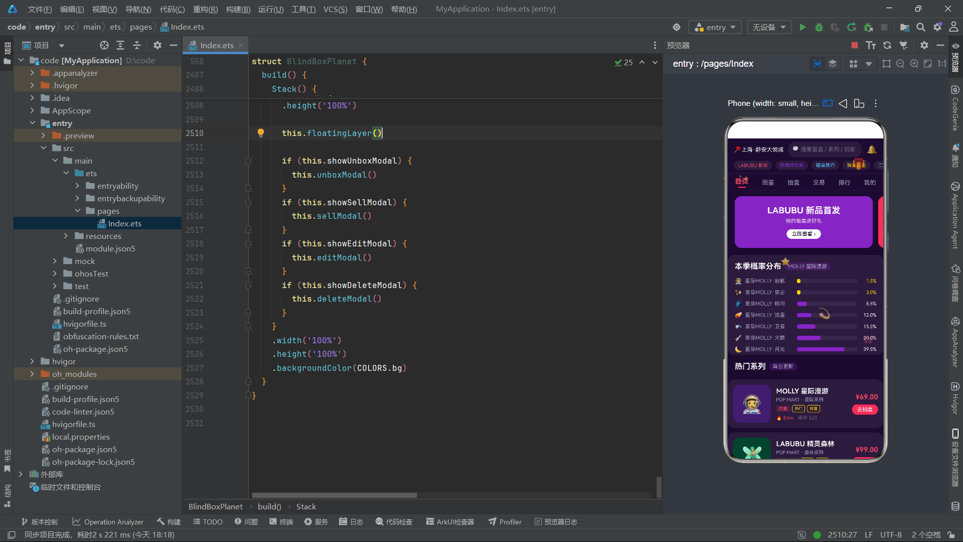
底部Tab栏的活跃状态管理通过 this.bottomTab 状态变量与三元表达式条件渲染实现。当 bottomTab 等于某个Tab项的 tab 值时,该Tab项的图标字号为24(放大)、透明度为1(完全不透明)、标签颜色为 COLORS.primary (红色),形成"高亮选中"的视觉效果。未选中的Tab项图标字号为20(标准大小)、透明度为0.5(半透明)、标签颜色为 COLORS.textDim (暗灰色),形成"弱化未选中"的视觉对比。这种通过三元表达式实现的"活跃/非活跃"视觉切换是ArkTS声明式UI的典型用法——开发者只需描述"不同状态对应的不同UI外观",框架自动在状态变化时执行视觉过渡。
底部Tab栏的 keyGenerator 设计为 item.label + this.bottomTab.toString() ——将Tab标签与当前选中索引组合作为键值。这一设计确保了当用户切换底部Tab时( bottomTab 变化),所有五个Tab项的键值同时变化,框架会重新渲染整个底部Tab栏以更新所有Tab项的活跃/非活跃视觉状态。虽然这种"全量重渲染"看起来比"仅重渲染变化的Tab项"开销更大,但底部Tab栏只有5个简单的 Column + Text 组件,重渲染开销极低,全量重渲染反而比精确渲染的代码更简洁。 switchBottomTab 方法在更新 bottomTab 的同时还根据索引值同步更新了 currentTab ——底部Tab 0对应内容Tab 0(首页),底部Tab 1对应内容Tab 1(图鉴),底部Tab 4对应内容Tab 5(我的),这种"底部Tab与内容Tab的联动映射"确保了底部Tab栏的点击能够正确切换页面内容。
转载声明:本文为转载整理,原文版权归原作者及原站点所有。
原文来源:CSDN HarmonyOS
原创地址:https://blog.csdn.net/2501_92985290/article/details/164003485
原文作者:柠落少女2440;如有侵权,请联系管理员删除。

最新文章
- 华为手机怎么ota升级鸿蒙,华为手机如何升级鸿蒙系统 步骤如下
- 【HarmonyOS 7】鸿蒙应用 AI Coding 工具链 DevEco Code 到 DevEco CLI
- 1.2 HarmonyOS NEXT分布式架构核心技术解析
- HarmonyOS Next音乐播放器组件开发实践
- HarmonyOS Next 用户认证应用
- 鸿蒙HarmonyOS应用开发 | 「鸿蒙技术分享」HarmonyOS NEXT元服务卡片实战体验
- 鸿蒙应用开发从入门到入行 - 篇7:http网络请求
- HarmonyOS NEXT: 抓住机遇,博
- devc++编译器_荣耀赵明揭秘方舟编译器:让安卓流畅度媲美甚至超越iOS
