1、介绍
集成树(tree-based ensemble learning)中,最有名的就是随机森林树(Random Forest,简称RF)与梯度提升树(Gradient Boosting Trees,简称GBM)。而近年在Kaggle 竞赛平台中最火红的XGBoost 也是基于GBM 所延伸出来的演算法。在解释集成树有三个非常好用的方法:
特征重要度(Feature Importance)
部分相依图(Partial Dependence Plot,简称PDP)
个体条件期望图(Individual Conditional Expectation Plot,简称ICE Plot)
这三个方法属于「事后可解释性(post hoc)」并且「通用于任何一种演算法模型(model-agnostic)」。
2、资料说明
本篇文章将以新生儿的资料进行举例说明。目的是为了解特征与预测新生儿的体重(目标变数y)之间的关系。
资料下载||新生儿资料.csv列名说明
1\. Baby_weight:新生儿体重
2\. Mother_age:妈妈年龄
3\. Mother_BMI:妈妈BMI
4\. Baby_hc:新生儿头围
下面提供了R与Python的程式码让大家练习与参考:
💻 R code:Google Colab R code
💻 Python code:Google Colab Python code
3、特征重要度
特征重要度(Feature Importance)指的是特征在模型中的重要程度,若一个特征非常重要,它对模型预测的表现影响就会很大。特征重要度的计算方式有很多,例如:Gain、Split count、mean(|Tree SHAP|) 等等。本篇则会介绍「置换重要度(Permutation Importance)」的计算原理。
3.1 计算原理
排列重要度的计算一定要在模型训练完后才能计算。而他的原理基本上就是将某一特征栏位的数据重新随机排列(其目的是为了维持分布不变),再跟据指标(例如:MSE)计算特征重要度。详细的步骤与说明如下:
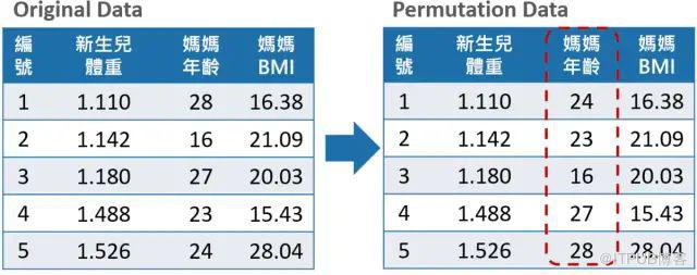
训练好一个模型f(假设特征矩阵为X、目标变数为y、误差衡量指标L(y, f))
通过损失函数计算出原始模型误差ɛᵒʳⁱᵍ= L( y, f(X))(例如:MSE)
将某一特征栏位(例如:妈妈年龄)的数据随机排列,再丢入回之前训练好的模型f计算计算模型的误差ɛᵖᵉʳᵐ = L( y, f(X ᵖᵉʳᵐ ) )。
计算此因子的重要程度importance = ɛᵖᵉʳᵐ-ɛᵒʳⁱᵍ。
把第4 个步骤中打乱的特征还原,换下一个特征并且重复3~4 的步骤,直到所有特征都计算完重要程度为止。
特征重要度可以让资料科学家了解那些特征是重要的或不重要的!
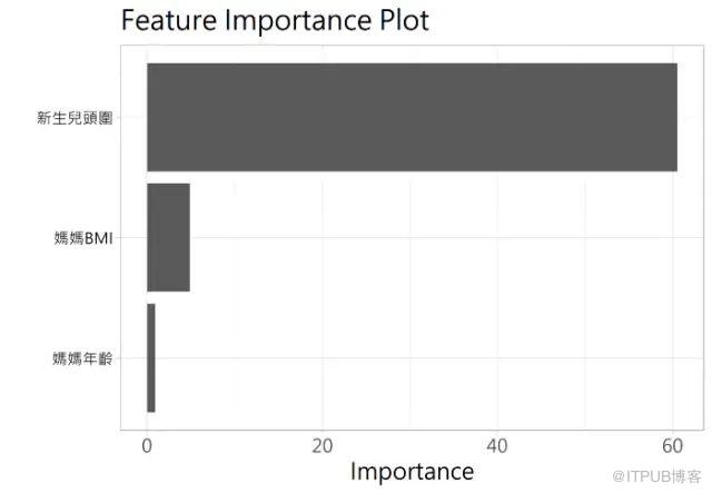
在此资料中新生儿头围为最重要的因子,重要度(importance)大约为60左右,代表的是若将新生儿头围的数据随意排列在带入模型会使得MSE 上升60 左右,而误差上升越多代表此特征在模型中的重要度越高。
.优缺点汇整
优点:
1.计算速度快不需要重新训练模型
2.直观好理解
3.提供与模型一致性的全域性解释。
缺点:
1.如果特征之间有高度相关时,置换重要度的方法会产生偏差。
3.2 决策树实例
import pandas as pd
import numpy as np
import matplotlib.pyplot as plt
%matplotlib inline

# https://www.kaggle.com/kumargh/pimaindiansdiabetescsv

#diabetes = pd.read_csv('pima-indians-diabetes.csv')
filename = 'data/pima-indians-diabetes.csv'
names = ['preg', 'gluc', 'dbp', 'skin', 'insul', 'bmi', 'pedi', 'age', 'class']
diabetes = pd.read_csv(filename, names=names)

print(diabetes.columns)
diabetes.head()

from sklearn.model_selection import train_test_split
X_train, X_test, y_train, y_test = train_test_split(diabetes.loc[:, diabetes.columns != 'class'], diabetes['class'], stratify=diabetes['class'], random_state=66)

from sklearn.tree import DecisionTreeClassifier

tree = DecisionTreeClassifier(random_state=0)
tree.fit(X_train, y_train)
print("Accuracy on training set: {:.3f}".format(tree.score(X_train, y_train)))
print("Accuracy on test set: {:.3f}".format(tree.score(X_test, y_test)))

tree = DecisionTreeClassifier(max_depth=3, random_state=0)
tree.fit(X_train, y_train)

print("Accuracy on training set: {:.3f}".format(tree.score(X_train, y_train)))
print("Accuracy on test set: {:.3f}".format(tree.score(X_test, y_test)))

diabetes_features = [x for i,x in enumerate(diabetes.columns) if i!=8]

print("")
print("Decision Tree Feature importances:\n{}".format(tree.feature_importances_))

def plot_feature_importances_diabetes(model):
    plt.figure(figsize=(8,6))
    n_features = 8
    plt.barh(range(n_features), model.feature_importances_, align='center')
    plt.yticks(np.arange(n_features), diabetes_features)
    plt.xlabel("Feature importance")
    plt.ylabel("Feature")
    plt.ylim(-1, n_features)

plot_feature_importances_diabetes(tree)
plt.savefig('Decision Tree feature_importance')
输出
Index(['preg', 'gluc', 'dbp', 'skin', 'insul', 'bmi', 'pedi', 'age', 'class'], dtype='object')
Accuracy on training set: 1.000
Accuracy on test set: 0.714
Accuracy on training set: 0.773
Accuracy on test set: 0.740

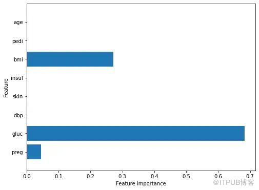
Decision Tree Feature importances:
[0.04554275 0.6830362  0.         0.         0.         0.27142106
0.         0.        ]
3.3 随机森林实例
# Random Forest
from sklearn.ensemble import RandomForestClassifier

rf = RandomForestClassifier(n_estimators=100, random_state=0)
rf.fit(X_train, y_train)
print("")
print('Random Forest')
print("Accuracy on training set: {:.3f}".format(rf.score(X_train, y_train)))
print("Accuracy on test set: {:.3f}".format(rf.score(X_test, y_test)))

rf1 = RandomForestClassifier(max_depth=3, n_estimators=100, random_state=0)
rf1.fit(X_train, y_train)
print("")
print('Random Forest - Max Depth = 3')
print("Accuracy on training set: {:.3f}".format(rf1.score(X_train, y_train)))
print("Accuracy on test set: {:.3f}".format(rf1.score(X_test, y_test)))

print("")
print('Random Forest Feature Importance')
plot_feature_importances_diabetes(rf)
Random Forest
Accuracy on training set: 1.000
Accuracy on test set: 0.786

Random Forest - Max Depth = 3
Accuracy on training set: 0.800
Accuracy on test set: 0.755

Random Forest Feature Importance

4、部分相依图PDP
部分相依图(Partial Dependence Plot)是由Friedman(2001)所提出,其目的是用来理解在模型中某一特征与预测目标y平均的关系,并且假设每一个特征都是独立的,主要以视觉化的方式呈现。
4.1 计算原理
PDP 的计算原理主要是透过将训练集资料丢入模型后平均预测的结果(即蒙地卡罗方法)。部分依赖函数的公式如下:
[图片上传失败...(image-cd53ac-1609120209965)]
[图片上传失败...(image-b03a24-1609120209965)]
。xs是我们想要画部分依赖图的特征集合;
。xᴄ则是剩下的其他特征;
。n为样本数
训练好一个模型f̂(假设x₁、x₂、x₃、x₄为特征、目标变数为y),假设我们想探讨的是x₁与y之间的关系,那么xs = { x₁ } 、xᴄ= { x₂, x₃ , x₄ }。
xs , xᴄ ⁽ ⁱ ⁼ ¹ ⁾代入得到第一组结果
接着置换xᴄ ⁽ ⁱ ⁼ ² ⁾得到第二个结果。
以此类推至i=n,并将得到的结果取平均。
部分相依图可以让资料科学家了解各个特征是如何影响预测的!
4.2 结果解释
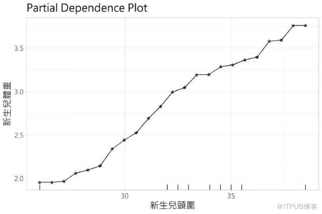
从这张图可以理解新生儿头围与新生儿体重有一定的正向关系存在,并且可以了解到新生儿头围是如何影响新生儿体重的预测。
.优缺点汇整
优点:
 1.容易计算生成
2.直观好理解
3.容易解释
缺点:
 1.最多只能同时呈现两个特征与y的关系,因为超过三维的图根据现在的技术无法呈现。
2.具有很强的特征独立性假设,若特征存在相关性,会导致PDP估计程产生偏差。
3. PDP呈现的是特征对于目标变数的平均变化量,容易忽略资料异质性(heterogeneous effects)对结果产生的影响。
4.3 Melbourne Housing Data的简单实例
数据来自kaggle: https://www.kaggle.com/gunjanpathak/melb-data
#
import pandas as pd
from pandas import read_csv, DataFrame
# from sklearn.preprocessing import Imputer
from sklearn.impute import SimpleImputer
from sklearn.ensemble import GradientBoostingRegressor
import numpy as np

def get_some_data():
    cols_to_use = ['Distance', 'Landsize', 'BuildingArea']
#     https://www.kaggle.com/gunjanpathak/melb-data
    data = pd.read_csv('data/melb_data.csv')
    y = data.Price
    X = data[cols_to_use]
    my_imputer = SimpleImputer()
    imputed_X = my_imputer.fit_transform(X)
return imputed_X, y

from sklearn.inspection import partial_dependence, plot_partial_dependence

# 构建数据
X, y = get_some_data()
# scikit-learn originally implemented partial dependence plots only for Gradient Boosting models
# 构建GradientBoostingRegressor模型实例
my_model = GradientBoostingRegressor()
# 训练模型
my_model.fit(X, y)
# 画图plot_partial_dependence
my_plots = plot_partial_dependence(my_model,
                                   features=[0, 1, 2], # column numbers of plots we want to show
                                   X=X,            # raw predictors data.
                                   feature_names=['Distance', 'Landsize', 'BuildingArea'], # labels on graphs
                                   grid_resolution=10) # number of values to plot on x axis

4.4 实例:用于识别糖尿病前危险因素的部分依赖图
from __future__ import print_function
print(__doc__)
from pandas import read_csv, DataFrame
import numpy as np
filename = "data/ln_skin_ln_insulin_imp_data.csv"
names = ['preg', 'gluc', 'dbp', 'skin', 'insul', 'bmi', 'pedi', 'age', 'class']
dataset = read_csv(filename, names=names)
# Compute ratio of insulin to glucose
#dataset['ratio'] = dataset['insul']/dataset['gluc']


import numpy as np
import matplotlib.pyplot as plt

from time import time

from mpl_toolkits.mplot3d import Axes3D

from sklearn.model_selection import train_test_split
from sklearn.ensemble import GradientBoostingClassifier
from sklearn.inspection import partial_dependence, plot_partial_dependence
from joblib import dump
from joblib import load

# split dataset into inputs and outputs
print(dataset.head())

values = dataset.values
X = values[:,0:8]
print(X.shape)
y = values[:,8]
#print(y.shape)

#def main():

# split 80/20 train-test
X_train, X_test, y_train, y_test = train_test_split(X,y,test_size=0.20,random_state=1)
names = ['preg', 'gluc', 'dbp', 'skin', 'insul', 'bmi', 'pedi', 'age']

print("Training GBRT...")
model = GradientBoostingClassifier(n_estimators=100, max_depth=4,learning_rate=0.1, loss='deviance',random_state=1)
t0 = time()
model.fit(X_train, y_train)
print(" done.")

print("done in %0.3fs" % (time() - t0))
importances = model.feature_importances_

print(importances)

#print('Convenience plot with ``partial_dependence_plots``')

features = [0, 1, 2, 3, 4, 5, 6, 7, (4,6)]
display = plot_partial_dependence(model, X_train, features,feature_names=names,n_jobs=3, grid_resolution=50)
输出
Automatically created module for IPython interactive environment
   preg   gluc   dbp       skin       insul   bmi   pedi   age  class
0   6.0  148.0  72.0  35.000000  165.475260  33.6  0.627  50.0    1.0
1   1.0   85.0  66.0  29.000000   62.304286  26.6  0.351  31.0    0.0
2   8.0  183.0  64.0  20.078082  210.991380  23.3  0.672  32.0    1.0
3   1.0   89.0  66.0  23.000000   94.000000  28.1  0.167  21.0    0.0
4   0.0  137.0  40.0  35.000000  168.000000  43.1  2.288  33.0    1.0
(768, 8)
Training GBRT...
 done.
done in 0.128s
[0.0544944  0.23726041 0.04045046 0.04838732 0.23154373 0.15424069
0.12426746 0.10935554]
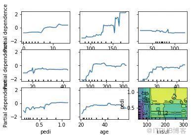
3d画展示
#fig.suptitle('Partial dependence plots of pre diabetes on risk factors')

plt.subplots_adjust(bottom=0.1, right=1.1, top=1.4)  # tight_layout causes overlap with suptitle


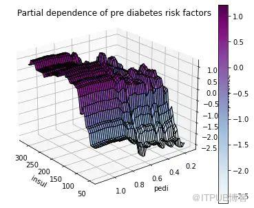
print('Custom 3d plot via ``partial_dependence``')
fig = plt.figure()

target_feature = (4, 6)
pdp, axes = partial_dependence(model, features=target_feature,X=X_train, grid_resolution=50)
XX, YY = np.meshgrid(axes[0], axes[1])
Z = pdp[0].reshape(list(map(np.size, axes))).T
ax = Axes3D(fig)
surf = ax.plot_surface(XX, YY, Z, rstride=1, cstride=1,cmap=plt.cm.BuPu, edgecolor='k')
ax.set_xlabel(names[target_feature[0]])
ax.set_ylabel(names[target_feature[1]])
ax.set_zlabel('Partial dependence')
#  pretty init view
ax.view_init(elev=22, azim=142)
plt.colorbar(surf)
plt.suptitle('Partial dependence of pre diabetes risk factors')

plt.subplots_adjust(right=1,top=.9)

plt.show()

# Needed on Windows because plot_partial_dependence uses multiprocessing
#if __name__ == '__main__':
#    main()

# check model
print(model)
Custom 3d plot via ``partial_dependence``
5、个体条件期望图ICE Plot
个体条件期望图(ICE Plot)计算方法与PDP 类似,个体条件期望图显示的是每一个个体的预测值与单一特征之间的关系。
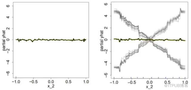
由于PDP呈现的是特征对于目标变数的平均变化量,容易使得异质效应(heterogeneous effects)相消,导致PD曲线看起来像是一条水平线,进而以为特征X_2对y毫无影响。因此,可以透过ICE Plot改善PDP的缺点:发现资料中的异质效应
5.1 计算原理
训练好一个模型f̂(假设x₁、x₂、x₃、x₄为特征、目标变数为y),假设我们想探讨的是x₁与y之间的关系,ICE的分析步骤如下:
对某一样本个体,保持其他特征不变,置换x₁的值并且输出模型的预测结果。
不断重复第一个步骤直到所有样本皆完成该步骤。
最后绘制所有个体的单一特征变量与预测值之间的关系图。
5.2 结果解释

灰黑色线代表的是每个个体对于目标变数的条件期望,红色线则是所有个体的平均水平(也就是PDP)。由于并不是每个个体都有相同的变化趋势,因此与部分相依图相比个体条件期望图能够更准确地反映特征与目标变数之间的关系。
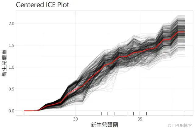
而个体条件期望图是从不同的预测开始,很难判断个体之间的条件期望曲线(ICE Curve)是否有差异,为了解决上述问题延伸了一个新方法,称作「Centered ICE Plot」。Centered ICE Plot 是将曲线做平移中心化的处理,其目的是为了表示特征在该点时个体间的预测差异。
Centered ICE 曲线则被定义为:
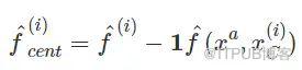
。xᵃ代表的是锚点( the anchor point),通常选择观察值的最小值或最大值做为锚点。
5.3 优缺点汇整
**👍🏻优点:
** 1.容易计算生成
2.解决了PDP资料异质性对结果产生的影响
3.更直观**👎🏻缺点:
** 1.只能展示一个特征与目标变数的关系图
2.具有很强的特征独立性假设
3.如果ICE plot的样本太多会导致折线图看起来非常拥挤凌乱
6 相关工具推荐
6.1 dtreeviz
链接:https://github.com/parrt/dtreeviz
使用demo:
导入所需要的包
from sklearn.datasets import *
from sklearn import tree
from dtreeviz.trees import *
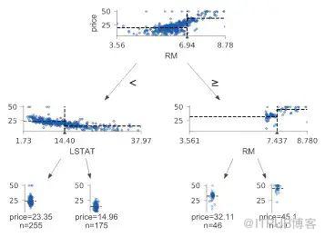
构建回归树
regr = tree.DecisionTreeRegressor(max_depth=2)
boston = load_boston()
regr.fit(boston.data, boston.target)

viz = dtreeviz(regr,
               boston.data,
               boston.target,
               target_name='price',
               feature_names=boston.feature_names)

viz.view()
构建分类树
classifier = tree.DecisionTreeClassifier(max_depth=2)  # limit depth of tree
iris = load_iris()
classifier.fit(iris.data, iris.target)

viz = dtreeviz(classifier,
               iris.data,
               iris.target,
               target_name='variety',
               feature_names=iris.feature_names,
               class_names=["setosa", "versicolor", "virginica"]  # need class_names for classifier
              )

viz.view()

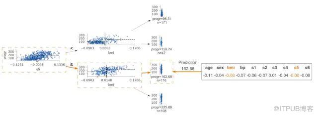
查看预测路径
regr = tree.DecisionTreeRegressor(max_depth=2)  # limit depth of tree
diabetes = load_diabetes()
regr.fit(diabetes.data, diabetes.target)
X = diabetes.data[np.random.randint(0, len(diabetes.data)),:]  # random sample from training

viz = dtreeviz(regr,
               diabetes.data,
               diabetes.target,
               target_name='value',
               orientation ='LR',  # left-right orientation
               feature_names=diabetes.feature_names,
               X=X)  # need to give single observation for prediction

viz.view()
更多功能 可以参考官方教程
6.2 shap
https://github.com/slundberg/shap

使用demo
import xgboost
import shap

# load JS visualization code to notebook
shap.initjs()

# train XGBoost model
X,y = shap.datasets.boston()
model = xgboost.train({"learning_rate": 0.01}, xgboost.DMatrix(X, label=y), 100)

# explain the model's predictions using SHAP
# (same syntax works for LightGBM, CatBoost, scikit-learn and spark models)
explainer = shap.TreeExplainer(model)
shap_values = explainer.shap_values(X)

# visualize the first prediction's explanation (use matplotlib=True to avoid Javascript)
shap.force_plot(explainer.expected_value, shap_values[0,:], X.iloc[0,:])

红色代表特征越重要,贡献量越大,蓝色代表特征不重要,贡献量低
7 参考资料
XAI| 如何对集成树进行解释?
Python037-Partial Dependence Plots特征重要性.ipynb
https://github.com/yanqiangmiffy/quincy-python-v2

