支持多种编程语言,如Python, R, Julia和JS,可以满足不同用户的需求和偏好。 提供了丰富而灵活图形类型和样式,可以制作高质量交互式图表。 可以轻松地将生成的图形嵌入到网页上,或者保存为静态文件或动画文件,方便分享和展示。 可以帮助用户进行高级的数据分析和机器学习,提供了Dash这个强大的应用框架。
Plotly Express:受Seaborn和ggplot2的启发,它专门设计为具有简洁,一致且易于学习的API。只需一次导入,就可以在函数调用中创建丰富的交互式绘图,包括地图、动画和趋势线等。 Graph Objects:提供了更多的自定义选项和灵活性。您可以使用Graph Objects来构建复杂的布局和样式,并添加更多的交互功能。下面我们来看一些Plotly绘制不同类型图形的案例,并给出相应的Python代码和注释。
散点图
# 导入plotly库
import plotly.express as px

# 创建一个数据集
df = px.data.iris()

# 使用scatter函数绘制散点图
fig = px.scatter(df, x="sepal_width", y="sepal_length", color="species")

# 显示图形
fig.show()
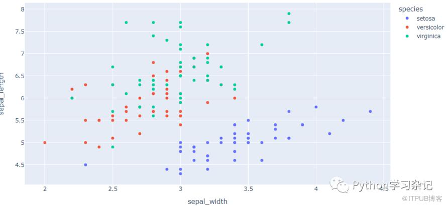
# 使用Plotly Express绘制散点图
import plotly.express as px # 导入plotly.express模块
df = px.data.iris() # 加载内置数据集
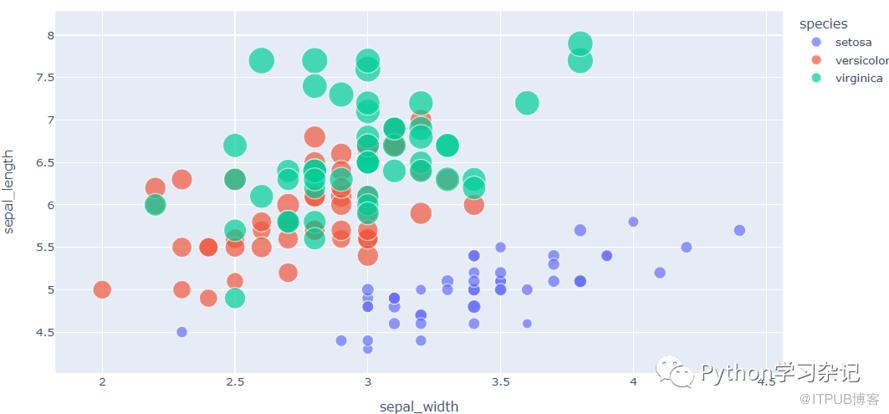
fig = px.scatter(df, x="sepal_width", y="sepal_length", # 设置x轴为花萼宽度,y轴为花萼长度
                 color="species", size="petal_length", # 设置颜色为品种,大小为花瓣长度
                 hover_data=['petal_width']) # 设置鼠标悬停时显示花瓣宽度
fig.show() # 显示图片

# 使用Graph Objects绘制散点图
import plotly.graph_objects as go # 导入plotly.graph_objects模块
import numpy as np # 导入numpy模块

t = np.linspace(0, 10, 30) # 0-10之间随机生成30个数字
x, y, z = np.cos(t), np.sin(t), t # 设置3个变量

fig = go.Figure(data=[go.Scatter3d( # 创建Figure对象,并添加Scatter3d对象作为数据源
    x=x, y=y, z=z,
    mode='markers', # 设置模式为标记点
    marker=dict(
        size=12,
        color=z,
        colorscale='Viridis',
        opacity=0.8) # 设置标记点的大小、颜色、颜色范围和透明度等属性
)])

fig.update_layout(title='3D Scatter Plot') # 更新布局设置标题

fig.show() # 显示图片

柱状图
# 使用Plotly Express绘制柱状图
import plotly.express as px # 导入plotly.express模块
df = px.data.gapminder() # 加载内置数据集
fig = px.bar(df, x="continent", y="pop", color="continent", # 设置x轴为大洲名称,y轴为人口数量,颜色为大洲名称
             title="Population of Continent", # 设置标题
             labels={"pop":"Population"}, # 设置y轴标签
             hover_data=["country"], # 设置鼠标悬停时显示国家名称
             height=400) # 设置高度为400像素
fig.show() # 显示图片

# 使用Graph Objects绘制柱状图
import plotly.graph_objects as go # 导入plotly.graph_objects模块
animals= ['giraffes', 'orangutans', 'monkeys'] # 定义类别列表
fig = go.Figure(data=[go.Bar( # 创建Figure对象,并添加Bar对象作为数据源
    name='SF Zoo', # 设置第一组数据名称
    x=animals, y=[20, 14, 23], # 设置x轴和y轴数据
    text=[20, 14, 23], textposition='auto'), # 设置文本标签和位置
    go.Bar(
    name='LA Zoo',
    x=animals, y=[12, 18, 29],
    text=[12, 18, 29], textposition='auto')
])
fig.update_layout(title='Number of Animals in LA and SF Zoo', # 更新布局设置标题
                  xaxis_title='Animals', yaxis_title='Count') # 更新x轴和y轴标题

fig.show() # 显示图片
饼图
# 使用Plotly Express绘制饼图
import plotly.express as px # 导入plotly.express模块
df = px.data.gapminder().query("year == 2007") # 加载内置数据集,并筛选出2007年的数据
fig = px.pie(df, values='pop', names='continent', title='Population of Continent') # 创建饼图,设置数值为人口数量,名称为大洲名称,标题为人口分布情况
fig.show() # 显示图片

# 使用Graph Objects绘制饼图
import plotly.graph_objects as go  # 导入plotly.graph_objects模块

labels = ['Oxygen','Hydrogen','Carbon_Dioxide','Nitrogen']  # 定义类别列表
values = [4500, 2500, 1053, 500]   # 定义数值列表

fig = go.Figure(data=[go.Pie(labels=labels, values=values)])   # 创建Figure对象,并添加Pie对象作为数据源
fig.update_layout(title='Composition of Air')  # // 更新布局设置标题

fig.show()  # // 显示图片
等高线图
# 使用Plotly Express绘制等高线图
import plotly.express as px # 导入plotly.express模块
df = px.data.iris() # 加载内置数据集
fig = px.density_contour(df, x="sepal_width", y="sepal_length", color="species") # 创建等高线图,设置x轴为花萼宽度,y轴为花萼长度,颜色为品种
fig.show() # 显示图片

# 使用Graph Objects绘制等高线图
import plotly.graph_objects as go # 导入plotly.graph_objects模块
import numpy as np # 导入numpy模块

x = np.linspace(-5, 5, 50) # 在-5到5之间生成50个数字
y = np.linspace(-5, 5, 50)
X,Y = np.meshgrid(x,y) # 创建网格点矩阵
Z = X**2 + Y**2 # 定义函数值

fig = go.Figure(data=[go.Contour( # 创建Figure对象,并添加Contour对象作为数据源
    z=Z,
    x=x,
    y=y,
    contours=dict(
        coloring ='heatmap',
        showlabels = True,
        labelfont = dict(size = 12,color = 'white')
    ) # 设置等高线的颜色、标签和字体等属性

)])

fig.update_layout(title='Contour Plot of Z=X^2+Y^2') #// 更新布局设置标题

fig.show() #// 显示图片
原文作者:Python学习杂记;如有侵权,请联系管理员删除。
上一篇:
文心一言介绍(附申请流程)
下一篇:
运筹优化工具库介绍(一)

请登录后发表评论
登录
全部评论
