Pyecharts是一个用于生成可视化图的Python库,它基于Echarts JavaScript库,提供了丰富的图表类型和配置项,可轻松地创建出各种精美的图表。本文,我将详细介绍Pyecharts的基本使用。
1基础使用
安装Pyecharts库:
可以通过pip命令安装Pyecharts库。
pip install pyecharts
导入所需的模块:
在Python脚本中导入所需的模块。
from pyecharts.charts import Line
创建图表对象
根据所需的图表类型创建相应的对象
line = Line()
设置图表的数据和配置项
通过设置数据和配置项来定义图表。
line.add_xaxis(['周一', '周二', '周三', '周四', '周五', '周六', '周日'])
渲染图表
使用render()方法将图表渲染为HTML文件或显示在Jupyter Notebook中。
line.render('line.html')。
示例
来看一个具体的例子,下面是一个简单的代码示例,用于生成一个折线图:
from pyecharts.charts import Line
from pyecharts import options as opts

### 创建图表对象
line = Line()

### 设置数据和配置项
line.add_xaxis(['周一', '周二', '周三', '周四', '周五', '周六', '周日'])
line.add_yaxis("销售额", [120, 200, 150, 80, 70, 110, 130])
line.set_global_opts(title_opts=opts.TitleOpts(title="销售额统计"))
### 渲染图表
line.render('line.html')
###在jupyter中直接显示,如果用其他ide不需要下面这行。
line.render_notebook()
在这个示例中,我们首先导入了Line类和options模块。然后,我们创建了一个Line对象,并设置了X轴和Y轴的数据和配置项。最后,我们使用render()方法将图表渲染为HTML文件。
2各类图形实现
柱状图
from pyecharts import options as opts
from pyecharts.charts import Bar
from pyecharts.faker import Faker


c = (
    Bar()
    .add_xaxis(Faker.choose())
    .add_yaxis("商家A", Faker.values())
    .add_yaxis("商家B", Faker.values())
    .set_global_opts(title_opts=opts.TitleOpts(title="Bar-基本示例", subtitle="我是副标题"))
)
c.render('mymap.html')##生成文件
c.render_notebook()##直接在jupyter中显示
在这个案例中,我们创建了一个Bar对象,并将数据集作为输入添加到图表中。最后,我们设置了图表的标题和其他配置项,并将图表渲染为HTML文件。
组合柱状图
from pyecharts import options as opts
from pyecharts.charts import Bar
from pyecharts.commons.utils import JsCode
from pyecharts.globals import ThemeType

list2 = [
    {"value": 12, "percent": 12 / (12 + 3)},
    {"value": 23, "percent": 23 / (23 + 21)},
    {"value": 33, "percent": 33 / (33 + 5)},
    {"value": 3, "percent": 3 / (3 + 52)},
    {"value": 33, "percent": 33 / (33 + 43)},
]

list3 = [
    {"value": 3, "percent": 3 / (12 + 3)},
    {"value": 21, "percent": 21 / (23 + 21)},
    {"value": 5, "percent": 5 / (33 + 5)},
    {"value": 52, "percent": 52 / (3 + 52)},
    {"value": 43, "percent": 43 / (33 + 43)},
]

c = (
    Bar(init_opts=opts.InitOpts(theme=ThemeType.LIGHT))
    .add_xaxis([1, 2, 3, 4, 5])
    .add_yaxis("product1", list2, stack="stack1", category_gap="50%")
    .add_yaxis("product2", list3, stack="stack1", category_gap="50%")
    .set_series_opts(
        label_opts=opts.LabelOpts(
            position="right",
            formatter=JsCode(
                "function(x){return Number(x.data.percent * 100).toFixed() + '%';}"
            ),
        )
    )
)
c.render_notebook()##直接在jupyter中显示
3D柱状图
import random

from pyecharts import options as opts
from pyecharts.charts import Bar3D

x_data = y_data = list(range(10))
def generate_data():
    data = []
    for j in range(10):
        for k in range(10):
            value = random.randint(0, 9)
            data.append([j, k, value * 2 + 4])
    return data

bar3d = Bar3D()
for _ in range(10):
    bar3d.add(
        "",
        generate_data(),
        shading="lambert",
        xaxis3d_opts=opts.Axis3DOpts(data=x_data, type_="value"),
        yaxis3d_opts=opts.Axis3DOpts(data=y_data, type_="value"),
        zaxis3d_opts=opts.Axis3DOpts(type_="value"),
    )
bar3d.set_global_opts(title_opts=opts.TitleOpts("Bar3D-堆叠柱状图示例"))
bar3d.set_series_opts(**{"stack": "stack"})
bar3d.render_notebook()
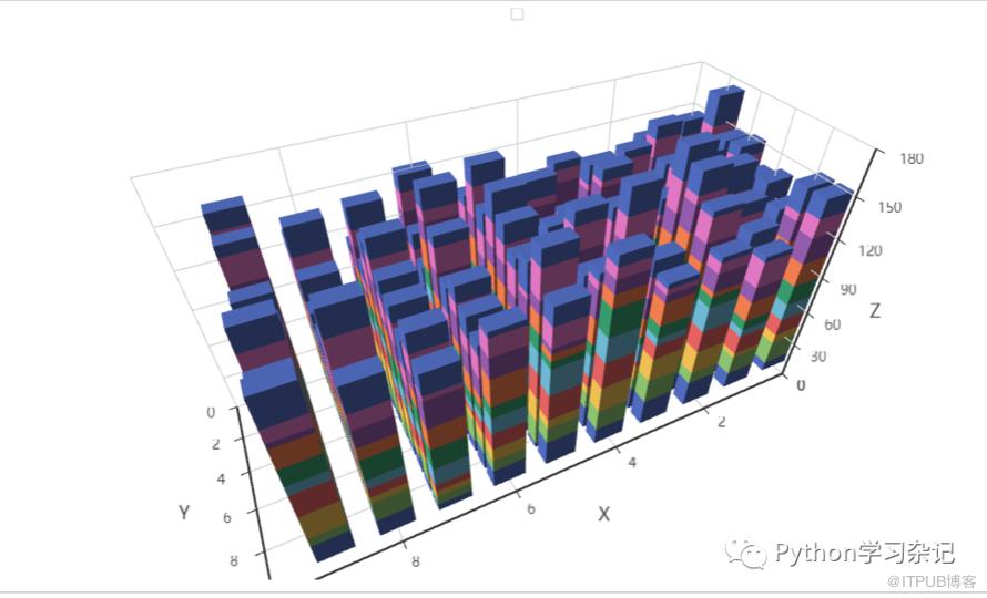 3D柱状图适合做复杂的多维度对比分析,也是会经常用到的。
k线图
pyecharts也可以画股市的k线图。注意以下数据是模拟数据,并非真实数据,数据仅供参考。
from pyecharts import options as opts
from pyecharts.charts import Kline

data = [
    [2320.26, 2320.26, 2287.3, 2362.94],
    [2300, 2291.3, 2288.26, 2308.38],
    [2295.35, 2346.5, 2295.35, 2345.92],
    [2347.22, 2358.98, 2337.35, 2363.8],
    [2360.75, 2382.48, 2347.89, 2383.76],
    [2383.43, 2385.42, 2371.23, 2391.82],
    [2377.41, 2419.02, 2369.57, 2421.15],
    [2425.92, 2428.15, 2417.58, 2440.38],
    [2411, 2433.13, 2403.3, 2437.42],
    [2432.68, 2334.48, 2427.7, 2441.73],
    [2430.69, 2418.53, 2394.22, 2433.89],
    [2416.62, 2432.4, 2414.4, 2443.03],
    [2441.91, 2421.56, 2418.43, 2444.8],
    [2420.26, 2382.91, 2373.53, 2427.07],
    [2383.49, 2397.18, 2370.61, 2397.94],
    [2378.82, 2325.95, 2309.17, 2378.82],
    [2322.94, 2314.16, 2308.76, 2330.88],
    [2320.62, 2325.82, 2315.01, 2338.78],
    [2313.74, 2293.34, 2289.89, 2340.71],
    [2297.77, 2313.22, 2292.03, 2324.63],
    [2322.32, 2365.59, 2308.92, 2366.16],
    [2364.54, 2359.51, 2330.86, 2369.65],
    [2332.08, 2273.4, 2259.25, 2333.54],
    [2274.81, 2326.31, 2270.1, 2328.14],
    [2333.61, 2347.18, 2321.6, 2351.44],
    [2340.44, 2324.29, 2304.27, 2352.02],
    [2326.42, 2318.61, 2314.59, 2333.67],
    [2314.68, 2310.59, 2296.58, 2320.96],
    [2309.16, 2286.6, 2264.83, 2333.29],
    [2282.17, 2263.97, 2253.25, 2286.33],
    [2255.77, 2270.28, 2253.31, 2276.22],
]
c = (
    Kline()
    .add_xaxis(["2023/8/{}".format(i + 1) for i in range(31)])
    .add_yaxis(
        "kline",
        data,
        itemstyle_opts=opts.ItemStyleOpts(
            color="#ec0000",
            color0="#00da3c",
            border_color="#8A0000",
            border_color0="#008F28",
        ),
    )
    .set_global_opts(
        xaxis_opts=opts.AxisOpts(is_scale=True),
        yaxis_opts=opts.AxisOpts(
            is_scale=True,
            splitarea_opts=opts.SplitAreaOpts(
                is_show=True, areastyle_opts=opts.AreaStyleOpts(opacity=1)
            ),
        ),
        datazoom_opts=[opts.DataZoomOpts(type_="inside")],
        title_opts=opts.TitleOpts(title="Kline-ItemStyle"),
    )

)
c.render_notebook()##直接在jupyter中显示
漏斗图
漏斗图一个常见的案例是商品在网站上展示、点击、访问、咨询待下单的过程。
import pyecharts.options as opts
from pyecharts.charts import Funnel

x_data = ["展现", "点击", "访问", "咨询", "订单"]
y_data = [100, 80, 60, 40, 20]

data = [[x_data[i], y_data[i]] for i in range(len(x_data))]

abc=(
    Funnel()
    .add(
        series_name="",
        data_pair=data,
        gap=2,
        tooltip_opts=opts.TooltipOpts(trigger="item", formatter="{a} <br/>{b} : {c}%"),
        label_opts=opts.LabelOpts(is_show=True, position="inside"),
        itemstyle_opts=opts.ItemStyleOpts(border_color="#fff", border_width=1),
    )
    .set_global_opts(title_opts=opts.TitleOpts(title="漏斗图", subtitle="纯属虚构"))
)
abc.render_notebook()##直接在jupyter中显示
仪表盘
仪表盘通常用来显示工作的进度,在pyecharts实现仪表盘的画图也是非常方便的。下面给出一个分段不同颜色仪表盘的例子。现在快到年底,很多公司都在抓kpi的进度,仪表盘是一个很不错的展现方式。
from pyecharts import options as opts
from pyecharts.charts import Gauge

c = (
    Gauge()
    .add(
        "业务指标",
        [("完成率", 55.5)],
        split_number=5,
        axisline_opts=opts.AxisLineOpts(
            linestyle_opts=opts.LineStyleOpts(
                color=[(0.3, "#67e0e3"), (0.7, "#37a2da"), (1, "#fd666d")], width=30
            )
        ),
        detail_label_opts=opts.LabelOpts(formatter="{value}"),
    )
    .set_global_opts(
        title_opts=opts.TitleOpts(title="Gauge-分割段数-Label"),
        legend_opts=opts.LegendOpts(is_show=False),
    )
)
c.render_notebook()##直接在jupyter中显示
折现图
import pyecharts.options as opts
from pyecharts.charts import Line
from pyecharts.faker import Faker

c = (
    Line()
    .add_xaxis(Faker.choose())
    .add_yaxis("商家A", Faker.values(), areastyle_opts=opts.AreaStyleOpts(opacity=0.5))
    .add_yaxis("商家B", Faker.values(), areastyle_opts=opts.AreaStyleOpts(opacity=0.5))
    .set_global_opts(title_opts=opts.TitleOpts(title="Line-面积图"))
)
c.render_notebook()##直接在jupyter中显示
注意,以上数据都是用Faker随机生成的,自己可以更改数据。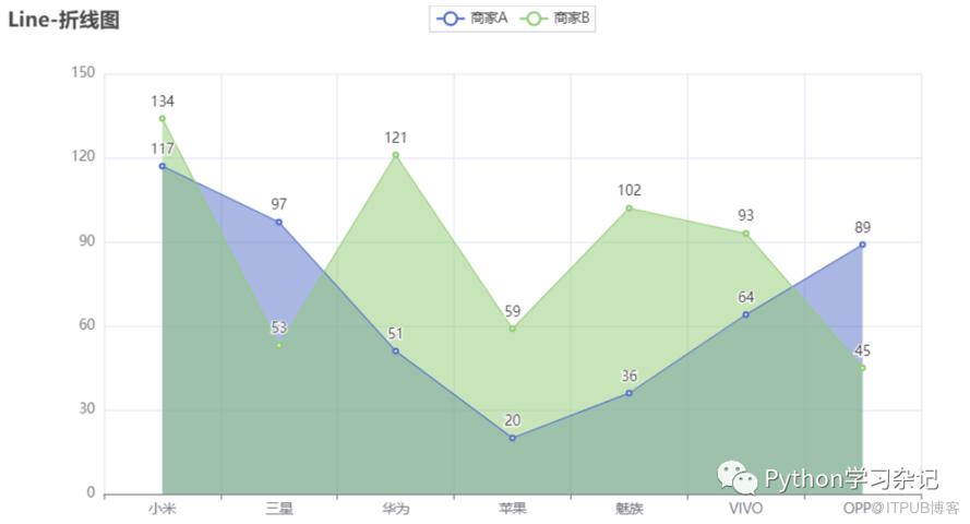
3D折线图
import math

from pyecharts import options as opts
from pyecharts.charts import Line3D
from pyecharts.faker import Faker

data = []
for t in range(0, 5000):
    _t = t / 300
    x = (1 + 0.25 * math.cos(75 * _t)) * math.cos(_t)
    y = (1 + 0.25 * math.cos(75 * _t)) * math.sin(_t)
    z = _t + 2.0 * math.sin(75 * _t)
    data.append([x, y, z])
c = (
    Line3D()
    .add(
        "",
        data,
        xaxis3d_opts=opts.Axis3DOpts(Faker.clock, type_="value"),
        yaxis3d_opts=opts.Axis3DOpts(Faker.week_en, type_="value"),
        grid3d_opts=opts.Grid3DOpts(
            width=100, depth=100, rotate_speed=150, is_rotate=True
        ),
    )
    .set_global_opts(
        visualmap_opts=opts.VisualMapOpts(
            max_=20, min_=0, range_color=Faker.visual_color
        ),
        title_opts=opts.TitleOpts(title="Line3D-旋转的弹簧"),
    )
)
c.render_notebook()##直接在jupyter中显示
饼图
from pyecharts import options as opts
from pyecharts.charts import Pie
from pyecharts.faker import Faker

c = (
    Pie()
    .add(
        "",
        [list(z) for z in zip(Faker.choose(), Faker.values())],
        radius=["40%", "55%"],
        label_opts=opts.LabelOpts(
            position="outside",
            formatter="{a|{a}}{abg|}\n{hr|}\n {b|{b}: }{c}  {per|{d}%}  ",
            background_color="#eee",
            border_color="#aaa",
            border_width=1,
            border_radius=4,
            rich={
                "a": {"color": "#999", "lineHeight": 22, "align": "center"},
                "abg": {
                    "backgroundColor": "#e3e3e3",
                    "width": "100%",
                    "align": "right",
                    "height": 22,
                    "borderRadius": [4, 4, 0, 0],
                },
                "hr": {
                    "borderColor": "#aaa",
                    "width": "100%",
                    "borderWidth": 0.5,
                    "height": 0,
                },
                "b": {"fontSize": 16, "lineHeight": 33},
                "per": {
                    "color": "#eee",
                    "backgroundColor": "#334455",
                    "padding": [2, 4],
                    "borderRadius": 2,
                },
            },
        ),
    )
    .set_global_opts(title_opts=opts.TitleOpts(title="Pie-富文本示例"))
)
c.render_notebook()##直接在jupyter中显示
雷达图
雷达图适合多维度比较一些指标,在对比分析中非常适用。
import pyecharts.options as opts
from pyecharts.charts import Radar


v1 = [[4300, 10000, 28000, 35000, 50000, 19000]]
v2 = [[5000, 14000, 28000, 31000, 42000, 21000]]

c=(
    Radar(init_opts=opts.InitOpts(bg_color="#CCCCCC"))
    .add_schema(
        schema=[
            opts.RadarIndicatorItem(name="销售(sales)", max_=6500),
            opts.RadarIndicatorItem(name="管理(Administration)", max_=16000),
            opts.RadarIndicatorItem(name="信息技术(Information Technology)", max_=30000),
            opts.RadarIndicatorItem(name="客服(Customer Support)", max_=38000),
            opts.RadarIndicatorItem(name="研发(Development)", max_=52000),
            opts.RadarIndicatorItem(name="市场(Marketing)", max_=25000),
        ],
        splitarea_opt=opts.SplitAreaOpts(
            is_show=True, areastyle_opts=opts.AreaStyleOpts(opacity=1)
        ),
        textstyle_opts=opts.TextStyleOpts(color="#fff"),
    )
    .add(
        series_name="预算分配(Allocated Budget)",
        data=v1,
        linestyle_opts=opts.LineStyleOpts(color="#CD0000"),
    )
    .add(
        series_name="实际开销(Actual Spending)",
        data=v2,
        linestyle_opts=opts.LineStyleOpts(color="#5CACEE"),
    )
    .set_series_opts(label_opts=opts.LabelOpts(is_show=False))
    .set_global_opts(
        title_opts=opts.TitleOpts(title="基础雷达图"), legend_opts=opts.LegendOpts()
    )
)
c.render_notebook()##直接在jupyter中显示
散点图
from pyecharts import options as opts
from pyecharts.charts import Scatter
from pyecharts.faker import Faker

c = (
    Scatter()
    .add_xaxis(Faker.choose())
    .add_yaxis("商家A", Faker.values())
    .add_yaxis("商家B", Faker.values())
    .set_global_opts(
        title_opts=opts.TitleOpts(title="Scatter-VisualMap(Size)"),
        visualmap_opts=opts.VisualMapOpts(type_="size", max_=150, min_=20),
    )
)
c.render_notebook()##直接在jupyter中显示
3总结
通过本文的介绍,大家可以了解并掌握Pyecharts的基础使用,文章代码均可直接复制运行,大家可以自行研究,探索更多的更精美的作图技巧。
原文作者:Python学习杂记;如有侵权,请联系管理员删除。

