使用CSS3实现动画勾选
相信大家在项目中会经常遇到这种需求:勾选框。现在用CSS3来实现一个动画勾选,只需要一个标签即可完成:
这次需要用到CSS中伪类 after,这个小技巧也是很容易忘记的,所以决定记录起来~
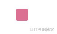
首先给标签加宽高加背景色:
<style>
    .check{
        width: 40px;
        height: 40px;
        background: palevioletred;
        position: relative;
        margin: 50px auto;
        border-radius: 5px;
        cursor: pointer;
    }</style><div class="check"></div>
接下来利用伪类给标签添加元素,同时水平垂直居中:
<style>
    .check{
        width: 40px;
        height: 40px;
        background: palevioletred;
        position: relative;
        margin: 50px auto;
        border-radius: 5px;
        cursor: pointer;
    }
    .check:after{
        content: '';
        display: block;
        width: 14px;
        height: 10px;
        border: 3px solid #fff;
        position: absolute;
        top: 50%;
        left: 50%;
        margin-top: -5px;
        margin-left: -7px;
    }</style><div class="check"></div>
变成这样:

接下来去掉上边框跟右边框,同时将剩下的旋转45°稍微调整上下左右的距离即可~
<style>
    .check{
        width: 40px;
        height: 40px;
        background: palevioletred;
        position: relative;
        margin: 50px auto;
        border-radius: 5px;
        cursor: pointer;
    }
    .check:after{
        content: '';
        display: block;
        width: 14px;
        height: 10px;
        border: 3px solid #fff;
        border-width: 0 0 3px 3px;
        position: absolute;
        top: 50%;
        left: 50%;
        margin-top: -8px;
        margin-left: -8px;
        transform: rotate(-45deg);
    }</style><div class="check"></div>

最终效果就出来啦~
我们还可以添加点击事件,一开始不设置颜色跟伪类,点击后添加一个class,给这个class添加伪类以及动画效果:
<style>
    .check{
        width: 40px;
        height: 40px;
        position: relative;
        margin: 50px auto;
        border: 1px solid #ddd;
        border-radius: 5px;
        cursor: pointer;
        transition: background-color 0.25s;
    }
    .checkActive{
        background: palevioletred;
        border-color: palevioletred;
    }
    .checkActive:after{
        content: '';
        display: block;
        width: 14px;
        height: 10px;
        border: 3px solid #fff;
        border-width: 0 0 3px 3px;
        position: absolute;
        top: 50%;
        left: 50%;
        margin-top: -8px;
        margin-left: -8px;
        transform: rotate(-45deg);
    }</style><div class="check"></div>
这样就完成啦!
作者:市民朱先生
原文链接:https://www.cnblogs.com/zhujunye/p/10451539.html
来自 “ ITPUB博客 ” ,链接:https://blog.itpub.net/4798/viewspace-2821885/ ,如需转载,请注明出处,否则将追究法律责任。

请登录后发表评论
登录
全部评论
