绘图: Python matplotlib简介
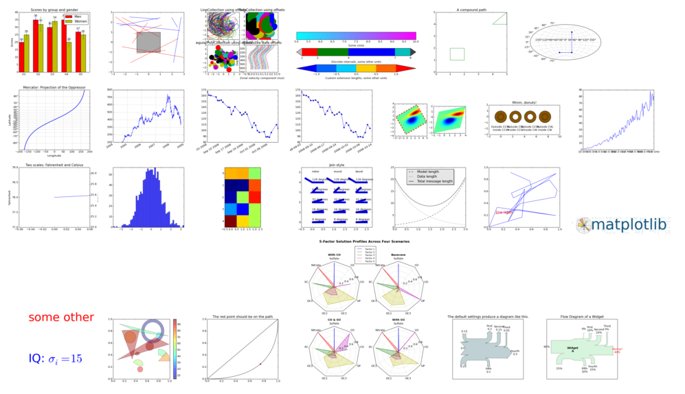
matplotlib是基于numpy的一套Python工具包。这个包提供了丰富的 数据绘图工具,主要用于绘制一些统计图形。你可以找到很多各式各样的 例子:
通过数据绘图,我们可以将枯燥的数字转换成容易被人们接受的图表,从而让人留下更加深刻的印象。实际上,早在一百多年前, 南丁格尔就曾经用统计图形来说服英国政府,以改善军队的卫生状况。
我们将以GDP数据为例子,看看如何绘制经典的饼图和条形图。
数据
下面是我们要使用的数据,为2011年 GDP前十的国家以及其具体的GDP:

USA        15094025
China      11299967
India       4457784
Japan       4440376
Germany     3099080
Russia      2383402
Brazil      2293954
UK          2260803
France      2217900
Italy       1846950
饼图
我们先来绘制 饼图 (pie plot)。饼图适用于表达各个国家GDP所占的百分比。每一小块的面积代表了占比的多少:
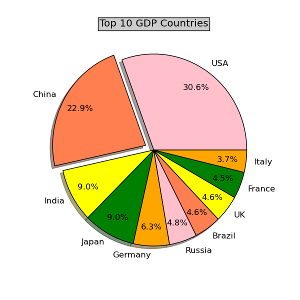
具体代码如下,可以看到我们主要使用了matplotlib.pyplot工具包:
# Make a pie chart# This script is written by Vamei, http://www.cnblogs.com/vamei# you may freely use it.import matplotlib.pyplot as plt# quants: GDP# labels: country namelabels   = []
quants   = []# Read datafor line in file('../data/major_country_gdp'):
    info = line.split()
    labels.append(info[0])
    quants.append(float(info[1]))# make a square figureplt.figure(1, figsize=(6,6))# For China, make the piece explode a bitdef explode(label, target='China'):    if label == target: return 0.1    else: return 0
expl = map(explode,labels)# Colors used. Recycle if not enough.colors  = ["pink","coral","yellow","orange"]# Pie Plot# autopct: format of "percent" string;plt.pie(quants, explode=expl, colors=colors, labels=labels, autopct='%1.1f%%',pctdistance=0.8, shadow=True)
plt.title('Top 10 GDP Countries', bbox={'facecolor':'0.8', 'pad':5})
plt.show()
条形图
下面我们尝试一下 条形图(bar plot)。用每个长条的高度代表每个国家的GDP,长条越高,GDP值越高:

代码如下:
"""Make a pie chart
This script is written by Vamei, http://www.cnblogs.com/vamei
you may freely use it."""import matplotlib.pyplot as pltimport numpy as np# quants: GDP# labels: country namelabels   = []
quants   = []# Read datafor line in file('../data/major_country_gdp'):
    info = line.split()
    labels.append(info[0])
    quants.append(float(info[1]))
width = 0.4ind = np.linspace(0.5,9.5,10)# make a square figurefig = plt.figure(1, figsize=(12,6))
ax  = fig.add_subplot(111)# Bar Plotax.bar(ind-width/2,quants,width,color='coral')# Set the ticks on x-axisax.set_xticks(ind)
ax.set_xticklabels(labels)# labelsax.set_xlabel('Country')
ax.set_ylabel('GDP (Billion US dollar)')# titleax.set_title('Top 10 GDP Countries', bbox={'facecolor':'0.8', 'pad':5})
plt.show()
该代码中我们利用了ax对象,以便控制刻度以及刻度所对应的国家名。这与我们在pie plot所做的有些不同(pie plot也可以这样实现,只是没有必要而已)。
从两个图上看,亚洲国家的GDP还是很厉害的。西方的话就是美国一枝独秀了。
来自 “ ITPUB博客 ” ,链接:https://blog.itpub.net/31543790/viewspace-2674562/ ,如需转载,请注明出处,否则将追究法律责任。
下一篇:
飓风“桑迪”路径图的制作

请登录后发表评论
登录
全部评论
