小菜前两天刚学习了 ButtonBar 按钮容器,今天顺便学习一下 ToggleButtons 按钮切换容器组,其切换效果可以应用在日常 TabBar 切换位置;
ToggleButtons
源码分析
const ToggleButtons({
    Key key,
    @required this.children,
    @required this.isSelected,
    this.onPressed,             // 点击状态
    this.mouseCursor,
    this.textStyle,             // 文本样式
    this.constraints,           // 宽高最大最小限制
    this.color,                 // 未选中颜色
    this.selectedColor,         // 选中颜色
    this.disabledColor,         // 不可选中颜色
    this.fillColor,             // 填充颜色
    this.focusColor,            // 有输入焦点时颜色
    this.highlightColor,        // 选中时高亮颜色
    this.hoverColor,            // 初始水波纹颜色
    this.splashColor,           // 选中时水波纹颜色
    this.focusNodes,            // 接受对应于每个切换按钮焦点列表
    this.renderBorder = true,   // 是否绘制边框
    this.borderColor,           // 未选中边框颜色
    this.selectedBorderColor,   // 选中边框颜色
    this.disabledBorderColor,   // 不可选中边框颜色
    this.borderRadius,          // 边框圆角弧度
    this.borderWidth,           // 边框宽度
})
简单分析源码可得,ToggleButtons 是一组水平方向切换按钮容器组,其子 Widgets 是通过 Row 进行排列的;children 和 isSelected 是必备属性,两者数组长度要一致;
案例尝试
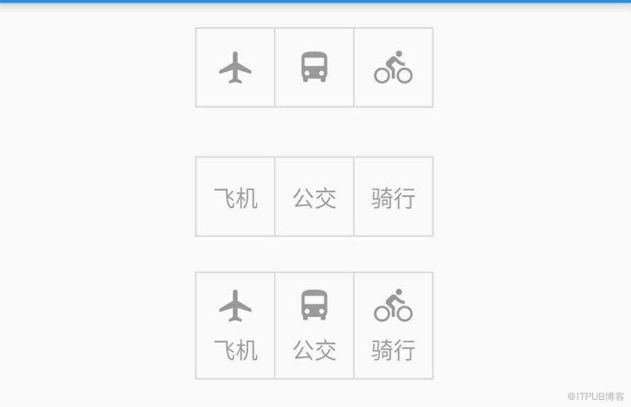
1. children & isSelected
children 的按钮状态由 isSelected 对应选中和未选中状态;两个数组长度一致且不可为空;
_toggleWid01(index) {
  var childList;
  if (index == 0) {
    childList = iconList;
  } else if (index == 1) {
    childList = textList;
  } else {
    childList = minxList;
  }
  return Container( height: 80.0,
      child: Center(child: ToggleButtons(children: childList, isSelected: stateList)));
}
2. color & selectedColor & disabledColor
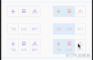
color 对应子 Widget 默认未选中状态颜色;selectedColor 对应子 Widget 默认选中状态颜色;disabledColor 对应子 Widget 默认不可选中状态颜色;其中当不设置 onPressed 或 onPressed == null 时为不可选中状态;
_toggleWid02(index, isPressed) {
  return Container( height: 80.0,
      child: Center(
          child: ToggleButtons(
              children: _getChildList(index),
              isSelected: stateList,
              color: Colors.grey.withOpacity(0.4),
              selectedColor: Colors.deepOrange.withOpacity(0.4),
              disabledColor: Colors.deepPurple.withOpacity(0.4),
              onPressed: isPressed
                  ? (selectedIndex) => setState(() => stateList[selectedIndex] = !stateList[selectedIndex])
                  : null)));
}
3. fillColor & highlightColor & splashColor
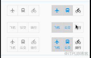
fillColor 对应子 Widget 默认填充颜色;highlightColor 对应子 Widget 在手势操作下,选中时的高亮颜色;splashColor 对应子 Widget 在点击过程中的水波纹颜色;
_toggleWid03(index, isPressed) {
  return Container( height: 80.0,
      child: Center(
          child: ToggleButtons(
              children: _getChildList(index),
              isSelected: stateList,
              fillColor: Colors.grey.withOpacity(0.4),
              highlightColor: Colors.deepOrange.withOpacity(0.4),
              splashColor: Colors.deepPurple.withOpacity(0.4),
              onPressed: isPressed
                  ? (selectedIndex) => setState(() => stateList[selectedIndex] = !stateList[selectedIndex])
                  : null)));
}
4. borderColor & selectedBorderColor & disabledBorderColor
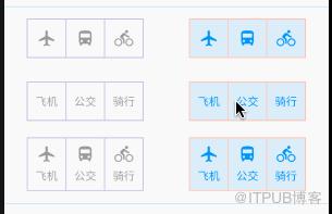
borderColor 对应子 Widget 未选中时边框颜色;selectedBorderColor 对应子 Widget 选中时边框颜色;disabledBorderColor 对应不可选择时边框颜色;
_toggleWid04(index, isPressed) {
  return Container( height: 80.0,
      child: Center(
          child: ToggleButtons(
              children: _getChildList(index),
              isSelected: stateList,
              borderColor: Colors.blue.withOpacity(0.4),
              selectedBorderColor: Colors.deepOrange.withOpacity(0.4),
              disabledBorderColor: Colors.deepPurple.withOpacity(0.4),
              onPressed: isPressed
                  ? (selectedIndex) => setState(() => stateList[selectedIndex] = !stateList[selectedIndex])
                  : null)));
5. borderRadius & borderWidth
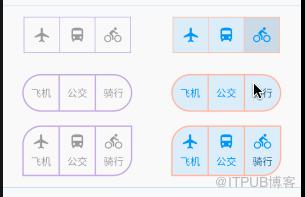
borderRadius 对应子 Widget 边框圆角弧度;borderWidth 对应子 Widget 边框宽度,默认是 1.0;
borderWidth: 1.0,
borderRadius: BorderRadius.all(Radius.circular(40.0)),

borderWidth: 2.0,
borderRadius: BorderRadius.only(topLeft: Radius.circular(25.0), bottomRight: Radius.circular(25.0)),
6. renderBorder
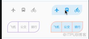
renderBorder 用于是否绘制边框,默认是 true;若为 false 则不进行边框绘制;
_toggleWid06(index, isPressed, isBorder) {
  return Container( height: 80.0,
      child: Center(
          child: ToggleButtons(
              children: _getChildList(index),
              isSelected: stateList,
              renderBorder: isBorder,
              borderWidth: 2.0,
              borderRadius: BorderRadius.only(topLeft: Radius.circular(25.0), bottomRight: Radius.circular(25.0)),
              borderColor: Colors.blue.withOpacity(0.4),
              selectedBorderColor: Colors.deepOrange.withOpacity(0.4),
              disabledBorderColor: Colors.deepPurple.withOpacity(0.4),
              onPressed: isPressed
                  ? (selectedIndex) => setState(() => stateList[selectedIndex] = !stateList[selectedIndex])
                  : null)));
}
7. constraints
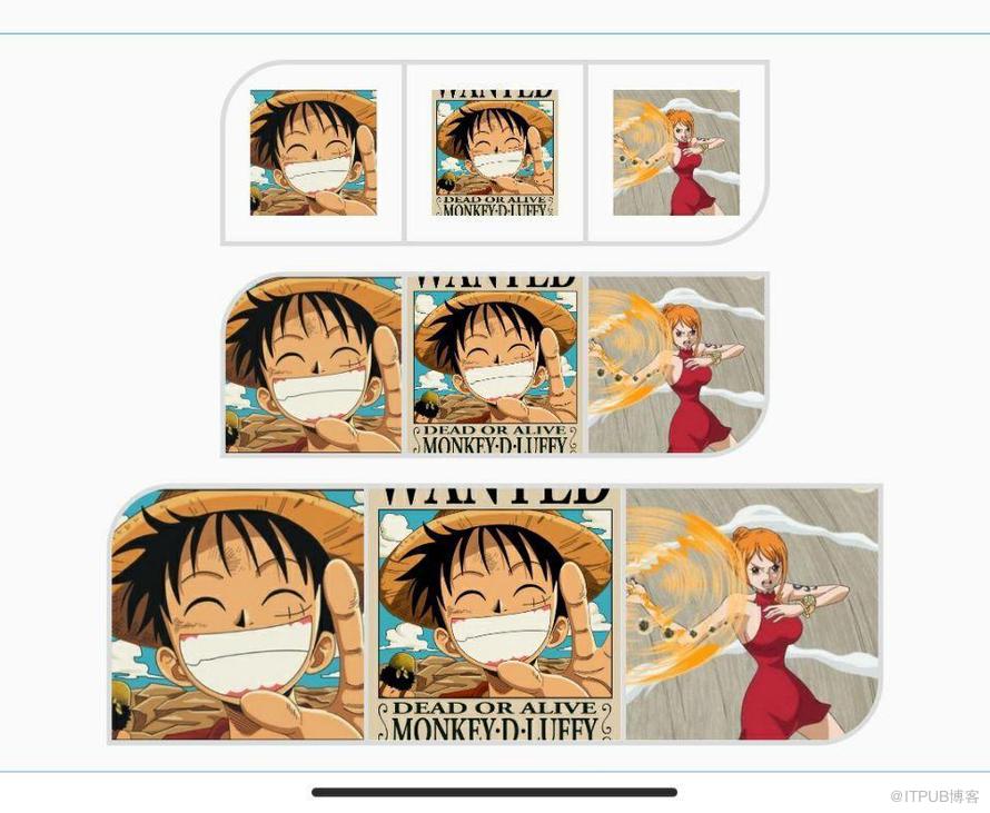
constraints 用于限制子 Widget 尺寸,采用 BoxConstraints 限制子 Widget 的最大最小尺寸,默认最小为 48.0;
_toggleWid07(size) {
  return Container(child: Center(
      child: ToggleButtons(
          children: [
            Image(image: AssetImage('images/icon_hzw01.jpg'), fit: BoxFit.cover, width: size, height: size),
            Image(image: AssetImage('images/icon_hzw02.jpg'), fit: BoxFit.cover, width: size, height: size),
            Image(image: AssetImage('images/icon_hzw03.jpg'), fit: BoxFit.cover, width: size, height: size)
          ],
          isSelected: stateList,
          borderRadius: BorderRadius.only(topLeft: Radius.circular(25.0), bottomRight: Radius.circular(25.0)),
          constraints: BoxConstraints(minWidth: 70.0, minHeight: 70.0),
          borderWidth: 2.0,
          onPressed: (selectedIndex) => setState(() => stateList[selectedIndex] = !stateList[selectedIndex]))));
8. focusNodes
focusNodes 用于接受对应于每个切换按钮的 FocusNode 列表,焦点用于确定键盘事件应该影响哪个子 Widget,若设置 focusNodes,其数组长度应与子 Widgets 长度一致;常用于外部设备操作;
focusWid() {
  return Row(mainAxisAlignment: MainAxisAlignment.center, children: [
    RaisedButton(
        child: Text('Previous'),
        onPressed: () {
if (_index > iconList.length || _index = iconList.length || _index 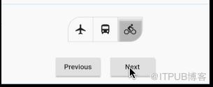
ToggleButtons 的使用非常便捷,小菜主要是想学习 ToggleButtons 整体的思路,包括设置圆角或边框等,内部 Widget 也对应裁切等,有助于自定义 Widget;如有错误,请多多指导!
来源: 阿策小和尚
来自 “ ITPUB博客 ” ,链接:https://blog.itpub.net/2826/viewspace-2797008/ ,如需转载,请注明出处,否则将追究法律责任。

