前言
Flex是Flexible Box的缩写,就是「弹性布局」。从2012年已经面世,但由于工作环境的原因一直没有详细了解。最近工作忙到头晕脑胀,是要学点新东西刺激一下大脑,打打鸡血。
Flex就这么简单
浏览器兼容性
一说到兼容性就是永远的痛,不过幸运的是只要在IE10加-ms-前缀就可以用啦^_^
涉及的对象
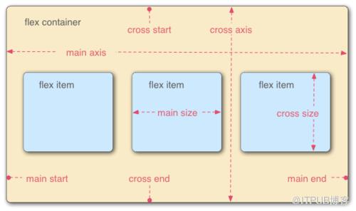
Flex布局主要是操作Flex Container 和 Flex Item两类对象。
Flex Container为作为布局容器拥有main axis,main start,main end,cross axis,cross start 和 cross end属性。
main axis为主轴,默认是水平方向;
main start为主轴起始位置,默认是主轴和左侧边框的交叉点(Flex Item会从main start和cross start开始排列);
main end为主轴结束位置,默认是主轴和右侧边框的交叉点;
cross axis为交叉轴,默认是垂直方向;
cross start为交叉轴起始位置,默认是交叉轴和上边框的交叉点;
cross end为交叉轴结束位置,默认是交叉轴和下边框的交叉点。
Flex Item则为容器内的孩子元素,拥有main size和cross size属性。
main size为Flex Item的主轴方向宽度;
cross size为Flex Item的交叉轴方向宽度。
玩转Flex Container
/* 设置Flex Container,为其直接孩子节点创建Flex Context */display: flex; /* 定义块级Flex Contianer */display: inline-flex; /* 定义行级Flex Contianer */
/* 设置main/cross axis方向和main/cross start, main/cross end的位置
 * row - 默认值,main axis为水平,main start为主轴和左侧边框的交叉点,main end为主轴和右侧边框的交叉点
 *               cross axis为垂直,cross start为交叉轴和上边框的交叉点,cross end为交叉轴和下边框的交叉点
 * row-reverse - main axis为水平,main start为主轴和右侧边框的交叉点,main end为主轴和左侧边框的交叉点
 *               cross axis为垂直,cross start为交叉轴和上边框的交叉点,cross end为交叉轴和下边框的交叉点
 * column - main axis为垂直,main start为主轴和上边框的交叉点,main end为主轴和下边框的交叉点
 *          cross axis为水平,cross start为交叉轴和左侧边框的交叉点,cross end为交叉轴和右侧边框的交叉点
 * column-reverse - main axis为垂直,main start为主轴和下边框的交叉点,main end为主轴和上边框的交叉点
 *                  cross axis为水平,cross start为交叉轴和左侧边框的交叉点,cross end为交叉轴和右侧边框的交叉点
 */
flex-direction: row | row-reverse | column | column-reverse
/* 是否换行
 * nowrap - 默认值,打死都不换行
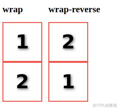
 * wrap - 乖乖换行,第一行到最后一行的方向为从 cross start 到 cross end
 * wrap-reverse - 乖乖换行,但第一行到最后一行的方向为从 cross end 到 cross start
 */flex-wrap: nowrap | wrap | wrap-reverse
/* 一次搞定flex-direction 和 flex-wrap设置 */flex-flow:||
/* 设置main axis方向的对齐方式
 * flex-start - 默认值,向main start对齐
 * flex-end - 向main end对齐
 * center - 居中
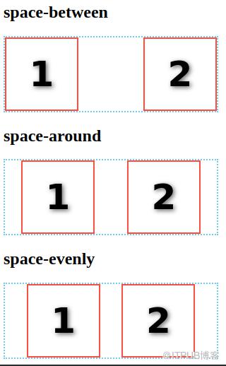
 * space-between - 若有多余空间,则平均分配到各Flex Item之间
 * space-around - 若有多余空间,则平均分配到各Flex Item两边
 * space-evenly - 若有多余空间,按"多余空间/(FlexItem数+1)"计算得到空间宽度,然后分配到各Flex Item两边
 */justify-content: flex-start | flex-end | center | space-between | space-around | space-evenly
/* 设置cross axis方向的对齐方式
 * stretch - 默认值,当height为auto时,Flex Item被拉伸沾满cross axis的空间;否则无效果。
 * flex-start - 向cross start对齐
 * flex-end - 向cross end对齐
 * center - 居中
 * baseline - 对齐Flex Container的baseline
 */
align-items: flex-start | flex-end | center | stretch | baseline
/* 设置cross axis出现多行时,cross axis方向的对齐方式。当仅有一行时,无效果。
 * stretch - 默认值,当height为auto时,Flex Item被拉伸沾满cross axis的空间;否则无效果。
 * flex-start - 向cross start对齐
 * flex-end - 向cross end对齐
 * center - 居中
 * space-between - 若有多余空间,则平均分配到各Flex Item之间
 * space-round - 若有多余空间,则平均分配到各Flex Item两边
 */align-content: flex-start | flex-end | center | stretch | space-between | space-around
玩转Flex Item
注意:Flex Item的float,clear和vertical-align均无效。
/* 设置显示顺序
 * 默认值为0,根据元素在DOM树的位置决定显示的顺序
 */order:
/* 设置当main axis方向存在多余空间时,元素拉伸所占的比例。
 * 例如#div1[style="flex-grow:1"]和#div2[style="flex-grow:3"],现在多余空间为400px,那么div1占400*1/(1+3),而div2占400*3/(1+3)。
 * 默认值为0,即元素不拉伸
 */
flex-grow:
/* 设置当main axis方向存在空间不足且flex-wrap:nowrap时,元素的缩放比例。
 * 默认值为1
 */flex-shrink:
/* 设置元素的默认宽度,当设置为0时flex-grow无效
 * 默认值为auto
 */flex-basis: auto |
/* 一次搞定flex-grow、 flex-shrink和flex-basis * 默认值0 1 auto,关键值none 为 0 0 auto,关键值auto为 1 1 auto。 */flex: none | [? || ]
/* 设置cross axis方向的对齐方式
 * stretch - 默认值,当height为auto时,Flex Item被拉伸沾满cross axis的空间;否则无效果。
 * flex-start - 向cross start对齐
 * flex-end - 向cross end对齐
 * center - 居中
 * baseline - 对齐Flex Container的baseline
 */
align-self: auto | flex-start | flex-end | center | baseline | stretch
应用
通过Flex Layout我们可以轻松实现过去不好实现的效果
色子

.box{
    vertical-align: top;
    margin: 10px;
    padding: 10px;
    width: 100px;
    height: 100px;
    background: #ccc;
    border-radius: 10%;
    box-shadow: 0 5px 1px #fff inset
        , 0 -5px 1px #888 inset
        , 5px 0 1px #aaa inset
        , -5px 0 1px #aaa inset;
    display: inline-flex;
    flex-flow: row wrap;}.dot{
    width:30px;
  height:30px;
    background: #222;
    border-radius:50%;
    box-shadow: 1px 4px 1px #000 inset
        , -1px -3px 3px #444 inset;}.box1{
    justify-content: center;
    align-items: center;}.box2{
    justify-content: space-between;}.box2 > .dot:last-child{
    align-self: flex-end;}.box3{
    justify-content: space-between;}.box3 > .dot:nth-of-type(2){
    align-self: center;}.box3 > .dot:last-child{
    align-self: flex-end;}.box4{
      flex-flow: column;
        justify-content: space-between;}.column{
    display: flex;
    justify-content: space-between;}.box5{
      flex-flow: column;
        justify-content: space-between;}.box5 > .dot{
    align-self: center;}.box6{
      flex-flow: row;
        justify-content: space-between;}.box6 > .column{
  flex-flow: column;}
圣杯布局

#header #main
body{
    margin:0;
    font-style: italic;
    font-family: sans;}/* Holy Grail Layout */.container{
    display: flex;
    flex-direction: column;}@media all and (min-width: 600px){
    .container{
        flex-flow: row wrap;
    }
    header,footer{
        flex: 0 0 100%;
    }
    header{
        order: 0;
    }
    footer{
        order: 4;
    }
    .left-aside{
        order: 1;
    }
    .right-aside{
        order: 3;
    }
    .left-aside,.right-aside{
        flex: 0 0 10em;
    }
    main{
        order: 2;
        flex: 1;
    }}/* User Defined Style*/.container > *{
    text-align: center;}main{
    background: #ccc;
    line-height: 6;}.left-aside{
    background: skyblue;
    line-height: 4;}.right-aside{
    background: tomato;
    line-height: 4;}header,footer{
    background: #666;
    line-height: 3;}
栅格系统

5/104/101/10auto3/10
/* Mobile First Grid System */.grid{
    display: flex;
    flex-flow: row wrap;}.row{
    flex:0 0 100%;
    display:flex;
    flex-flow: row wrap;}.col{
    box-sizing: border-box;
    padding: 5px;
    flex: 0 0 100%;}@media all and (min-width:600px){.col{
    flex: 1;}.col-10{flex:0 0 100%;}.col-9{flex:0 0 90%;}.col-8{flex:0 0 80%;}.col-7{flex:0 0 70%;}.col-6{flex:0 0 60%;}.col-5{flex:0 0 50%;}.col-4{flex:0 0 40%;}.col-3{flex:0 0 30%;}.col-2{flex:0 0 20%;}.col-1{flex:0 0 10%;}}/* User Defined Style*/.col>div{
    text-align: center;
    background: #bbb;
    line-height: 2.5;
    height: 100%;
    font-family: sans;}
带附加项的表单控件

  Amount

  Encrypt
.form-input{
    display: inline-flex;
    line-height: 2;
    border: solid 1px rgba(0,0,0,0.3);}.form-input:hover{
        border: solid 1px rgba(0,0,0,0.4);}.form-addon{
    font-style: normal;
    color: #666;
    background: #ddd;
    padding-left: 10px;
    padding-right: 10px;
    border-right: solid 1px rgba(0,0,0,0.3);}.form-addon-after{
    border-left: solid 1px rgba(0,0,0,0.3);
    border-right: none 0;}.form-control{
    border:none 0;
    outline-color: transparent;
    padding: 5px;
    caret-color: #888;
    font-size: 16px;}
总结
尊重原创,转载请注明转自:https://www.cnblogs.com/fsjohnhuang/p/9134088.html ^_^肥仔John
参考
来自 “ ITPUB博客 ” ,链接:https://blog.itpub.net/2281/viewspace-2802169/ ,如需转载,请注明出处,否则将追究法律责任。

