面试题
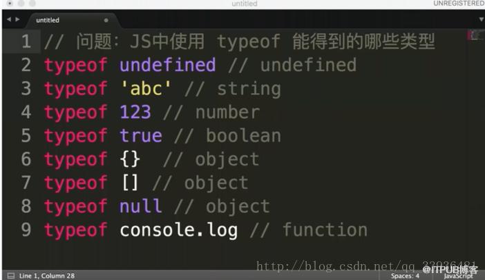
- JS中使用typeof能得到的哪些类型?JS数据类型
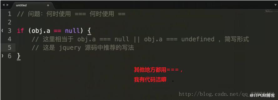
- 何时使用
===何时使用==? 强制类型转换 - window.onload 和DOMContentLoaded的区别?浏览器渲染过程
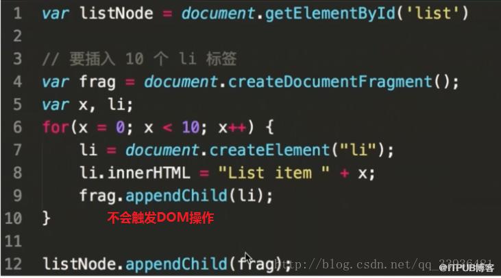
- 用JS创建10个
标签,点击的时候弹出来对应的序号 作用域 - 简述如何实现一个模块加载器,实现类似require.js的基本功能 JS模块化
- 实现数组的随机排序 JS基础算法
- 拿到一个面试题,你第一时间看到的是什么->考点
- 又如何看待网上搜出来的永远也看不完的题海->不变应万变
- 如何对待接下来遇到的面试题?->题目到知识再到题目
变量类型和变量计算
几种基本数据类型?复杂数据类型?值类型和引用数据类型?堆栈数据结构?
- 基本数据类型:Undefined、Null、Boolean、Number、String
- 值类型:数值、布尔值、null、undefined
- 引用类型:对象、数组、函数。
- 堆栈数据结构:是一种支持后进先出(LIFO)的集合,即后被插入的数据,先被取出
- js数组中提供了以下几个方法可以让我们很方便实现堆栈:
- shift:从数组中把第一个元素删除,并返回这个元素的值。
- unshift: 在数组的开头添加一个或更多元素,并返回新的长度
- push:在数组的中末尾添加元素,并返回新的长度
- pop:从数组中把最后一个元素删除,并返回这个元素的值。
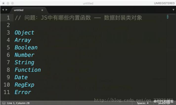
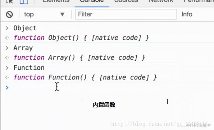
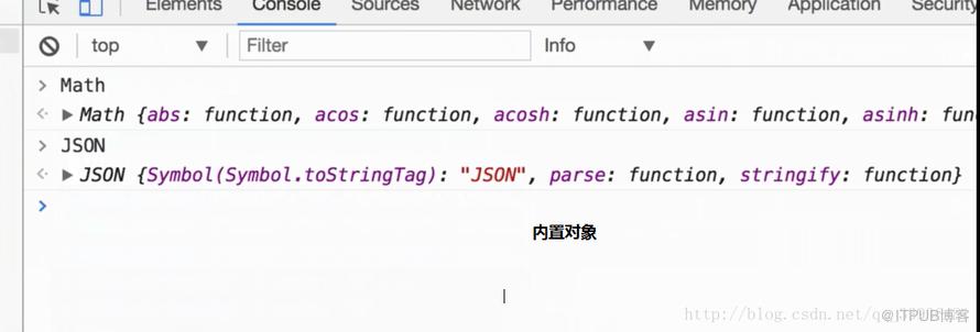
JS内置函数
- 内置函数Object,Array,Boolean,Number,String,Function,Date,RegExp,Error
- 内置对象Math,JSON……
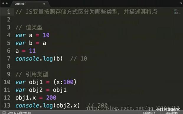
值类型和引用类型
- 值类型:数值、布尔值、null、undefined。
- 引用类型:对象、数组、函数。
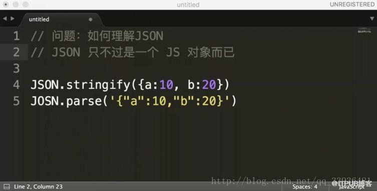
JSON
对象是一个无序的“‘名称/值’对”集合。一个对象以“{”(左括号)开始,“}”(右括号)结束。每个“名称”后跟一个“:”(冒号);“‘名称/值’ 对”之间使用“,”(逗号)分隔。
- zh.wikipedia.org/wiki/JSON
- www.json.org/json-zh.html
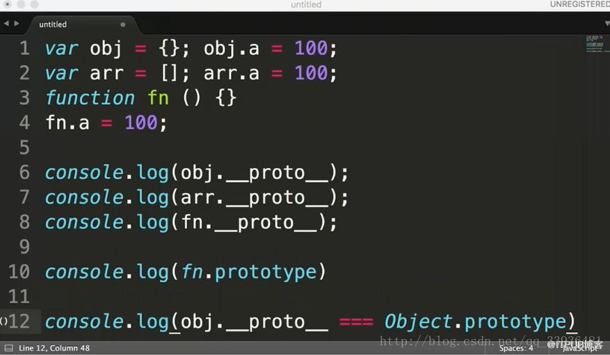
原型和原型链-构造函数问题
- 如何准确判断一个变量是数组类型
- 写一个原型链继承的例子必领会
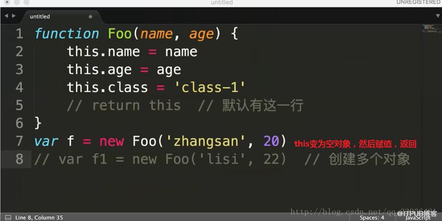
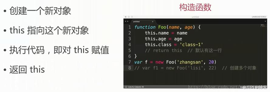
- 描述 new一个对象的过程
- zepto(或其他框架)源码中如何使用原型链
instanceof的妙用
object instanceof constructor
instanceof 运算符用来检测 constructor.prototype 是否存在于参数 object 的原型链上。
-
var a={}其实是var a=new Object()的语法糖 -
var a=[]其实是var a=new Array()的语法糖 -
function Foo(){..}其实是var Foo=new Function(..) - 使用instanceof判断一个函数是否是一个变量的构造函数
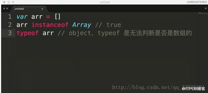
- 判断一个变量是否为“数组”:变量 instanceof Array
typeof无法判断数组
new对象过程
原型链继承
- 循环对象自身的属性
var item
for (item in f) {
	if (f.hasOwnProperty(item)) {
		console.log(item)
	}
}
Dom
- DOM 是哪种基本的数据结构?树
- DOM操作的常用API有哪些
- DOM 节点的 attr 和property 有何区别
- Dom操作常用API
- 获取Dom节点getElementById
- 获取父元素 parentElement
- 获取子元素 childNodes
- 新增节点appendChild
- 创建元素createElement
- 删除节点 removeChild
- 获取DOM节点,以及节点的property和Attribute
- 获取父节点,获取子节点
- 新增节点,删除节点
- JS中Attribute 和prototype 的区别是一个是标签属性 一个是对象属性
- praperty只是一个JS对象的属性的修改
- Attribute 是对html 标签属性的修改
网络基础
- 从输入url到得到html的详细过程
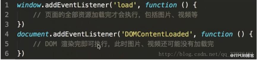
- window.onload 和DOMContentLoaded的区别
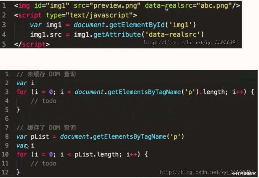
图片懒加载
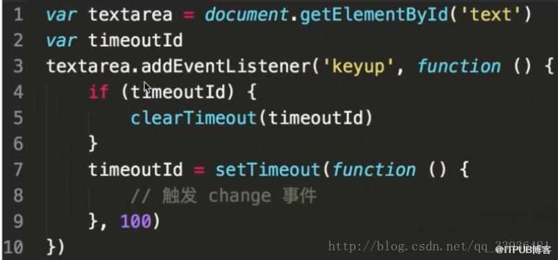
BOM
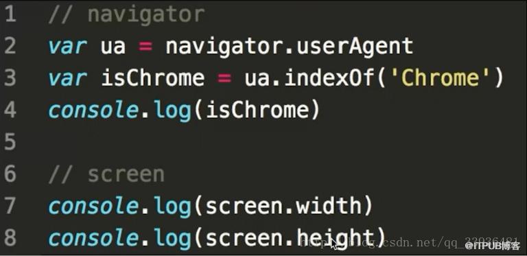
- 如何检测浏览器的类型
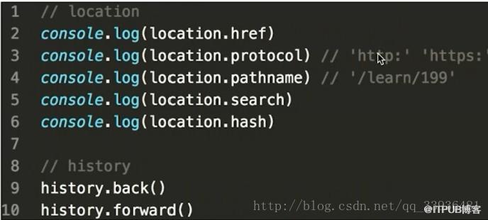
- 拆解url的各部分
事件绑定
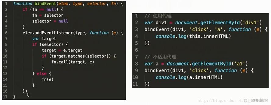
- 编写一个通用的事件监听函数
- 描述事件冒泡流程
- 对于一个无限下拉加载图片的页面,如何给每个图片绑定事件
代理
事件委托就是利用事件冒泡,只指定一个事件处理程序,就可以管理某一类型的所有事件。
冒泡
- DOM树形结构
- 事件冒泡
- 阻止冒泡
- 冒泡的应用
- 使用代理
- 知道代理的两个优点
ajax请求(包括http协议)
- 手动编写一个ajax,不依赖第三方库
- 跨域的几种实现
- 描述一下cookie,sessionStorage 和 localStorage的区别?
- 容量
- 是否会携带到ajax中
- API易用性
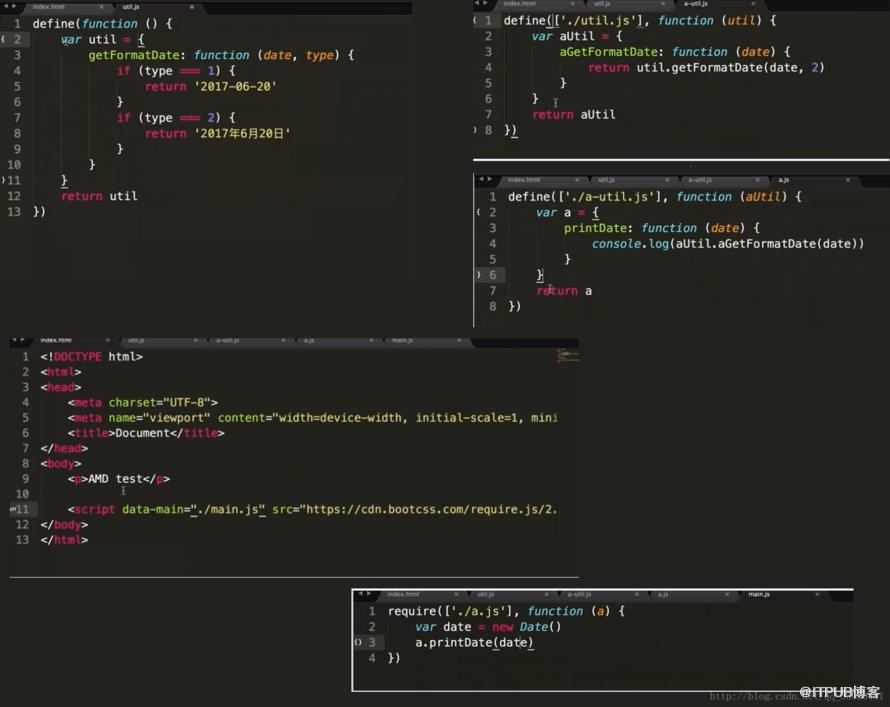
js模块化
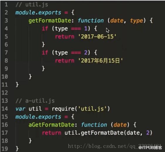
- util,js getFormatDate函数
- a-util.js aGetFormatDate函数使用getFormatDate
- a.js aGetFormatDate
不使用模块化
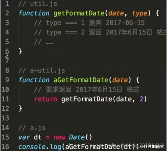
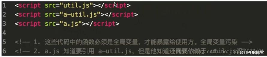
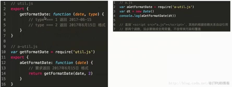
export和require
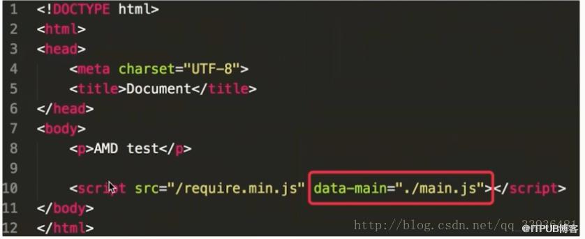
requires.js
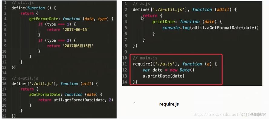
引入
CommonJS
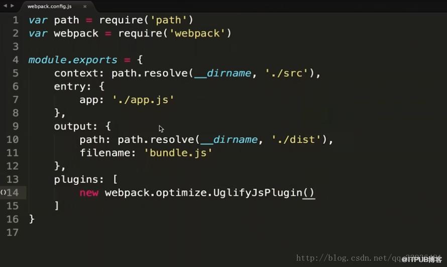
webpack
页面布局
- 浮动(margin负值)双飞翼
- 变形,圣杯
- 绝对定位
- 流式布局(浮动)
- BFC
- BFC 区域,不会与浮动元素重叠。
- Flex 布局
- Table 布局
- Grid布局
题目:假设高度已知,请写出三栏布局,其中左栏、右栏宽度各为300px,中间自适应
html lang="en">
head>
    meta charset="UTF-8">
    title>Documenttitle>
    style type="text/css">
        *{
            padding: 0;
            margin:0;

        }
        .layout article div{
            min-height: 100px;
            text-align: center;
        }
    style>
head>
body>
    section class="layout float">
        style meida="screen">
            .layout.float .left{
                float: left;
                width:300px;
                background-color: #5F5F5F;
            }
            .layout.float .right{
                float: right;
                width:300px;
                background-color: #5F5F5F;
            }
            .layout.float .center{
                background-color: #E0E0E0;
            }
        style>
        article class="left-right-center">
            div class="left">div>
            div class="right">div>
            div class="center">
                h1>浮动解决:脱离文档流,兼容比较好,增加高度溢出,无法使用h1>
            div>
        article>
    section>
    section class="layout absolute">
    style type="text/css">
        .layout.absolute .left-center-right>div{
            position: absolute;
        }
        .layout.absolute .left{
            left:0;
            width: 300px;
            background-color: #FFC3C3;
        }
        .layout.absolute .center{
            left:300px;
            right: 300px;
            background-color: yellow;
        }
        .layout.absolute .right{
            right: 0px;
            width: 300px;
            background-color: #A8F2E2;
        }

    style>
        article class="left-center-right">
            div class="left">div>
            div class="center">绝对定位,下面的元素都要脱离文档流,超出div>
            div class="right">div>
        article>
    section>
    section class="layout flexbox">
    style type="text/css">
        .layout.flexbox{
            margin-top: 100px;
        }
        .layout.flexbox .left-center-right{
            display: flex;
        }
        .layout.flexbox .left{
            width:300px;
            background-color: #A2EFAA;
        }
        .layout.flexbox .center{
            flex: 1;
            background-color: #F8E0A1;
        }
        .layout.flexbox .right{
            width:300px;
            background-color: #A2EFAA;
        }

    style>
        article class="left-center-right">
            div class="left">div>
            div class="center">flexdiv>
            div class="right">div>
        article>
    section>

    section class="layout table">
    style type="text/css">
        .layout.table .left-center-right{
            width: 100%;
            display: table;
            height: 100px;
        }
        .layout.table .left-center-right>div{
            display: table-cell;
        }
        .layout.table .left{
            width: 300px;
            background-color: red;
        }
        .layout.table .center{
            background-color: blue;
        }
        .layout.table .right{
            width: 300px;
            background-color: yellow;
        }
    style>
         article class="left-center-right">
            div class="left">div>
            div class="center">表格:需要同时增高div>
            div class="right">div>
        article>
    section>

    section class="layout grid">
    style type="text/css">
        .layout.grid .left-center-right{
            display: grid;
            width: 100%;
            grid-template-rows:100px;
            grid-template-columns:300px auto 300px;
        }
        .layout.grid .left{
            background-color: yellow;
        }
        .layout.grid .right{
            background-color:blue ;
        }
        .layout.grid .center{
            background-color: red;
        }
    style>
        article class="left-center-right">
            div class="left">div>
            div class="center">网格布局,超出高度无法使用div>
            div class="right">div>
        article>
    section>
body>
html>
- 延伸:方法的缺点,优点,兼容性,比较,考虑纵向(flex,table支持高度),实用性,为什么
CSS盒模型
- 谈谈你对CSS盒模型的认识
- 基本概念:标准模型+IE模型
- 深入理解BFC
- DOM事件
- 事件分为三个阶段: 事件捕获 –> 事件目标 –> 事件冒泡
- 使用严格模式,注意作用域
- 使用类与对象,结合模块化构建中大型项目
- 使用Promise替换传统的回调函数
- 使用箭头函数要注意this的指向
- 学会使用Generator完成异步操作应用
来自 “ ITPUB博客 ” ,链接:https://blog.itpub.net/1696/viewspace-2796711/ ,如需转载,请注明出处,否则将追究法律责任。

请登录后发表评论
登录
全部评论
